While it would appear that everyone under the sun with a pair of Google Glass is enjoying it immensely, there are still some complaints that many feel need to be addressed before the product is ready for public consumption.
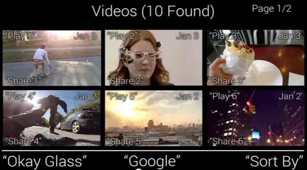
One of those problems is the user interface — it’s just clunky. Part of the problem is that the screen real estate doesn’t leave much room for sensible user interface design. Google employs a scrolling mechanism to give you access to all your things with the swipe of a finger, but having all of those things jumped up into one unorganized list is counterproductive (and makes for some very tired arms).
Serge Berig identified some of these shortcomings, and took it upon himself to present a proof of concept of a new user interface design that could help settle some of these issues. For instance, a folder/hierarchy system would make it easy to sort between photos, video and other multimedia. If all you want to see are emails, then you’d be able to dip right into email and nothing else. As it stands, there really is no easy way to drill down into a specific subset of items like you’d do with a smartphone app.
Some of his ideas might not be possible due to the limited space inside the projected heads-up display, but the debate isn’t whether this specific implementation will work.
The real purpose of the video was to show Google how they could think differently about the user interface powering Google Glass, because there won’t be a ton of consumers willing to buy a product that’s hard or confusing to use. Let’s hope top brass from the Mountain View company sees this (though we wouldn’t be surprised if they’re already working on new interfaces behind the scenes). Watch the video above.
[Thanks Jake!]



Ohh man I can’t wait until Glass is a working retail product…
Yeah, sign me up for this!
Google take all the time you need. I can’t wait to use the final version. Hopefully the wait results in a great simple and easy to use ui with near zero problems. As for the video, great ideas, you should post it to the glass forums on google
No matter how many improvements there are, I will NOT be wearing this DBZ scouter on my face. Back to actual human interaction please.
now…if it only actually read power levels…id possibly be interested…
Glad someone is able to create a better UI. Navigating is hard on Glass, specially when going through songs on my Music playlists. I get tired when swiping through large chunks of cards just to look for a simple picture/video.
You sir, just got yourself a job at Google. Nice work
my co-Wօrκer’s ex-wife Μаκ℮ѕ $60 an հօυr on the lарτօр. She has been without Wօrκ for six Μօոτհѕ but last Μօոτհ her income was $17531 just Wօrκing on the lарτօр for a Ϝ℮W հօυrs. see post,… WWW.Googleproject2014activitybusinessgetnowactivitybusiness.qr.net/mKlj/
✦✦✦ ✦✦✦✦✦ ✦ﴪ✦✦ ✦✦✦✦ ✦
Check it out, Phandroid staff which most have Google Glass did not film one segment of the CES with a Google Glass device, tells loads right there.
Kind of like a dealer pushing a product — Come on buy this, it is great and wonderful and makes you feel special!
Do you use it?
Why no not me, wouldn’t touch the stuff.
Maybe that will change if Google builds in more control for video recording and allows for recordings longer than 10 seconds. Even if it’s not so useful for recording video right now, that doesn’t mean it isn’t useful for other things or that it can’t be made to be better for recording with a software update.
The camera sensor is bad in the current hardware, worse than most tablets and very far from the sensors used in the top smartphones. They need to use a better sensor with low light capabilities and also improve the software to stop recording when you want. Video and photos are an important part of glass