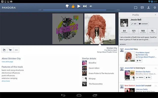
We’ve been getting a little tired of getting our internet radio on our Android tablets through an app that looked like it belonged on an Android phone. Sure, the tunes still sound just as good, and we suppose you’re not really looking at the app too much when you’re listening, but it was still a bit hard to look at. Thankfully, today’s update changes that for good.
The app keeps all of the same functionality you’re used to, such as support for lyrics, the ability to rate music, the ability to view your profile information and more, except it does it all in a much more spacious viewing area. There’s one interesting change seen in the Google Play screenshots that aren’t in the current app, though — the app has a Chromecast icon at the upper right.
Google officially announced Pandora as an early Chromecast partner when the HDMI-based media streaming dongle was first announced, but we have yet to see the fruits of that little partnership. The latest rumors suggested we were “days away” from seeing Chromecast support in Pandora, so it sounds like things are right on schedule. For now, just enjoy the new tablet experience, and keep your fingers crossed that it won’t take as long to bring Chromecast support as it’s taking Google to launch the Nexus 5 and Android 4.4 KitKat.






Assuming you meant, “looked like it belonged on an Android phone.” :)
I don’t see a sleep timer in the tablet version.
wow finally. that’s why i gave them 3 stars because they didnt have tablet UI
definitely good news
I see the Chromecast icon!
No notification controls. Still.
It’s still a PITA to actually quit this app on tablet or phone.
Chromecast should be immanent
http://investor.pandora.com/phoenix.zhtml?c=227956&p=irol-newsArticle&ID=1870800&highlight=