
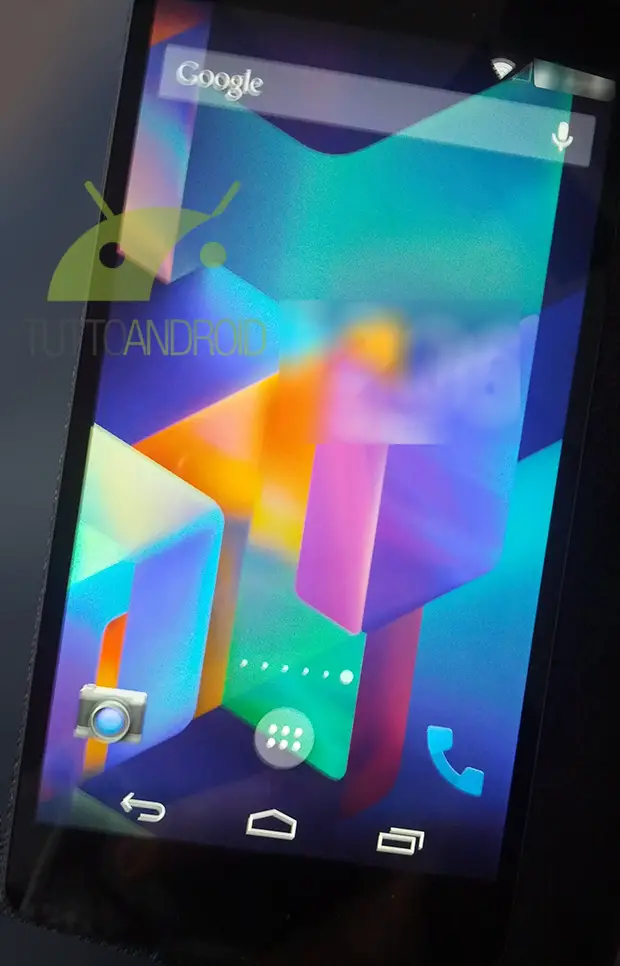
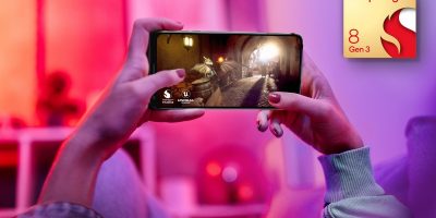
Will Google announce KitKat and the Nexus 5 next week? Maybe. Is the latest leak enough to hold you over? Probably not, but here it is anyway. This is purported to be Android 4.4 running on the upcoming Nexus 5, and if it seems to look a lot like Jelly Bean, that’s because it does.
There are a few tweaks: a transparent notification bar, a tweaked app drawer showing five rows of four apps each over your phone’s background instead of black, and the ability to access Google Now by swiping left past the leftmost home screen. The Nexus 5 also reportedly features the same “OK, Google Now” voice commands as the Moto X.
There are likely to be plenty of other changes — some on the surface, some under it — that will be revealed when Google unveils the latest update. It’s Android 4.4 version number, however, seems to be more and more fitting. Despite getting a new codename with KitKat, the build will share a lot in common with Jelly Bean.
Rumors point to Google unveiling KitKat and the Nexus 5 next week, possibly on October 15th. Keep it tuned here for all of the latest developments.
[via TuttoAndroid]


Where are the rest of the leaked pics? There are a few more. Either way, I’m sold already!!!!
I dont know how I feel about this…
Lol
That second pic looks like the nexus 5. The speaker grill is missing and the front facing camera is on the right side whereas this pic has some circle thing on the left.
That’s a lot of bezel on the bottom there.
The speaker grill is there. You just have to look very hard; bad lighting.
i thought “ok, google now” would have been Motorola’s trademark so they could sell phones and get out of hot water . it’s cool to have on other phones (I’m not complaining), just thought exclusivity would help Moto make more money. but thanks Google!!!
Active notifications is the bigger item for moto, as no special case needed unlike galaxy devices.
I’m buying. Where’s the BUY NOW button?
Looks pretty nice.. And thanks to those awesome Google play edition phones I’ve actually got hope to have a stable build of this running on my galaxy s4 before the month is over
TAKE MY MONIES NOW!!!!!
My body is ready :3
lol, yours too?
Looks great. It’s just me or talking kit kat all the time really gets you craving chocolate? I’m trying to lose weight Google, not gain. Next version I want it to be Android Lean Cuisine. =P
Finally found the Android Kit Kat bars at the grocery store yesterday. I bought 3 lmao
Good luck bro, hope u get the N7!
Alphabetically, messaging should come after maps. So does this mean hangouts integration confirmed?
On another note, no bloat ware to be found that is so beautiful :’-)
I’ll be happy with handouts integration once I’m happy with handouts by itself
Good catch
Damn you’re good!
Gallery is also missing, seemingly replaced with “Google Photos”. *gasp*
Still lags though. Also wow no 64 bit? Android really needs to catch up.
Nothing lags, except your grasp on reality.
Looks almost exactly like Paranoid Android.
Apparently people have never seen ASOPA before. Too bad.
All is well. Give me the price!
Free update(only guaranteed for nexus devices Gnex and newer)..
My god, it’s now even more like the iPhone. Why don’t they just call it iDroid? Missing Andy Rubin right now…
How is it…….. huh?
staph him chris,
lol
5 rows of shortcuts, search to the left of the left-most screen, little page dots on the bottom, and apparently they’ve removed the nice static 4-shortcut with app drawer button on the bottom? It’s not static when I swipe home screens? This is familiar iPhone territory… not as useful as Jelly Bean. Fail.
dhinged pls
y u do dis
In your confusion you forgot to not mix up the home screen with the app drawer. Also, shut up.
Go home dhinged, you’re drunk!
WTF -_-
What is wrong with you?
It does resemble TouchWiz a little.
I thought it looked like jellybean with a transparent notification bar, white notifications, slightly different app drawer icon, boxier phone icon, and a different background. I guess we just see things differently.
Yup, you’re right. And I’d add that, whatever the inspiration was, I do see improvement and that’s always welcome.
go home dhinged, you’re not drunk, you’re cray cray (that is apparently what the kids call people who are crazy).
Don’t sass me, girl!
See how Apple Jedi mind tricks work? Apple copy Android, then next time Android release a new version, people start to think that it’s a copy of iOS.
‘Cause nobody cept Apple ever had an original idea.
You know, I expect people to read and understand what I write… I want Android to be original and better than the iPhone, that’s why I bought it over the iPhone. I never liked the left-swipe search, I always preferred Google’s way (though long-pressing the home button and swiping up for Google Now is not as efficient as long-pressing the search button for voice search like Android used to do or long-pressing the home button for Siri), and I always preferred Android’s 4-shortcut + apps drawer static row to Apple’s no-app-drawer-whatsoever… so, I know it’s hard to understand what people write in this day and age of fly-like attention spans, but really, try this time, you might learn something.
“long-pressing the home button and swiping up for Google Now”.
You don’t have to long-press the home button. Just swipe up from the home button to open Google Now.
Fine (I’ve got the Razr Maxx), but pressing the search button pre-Ice Cream Sandwich or long-pressing it pre-4.1 to reach voice search was still easier. Google made it harder. Lame.
It’s not hard to understand you my friend, you are just wrong. That’s all. Could you please explain how Android is “now even more like the iPhone”. Please bear in mind that Android had a flat UI two years before the iPhone, had a notifications system + drawer about 5 years before the iPhone and has been using transparency in it’s UI for 2+ years as well. Did I mention shortcuts to settings? Silly me, I simply don’t have enough time (or the inclination) to list every area of UI where the iPhone has aped Android and not the other way around.
The iPhone had some original ideas yes, but that was either back in 2009 or not worth copying (Apple Maps, zooming in and out so much it causes motion sickness, etc).
The bottom line is this – Apple had a very simple, but not very functional UI and have been attempting to “bolt on” additional functionality so they can handle notifications, task switching etc. Android had most of this stuff designed in from the off, which initially made it more complex (as it was more functional) but this solid foundation is now paying dividends as Android is more intuitive and coherent, having been better thought out.
The irony is that Apple is so well thought of in design terms by those “not in the know”. Just shows what a few slick transitions and a sparkly gee whiz case can do for you ;-)
It looks beautiful, I’m waiting for this to come to my Nexus 4 :$
Icons should be ROUND all over android
There should be an app that rounds up all the icons if that’s what u want (maybe there is). But not being native to Android. Android is all about freedom.
Disagree. I always liked how Android icons could be any shape. A nice contrast to how all iOS icons are the same rounded-square shape.
At the end of the day, they can make them however they want…cause I’m gonna make them however I want…we’re in the Android land after all
Looks really clean, I like it.
Now if only more than 1% of Android phones could get it at launch.
Of course you like it. Transparent notification bar and showing your wallpaper instead of a black background? shamelessly taken from IOS 7. Google may not know how to innovate but they sure are good at copying.
Just like how IOS7 “shamelessly” took the notification shade from android….or the quick settings (control panel) that android has had for years.
Anyone got a towel?
Its gonna be hard to say goodbye to my HTC One…
Why don’t you just flash the Google edition firmware and download 4.4 on your HTC one when it comes out? Or are you not that tech savvy?
That’d be a smarter move indeed.
Phones already rooted and running a custom Rom. It’s just that side of me that wants a Nexus device
Can’t be done for Tmo version, can it?
Can. All GMS builds are compatible with each other. It’s really nice :)
Itll prob be on the HTC TWO, lol.
Not that I don’t still enjoy my Gnex, but I am hungry for this new phone, although the bezel in the image doesn’t look as slim as the G2, which is disappointing, that was one of the major things I was looking forward to.
It’s not as slim on the sides due to the hardware buttons, though slimmer than the Gnex or N4, and the top/bottom aren’t as slim either, big chin especially.
I think we should stop calling KitKat the new “codename”. At the companies I’ve worked at a project will often have atleast 4 different names: engineering designation, internal codename, external codename, marketing name.
I view KitKat as the marketing name. It seems that even the developers at Google mostly thought it was KeyLimePie, so that was clearly the internal codename.
Is it just me or does that phone handset icon look.. wrong?
maybe if it was on the left side instead, it’d look a little better
Remember, that’s one of the rumored changes, along with the camera app.
I’m bringing my credit card with me to work next week just in case pre-oder sales go live on Tuesday.
First picture Lockscreen please tell me you pull up on that camrea icon to open up the camrea…Thats what IOS7 does xD
you can slide it to the left.
Oh really???
You can already pull the lock icon to the left on JB to start the camera (of course, your maker might have changed the default lock screen).
I did not know this.. thank you guys :D
True, i just said that above.
iOS7 took most of Jelly Bean’s animations, why not take something back.
That’s going to be hilarious if this is real. :P
You can do that on the current lockscreen as well. At least on my ONE it does.
Android has it for years… that you unlock to launch apps…
Sexxaaayyyy
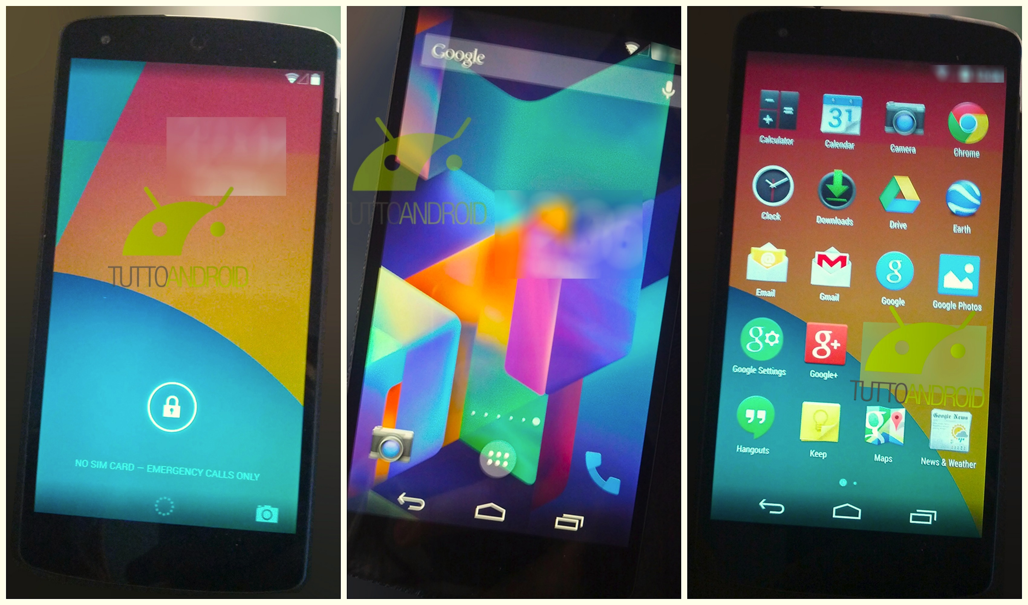
Are two apps intentionally censored? Any ideas what they are?
That looks like it was a date/time weather like a beautiful widget or similar…showing that may help ID the leaker
Google,find the leaker, cut his Oo….:-)
In both middle and right images I’d say yes, since in the right image g+ would be directly next to the hangouts app unless the person had some personal apps. In truth there aren’t many that could be there, and the leaker could be found out easily. I have exactly two apps in that location on my tablet(gospel library and groove IP), but only the former on my phone.
So maybe VZW will have this on my GN by the time I leave them in march.
Great.
That’s what I used to have with my previous near pure android phone, G2x, hope…..
I hate to admit it, but the colors are reminiscent of iOS7…
Or JB, since that’s what iOS7 resembled.
It’s just the wallpaper mainly.
The 3rd pic makes it look like you can remove the Google search bar and replace it with an additional row of icons. That would be greatly welcomed! I never use Google search so I’d rather have another row on icons and not waste that space.
Damnit, it’s the app drawer. PLEASE give us an ability to remove the fudging search bar!!!!
Just use the Nova launcher and the search bar is gone.
exactly what I was typing when your post popped up! (be much cooler if it was a native option of course..)
I cannot stand the searchbar, i like a clean , minimalistic screen…and don’t tell me what should I have on my home screens, that’s why I can’t stand Iphone. And if you need to search something, just Swipe up from the bottom of your screen, Google search will pop up.
Nova Launcher is much better than stock Android launcher; not only does it let you remove the search bar (which is great if your phone already has a search button), it lets you change the number of rows on your homescreen, do vertical (non-paginated) scrolling in the app drawer, swipe left to view widgets, and resize any widget. Only drawback is it can see what’s in your widgets, though I don’t think the developer cares about that.
The Google search bar can be removed on any Android device. Have you ever tried ? Besides why would you want to clog up one of your home screens with icons, thats what the app drawer is for.
Please tell me how to remove it without installing a different launcher!?
touch and hold till it comes loose then drag it to the trash like any other widget on the homescreen. I always clear all my homescreens of whatever is preloaded when i first turn on the phone and customize it to what i want. The Search Bar always gets erased til i decide where i want to put it.
Yes, possible on older Android. In Jelly Bean, the search bar is static.
I have Jelly Bean, on my HTC ONE. I just deleted it and put it back as we speak.
So you have HTCs SenseUI, which is not stock Jelly Bean.
Doesn’t work on the raw android versions, i.ex. nexus builds.
Well thats just silly. I would have thought raw android versions would be completely customizeable, well they used to be.
I remember when Android phones had a search button (magnifying glass) on the phone regardless of whether you’re on the home screen or not that can be tapped to search or held to do voice search… it’s a lot easier than having to go to the launcher and tap a search bar at the top (easier to tap things at the bottom) or the microphone button.
The 3rd pic shows the app drawer ;-)
I don’t understand why they won’t fully commit to the flat icons.
Hangouts has it, but the camera doesn’t.
Gmail for iOS has it, but Gmail for Android doesn’t.
Hate to use the F word, but…
because flat icons suck
I’m OK with your concern, Android needs a better way to standardize icons, flat icons are a very good option..!!
Valid concern and one I share. From the pic it looks like the Hangouts, Google Settings, Google, G Photos and Keep apps are flat.
Why do they need flat icons? I like the 3D perspective. It’s boring if they become like everyone else.
The icons you mentioned aren’t flat if you look carefully. Look at the white border on the top left of Hangouts for example.
take my money now
I do not use Google photos. I always turn off auto backup. The lack of native gallery is disappointing, I’ll just have to get by with quick pic. That said,looks lovely. I can’t wait for kit Kat and especially Nexus 5! Take my money Google! Take it nowwwwww!
The stock Android gallery app already incorporates photos from G+, so I think they’re simply rebranding it, and maybe making it easier to backup photos from the Gallery to G+.
I noticed there’s no “Gallery” app… is Google going to require us to use the cloud to store and view photos? And G+? Can I not just take pictures with my phone and view them there without them being sent to a server?
Please change that wallpaper….looks like mango sorbet
*grabby hands* GIMME!!!!!
My god…its beautiful.
Looks very nice :)
“OK, Google Now” you say? Hell yes I say.
Still, I wish I could say something shorter. Like “Phone” or a custom hotword (which would remove the possibility of someone else activating your phone.
“I’ve got my eyes on you…”
Whoop Whoop 2D icons :D
4×5 Icon Layout.
iOS Style Paging…..
gonna get sued for sure.
…and people thumb me down for saying how much each new iteration of Android is closer to the iPhone; thanks for not being ignorant.
I think you have that backwards
Dude I noticed the same thing!!! So why only 4 icons across….are the icons really large or is this phone really narrow? I hope it’s just the picture and the phone’s not similar to the iPhone 5 style…
Actually I’m a Apple fanboy, but I’m a little worried about Android.