We’ve been hearing a lot about a rumored HTC T6 for quite sometime. In a 5-inch+ smartphone market largely dominated and pioneered by Samsung with their Note series, it only makes sense more Android OEM’s would want to get a piece of the pie. Now rumored as the HTC One Max, the T6 will be HTC’s phablet device to go head-to-head with the Samsung Galaxy Note 3 and today, we’re getting a little more allegedly leaked info on the device.

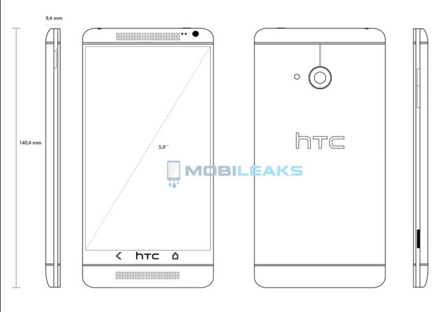
The boys at Mobileaks put together this handy blueprint of the One Max, along with its leaked dimensions. To the untrained eye… yeah, it looks exactly like the HTC One. But the dimensions of the device show something slightly smaller than the Galaxy Note 2 (140.4mm vs the Note 2’s 151.1mm), and with the same 9.4mm thickness. What’s odd is the 5.9-inch display is obviously larger than the Note 2’s 5.5-inch screen, and with much larger bezels, how did they manage to make the height smaller than the Note’s? There must be some kind of mobile wizardry going on here if this blueprint is accurate.
Also “confirmed” were some more of the device’s specs, 5.9-inch full HD 1080p display, 2.3GHz Snapdragon 800 quad-core CPU, Android 4.3 or higher, 3,300mAh battery, UltraPixel Camera and BoomSound (which Mobileaks is calling “Tree Sound” for whatever reason).
Looks like Samsung’s unchallenged Galaxy Note days are numbered thanks to a flood of new phablets soon to arrive on store shelves. With the already available LG Optimus G Pro, upcoming HTC One Max, and rumored Sony Xperia ZU (sporting a 6.44-inch display), big booty phone lovers will finally have their options.


The button setup
i know i don’t get it… they were the only manufacturer that kept with a consistent layout, and the INTENDED layout until now…. idk why they ruined their good streak
the layout (BACK – HOME – MENU – (and used to be search)) was the perfect layout if you were going to do hardware integrated nav buttons
I miss my G1’s call, end call, back, home, and search physical buttons :c
Me too…also miss the g2 setup
I got used to the button setup on my H1 within a couple days. I can honestly say that it isn’t bad, and with most apps (except Facebook… -.-) following Google’s design guidelines, the switch-window button and the menu button seems useless.
I use the multitask button so much that I can’t imagine myself switching my N4 for HTC One GE :/
One thing this will have going against it (most likely) is a non-removable battery. I use a bigger extended battery for my Note 2 so an HTC phone wouldn’t really work for me.
Wait- you put an extended batter on your Note 2???? :O
Can you post a picture of that beast? I’m curious to see the size..
Check this out,the mutha of all phone batteries:
http://androidforums.com/samsung-galaxy-note-2/712398-review-zerolemon-9300-mah-extended-battery-note-2-w-pics.html
http://www.amazon.com/warranty-ZeroLemon-Extended-Protection-Compatible/dp/B00AKZWGAC/ref=sr_1_2?ie=UTF8&qid=1370659579&sr=8-2&keywords=zerolemon+for+galaxy+note+2
Nice, it’s smaller than the Note 2, and it has a bigger screen than the Note 2… This could even be a winner over the Note 3, but we’ll see about that…
My problem with the Note 3 is — like the GS4/GS3 — it will most likely look identical to the 2.
I’m really hoping Samsung will give it a complete overhaul, but I don’t see them doing with a Note. The next GS5 flagship, maybe.
And that it will be a cheap plasticky piece of shît
Holy crap, that really will be tablet size with that much top and bottom bezel. Maybe they should call it the HTC ONE + one”
It’s still smaller than the Note 2… “(140.4mm vs the Note 2′s 151.1mm)”
Ah, I always overestimate. I’m not into the big phones personally.
Neither am I… But I can definitely see the appeal of them
Totally, I just wouldn’t buy a tablet. I hardly use my N7 anyways…
The top is actually pretty small. Seems like the moved up the display and left a pretty big bottom bezel. Thankfully, the capacitive buttons and speaker break it up so it’s not so noticeable to the eye (illusion).
Maybe it was just the drawing that made the bottom look overly big. Iunno
Hopefully it’s screen won’t end up being more like the LG Phablet which was more like 4:3 “Pan & Scan”
Camera button!!!
Good eye! :O
i thought that was just the usb port
I am wondering what is the MegaPexil on the camera?
I think I would be making an educated guess with 4MP. The HTC One “ultra pixel” stuff is also 4MP.
Are you sure this isn’t a slot for an SD Card?
I know such isn’t mentioned in the link from MOBILEAKS,but,it has been mentioned elsewhere.
http://theunlockr.com/2013/05/30/the-htc-phablet/
http://www.engadget.com/2013/05/30/htc-t6-rumor/
A physical button for the camera would always be welcomed,but,given a choice,I’d take the SD Card slot.
I think it is a camera button, being solid black and the location. I don’t see htc changing the locations of ports so I’d assume the micro SD will be on the top and micro usb most likely on the bottom. Also it’s on the very thin plastic perimeter, too small to be USB or SD which would most likely have a flap.
I’m not a fan of the lock button on the side unless it’s on the lower half like on the Lumia devices so I won’t complain about it being on the top, other than it being switched sides AGAIN..
ugh. Is the power button still on top?
oh hell no :/ that sucks big time
I like big booty..
HTC One just a lil bigger.
Saw the word “booty”. Knew it was Chris. Man after my own heart.
Something is a little fishy with those numbers. I just calculated and 5.9 inches of screen translates to 149.86mm. If the screen goes diagonally 149.86mm, how the heck do you fit that into 140.4mm height for the device overall? Either the 140.4mm measurement is wrong or I’m missing how this can mathematically happen. Maybe 140.4mm got translated incorrectly and it should be 160.4mm? That would make more sense, especially with the bezel layout. And just checked it. 160.4mm translates to 6.31 inches. That sounds more realistic.
Hmmm.. Pythagoras was wrong then
LOL…I guess so.
Mathematically speaking – At some aspect ratio, you could fit it into even much less.
I am sure there is a way that exists. But the diagram leads me to believe that the numbers were listed wrong.
Sorry to be the grinch, but given the 5.9″ screen and scale of the image above, I’ve calculated the phone dimensions to be 166.7mm x 76.8mm. Obviously a screen 130.5mm tall cannot fit in a 140.4mm device with such large bezels top and bottom.
No apologies needed,it’s good to see B.S. called out for what it is.
The author hinted at such,something doesn’t add up.Obviously,anyone could sketch such a simplistic image,these are hardly “blueprints” by any stretch.
If anything,this could be a quick rendering “leaked” by HTC to garner interest in such a product before going ito full R&D-production mode.The gaffe in proportions not measuring up is probably also intended,to hedge bets in case this never makes it to production & gives HTC plausable deniability that it was ever under consideration.
How many times have we seen this formula repeat itself?
It’s not a coincidence that it follows the same script time & time again.If mfgs didn’t want such to see the light of day,they’d have such plans locked down.
Well, this might not be on scale, but the measurements are probably right
Ummm… how can you physically fit a screen thats 130.7mm tall in a 140.4mm tall device and still fit speakers, camera and logo and still provide enough structural strength.
A 5.9″ screen is 130.7mm x 73.5mm…. check the maths if you don’t believe it.
100% Correct.
WTF HTC! Get rid of that crappy button layout and the big HTC eyesore! It’s enough to ruin the whole phone for me.
It’s actually Samsung who ruins Android ecosystem with supporting legacy menu button. As of Android 3.0 Honeycomb, this button should be the part of the UI. You can cry, that’s okay… ^^
If the note 3 isn’t bigger than this, sign me up h.t.c.
If I had to guess the phones dimensions from just the 5.9″ diagonal and using a phone height of 160.4mm then the phone dimensions are probably 160.4 x 80.5 x 9.4mm with a viewable display of 130.7 x 73.5mm, which would make it 0.7″ taller and 0.4″ wider than my HTC DNA with a 39% greater viewing area. Bring it on HTC, I can’t wait…
Exactly. This is what I had mentioned earlier. I think the 140.4mm listing is just a typo. 160.4mm makes much more sense.
Stylus silo?
I scaled this image on AutoCAD and the screen is only 5.09 inches. Maybe this is next years ONE?