The home-screen is one of the most important parts of Android. In fact, I’d wager to guess that it is the most important part of Android for a lot of people. It’s the first thing you see when unlocking your device (unless you locked it while still inside of an app) and it’s your hub to access everything your phone has to offer. This is the launching pad for all your apps and games, your important documents and information, and it gives you as little or as much instant access to your apps as you need thanks to the advent of widgets and shortcuts.
We’re curious — how is your home-screen setup? Some people have probably spent countless hours manipulating their home-screen to make it look exactly how they want. Some people go as far as using custom launchers to expand the amount of on-screen items they can have, use images and custom icons, and do more crazy things. Some go the Apple route by having their most favorite apps laid out onto the home-screen like an endless grid of nothingness. Others prefer a nice middle ground. Here’s my philosophy.
I keep it simple
I don’t like to have billions of home-screen panes at once. Ever since the beginning of time, three was all I needed. Maybe it’s because I got so used to it on earlier versions of Android with my G1, or perhaps it’s just because three is a nice, solid number, but if a launcher allows me to customize the amount of home-screen panels I have I always set it to three.
The left pane has always been reserved for my social widgets, giving me access to Facebook, Twitter and more at a quick glance. I typically prefer to go into these apps individually to get a bigger, more robust look at the timeline, but if I’m just bored and want to take a quick look at what my friends are up to they’re only a swipe away.
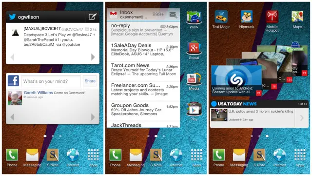
My right pane is where I put miscellaneous widgets. Music, YouTube, USA Today, and — in recent weeks — Google Now all enjoy a home here (though the list is being jumbled around all the time). I might only use up 4×3 of the pane, with the other four spots being reserved for apps I use often, but not often enough that they belong on my main home-screen.
And with that perfect segue, my main home-screen (placed in the middle and set as the default) is the most important of them all. This is where a majority of my time is spent, with a Gmail widget docked off to the side for instant access to my overactive inbox. The Gmail widget is 3×4, giving me a column of four slots off to the right. All of these slots contain folders: Work, Social, Play, and Media.
Work is where I throw the official Phandroid app, Skype, Dropbox, Evernote, Hootsuite, Calendar and more. Social simply groups any social app I have on my phone, even ones I don’t use terribly often. Media consists of YouTube, Google Play Music, Netflix, Hulu Plus and any other multimedia app I might have on my phone. Finally, Play is where I store all my favorite games, including the Google Play app for quick and easy access to one of the biggest app markets out there.
As you can see, I fall into that “in-between” category of home-screen tweakers. I don’t like to do too much, but I do use widgets and folders to my advantage to group everything in a way that makes sense for me, giving me less than three clicks to get to anything that’s important to me. And for someone who switches ROMs as much as me, having such a simple setup allows me to get my setup back without having to spend much more than 5 minutes (unless you add in the time needed to redownload all my apps).
I hate redundancy
Unless you’re talking about backing up files and photos, most folks learn that I absolutely hate redundancy. I look at other peoples’ phones and cringe at the fact that there is a clock widget taking up a 4×2 block when the time is always displayed right there in the status bar. People have their own reasons, of course. Some might have it there as part of a weather widget or a news widget. But I just can’t do it. Why waste space on a clock when I don’t need it?
Likewise, I do not place a shortcut to settings on any of my home-screens because it’s redundant as of Android 4.0. The settings can now be accessed from anywhere within the operating system via the notification pane, so goodbye ugly settings icon!
Staying on the topic of redundancy, I also hate having multiple apps which lead to the same thing. For instance, there is no need for a Phone app and a Contacts app because you can access Contacts via the Phone app. Why not just have a shortcut to Phone, then?
These are the sort of things I think about when setting up my home-screen, and although it may look simple at first, a lot of thought has been put into my particular configuration to fit me. And that’s the best part about having an OS as customizable as Android is — you make it all about you. How about some of my other Android-toting comrades?
Chris’s Home-screen
Kinda weird how, now that I’m showing if off to the world, I’m just now realizing how boring my homescreen setup is. In fact, I’m actually a bit embarrassed. No fancy wallpapers, icons, or widgets, but in my defense, I go through way too many Android devices and it’s become a chore setting up my homescreen from scratch all the time. This is why I just default to the same setup that was on my G1 back in the day. Life of an Android nomad, I guess.
When I unlock my device I try to minimize, first — the amount of screen swipes needed to access my most used applications, and second — the amount of screen taps needed to do the same. I guess it can best be summed up as speed and utility over minimalism and beauty. Not having toggle settings on the HTC One is frustrating (something I hear HTC will be addressing in their Android 4.2.2 update), forcing me to use the stock power widget.
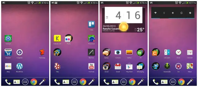
Nova Launcher Prime is my go-to homescreen replacement. There’s a few settings I enjoy like Ice Cream Sandwich transitions, and other little tweaks that always keep me coming back. My default homescreen has a big stock Beautiful Widgets 4×2 weather clock. I enjoy the look because it’s both clean and minimal, and looks like it’d come out of the box with stock Android. Below it are my most used applications, with a few placed inside folders. Nothing special.
Edgar’s Home-screen
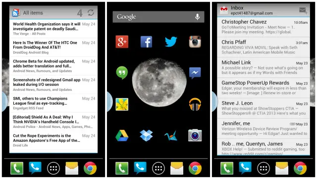
My homescreen setup is purely based on functionality. Not a fan of Samsung’s UI, so I replaced it with NOVA Launcher. The wallpaper is one of my photographs, called “Mother Moon”. I like that it offers a minimalistic, yet beautiful touch to my phone. My most frequently used apps are placed surrounding the moon in the main homescreen, as well as in the dock (you can swipe left and right to access more apps in there). I only use 3 homescreens, so the other two simply have my Gmail and RSS feed. Simple and convenient!
Post your own!
We want to see what your home-screen looks like! Show us your ideal arrangement of icons, widgets, and shortcuts. Show us your super tricked-out image-based icons or your unique wallpaper. And, if you’re so compelled, tell us why you have it setup the way you do. It’s always interesting to see how other people think in regards to setting up their phones so if you have the time to show us a screenshot or two and tell us about it, please don’t hesitate. Get started in the comments section below!




S4
What is that widget? Thanks.
its the zooper widget but pro version probably xD
Wow, now that I look back on it we are some plain old people here at Phandroid ;)
There’s more of us out here than what you might think:
Definitely don’t see the point in having the time displayed more than once on a screen,or the weather for that matter,as I don’t need my phone to tell me what it’s like outside. ;-)
I have a very clean desktop,one page + BLINKFEED,w/folders on the desktop & dock on my HTC ONE,which leaves plenty of room for the occasional widget on the top half of the page & no wallpaper.
I have plenty to look @ while actually using my phone (e-mails/newsfeeds/PHANDROID-ANDROID FORUMS/occasional videos/etc…)
Knowing I’m in the minority here,I prefer a minimal appearance,but,definitely have an appreciation for everyone’s individual tastes/customizations.
I actually enjoy seeing what others can do w/their desktops & perhaps that’s why I choose to keep mine minimalistic.
Couldn’t figure out how to put a picture in comments from the phone app. So here’s this http://db.tt/PgWxmxEx
I really like that which ROM do you use? is there a tutorial on YouTube? I’d like to change my Nav buttons.
“I look at other peoples’ phones and cringe at the fact that there is a clock widget taking up a 4×2 block when the time is always displayed right there in the status bar”
Me too
The only time I can condone it if it has a custom rom that hides the time on the upper right corner AND the time widget is BEAUTIFUL!
My homescreens are also more about function than design, but I do everything I can to make it look better as long as it does not take away from the function.
Hard to read the Notification time when it’s docked on my desk.
Yep, to small when your in a hurry or in the sunlight.
My N4 on paranoid android
using which icons?
That’s just Minimal MIUI theme, it’s on the play store for a $1.30. As for the Skyrim icon, I just found one off google with a null background.
Ahh thanks, yeah I thought it was those ones :)
Good find with the skyrim one!
Now this looks effing good.
Thanks man.
My brand new minimalistic homescreen :)
what icon pack is that, I love the minimalistic ones :)
Here it is :) https://dl.dropboxusercontent.com/u/10678215/Lucid%20Round.rar
Thanks very much :) your own creation?
Atrix 2
check out mine, I have one two…
..minimal N4
Is that a live wallpaper? If so, can you share the link? :D
Not live but here’s the link…http://t.zedge.net/wallpaper/9616456/?page=6#content
Can you please tell me what widget you are using for your clock?
Zooper widget
what icon pack are you using?
http://db.tt/i5zTGwJ7
Galaxy Note 2, Nova Launcher Prime, Floating Notifications (no root needed).
Google Nowish
Should add that this is from a N7
Woah… Where’d you get the cool card widgets??
dude, that wallpaper looks great, can you share with us the link please? :o
GoogleNowWallpaper HD in the Play Store I think.
Got it, thanks dude!
What widgets are those?
What icons??
Galaxy Nexus.
Edit: You’ve edited out “simple.” Good
LG Optimus G
Have u got a link for ur wallpaper?
dat wallpaper looks neat.
Oh my is it the 27th of Mav already!
You know people are gonna ask you for your wallpaper…
So where’d you get it? :)
Can you provide a link for that wallpaper?
black and simple
On my HTC One. I love the minimalist look
Super tacky
Here’s mine
On my Nexus 4:
Essentially out of the box stock main homescreen, but with Nova Launcher and Minimal UI icon pack
all custom uccw
Very nice
That’s very cool looking!
thank you both
Josh Cunha, can you help advise me how to make mine look like that? if so, simple instructions to sean.carey2010@gmail.com would be great!
Very slick. Nice job!
Here’s mine!
Oh wow that’s clean. Mind sharing how you accomplished such bossness? I MUST KNOW O_O
Thanks! The vertical notification widget is courtesy of Missed it! Just configured accordingly. Icons are SmallWhites. Nova Launcher. Just hide dock and notification bar!
like ur homescreen m8! where did u get the ball ground from? any chance you can email it to bcmicros@gmail.com.
many thanks!
Thanks! I found it in the Zedge app. Amazing selection of wallpapers there. Search ‘dark wallpaper’ and it’ll be one of the first couple that come up.
ok m8 many thanks!
If you can’t find it I’ll upload to Box/Dropbox for you.
nice one!
Hi, can u tell me, what a wallpaper with icons it is ?.. where i can download this ? .. thxs
Here you go. Wallpaper:
https://www.box.com/s/cm7k3wkktap3cn8ckdvf
Icons are SmallWhites found in the Play Store.
Forever Alone?
ROFL, it’s funny you say that because I almost included that with my original post! ;)
ROFL, it’s funny you say that because I almost included those very words with my original post! ;)
I like being to see the time at a quick glance so I deal with the redundancy. My Galaxy Nexus
Moto Razr
Folders are amazingly functional
Folders are very handy..
Got to keep it clean.
Can you please tell me what clock widget you are using?
If I had a guess, I’d say Minimalistic Text Widget.
Its jbclock+
I like my homescreen extremely clean! Swipe up for a side bar full of apps, swipe down for Google voice where I do most of my messaging and pull down notification window for time and weather. I would love to get rid of the lower left TSF shell menu button but you can now longer remove it.
Try NOVA Prime… it has swipe actions, and it doesn’t have the icons at the bottom :)
I’m currently using next launcher with the 3d tunnel app as my live wallpaper. I’m about to try the black version now that its on sale.
I agree 3 homescreens is all you need. I use the bottom 4 icons as folders for my stuff. One for phone stuff (phone, text message, contaxts, etc.). the second is for my news and financial links to accounts and shopping (credit union app, phandroid, amazon, usa today, ebay, etc.). The third folder is for my multimedia stuff (youtube, camera, gallery, etc.). Lastly I make a folder for nothing but google apps. I like my homescreen practically naked so I neverbhave more than a widget oe two on each.
and I also agree with the person who says they dont need a clock widget when its always there on your lockscreen or top corner. but that’s just me.
Fire power
I like simplicity, as well as circles :) I use NOVA for swipe actions on most of the icons.
Mine’s a little generic :c Motorola Atrix 2
Something simple…
Ooh what’s that weather thing?
It’s 1weather – With Red accent colour.
GS3
this is how mine looks like! minus the icons in the middle part.. just the widget , wallpaper, and the dock.. LOL
Blazing
here`s my homescreen, i love uccw
HTC DNA. My favorite launcher…ADW ex with ics theme, on top of viperdna rom. Live wallpaper is solar power.
I just checked out the Live Wallpaper. If it plays nicely, I will just have to support this dev. That wallpaper is nice. Right now I have Exodus Pro.
https://play.google.com/store/apps/details?id=com.thormedia.lwp.solar_power_free&feature=search_result#?t=W251bGwsMSwxLDEsImNvbS50aG9ybWVkaWEubHdwLnNvbGFyX3Bvd2VyX2ZyZWUiXQ..
im loving uccw
Please how do I get this??
Uccw pages theme and nova launcher
how do you get this theme or launcher thank you?
can you help advise me how to make mine look like that? if so, simple instructions to sean.carey2010@gmail.com would be great!
G-Nexus….I only use one home screen with Nova Launcher Prime….Back2Black back ground, with Metro Station icon pack…I like to keep it simple.
HTC One, UCCW is the sheeeeet
Looks quite nice, but what does rain lead to?
Leads nowhere touching the app just updates the weather, it’s raining today
okay nice
:O
Saw your comment regarding toggle settings.Have you checked out NOTIFICATION TOGGLE in the GOOGLE PLAY STORE?
https://play.google.com/store/apps/details?id=de.j4velin.notificationToggle&feature=search_result#?t=W251bGwsMSwxLDEsImRlLmo0dmVsaW4ubm90aWZpY2F0aW9uVG9nZ2xlIl0.
Using this w/stock SENSE 5 on the HTC ONE,only occasionally switching back to HOLO LAUNCHER w/one screen & folders.
Or even try Widgetsoid witch offers widgets for homescreens and notification toggles that can be customized to the theme of your phone https://play.google.com/store/apps/details?id=com.jim2&feature=nav_result#?t=W251bGwsMSwxLDMsImNvbS5qaW0yIl0.
how do you get this theme or launcher thank you?
Theme is called uccw pages in play store and I use nova launcher
ok thank you im going to try it
I started making one on my Nexus 7. It’s a LOT of work to do on your own. LoL!!
Me2 watch the YouTube video for installing pages
Uccw theme and it takes you step by step through it
Thanks, but I know about those. I was trying to learn how to use custom images for weather. I wanted lava for Sunshine(or whatever) since that’s what it feels like in Houston. LoL!!
The moment UCCW allows Gifs for images will be the day this app becomes beyond awesome.
When u touch the weather it changes I’m told
But I’ve been in rain for a few days so ill know when it
Stops
Try changing the weather address, temporarily and see if it changes.
Yeah it changed to sunny now
your home screen looks very nice
Can you please give me a detailed steps on how to get it like yours? I tried it but couldn’t get it to be like how you set yours up. My email is princew14@gmail.com. Thanks so much!!!
Not bad!! Even as an apple user I find that
Impressive. Was it hard to do that?
Surprisingly no, YouTube video tutorial was great, 6 screens, done in bout 20 mins
Galaxy nexus
I keep it clean, Google Now, Chrome Rings and my most used apps
oh and I HATE touchdown, but corporate IT has blocked the default mail client…
hi.. what is the time/weather widget on this one? please tell.. thank you
got it from google.. it’s rings digital weather clock.. not chrome rings, that’s why it wouldn’t show up in the play store..
That is OneMoreClock btw…
Zooper + ADW
Galaxy Nexus
I call this my 8 bit fix
I feel bad for the poor son of a gun that apparently needs to down vote everyone to compensate for his “parts”. This is Android, and there is no “wrong way” to have your phone set up.
I think I saw that pattern here, somebody is killing time ..
This is my custom UCCW F-16 Fighting Falcon Theme
Smart launcher nuff said
Awesome wallpaper! Can we get a link to that? :)
Its from zedge
This is a great article actually… I’m with Quentyn, I mix it up with widgets and folders, no more than 3-4 home screens
This is my Custom UCCW F-16 Fighting Falcon Theme. All the buttons are interactive
Willing to share?
Sure. I can send you the custom wallpaper. The rest are UCCW widgets, eye in sky widget. Blaque icon pack and used desktop visulizeR
you guys have awesome home screens
I still haven’t figured out how to use UCCW yet, but this is one of the most innovative homescreens I’ve seen! That’s absolutely brilliant.
Thanks ac!
I’m going to have to sit down one weekend and really figure out UCCW. Although I probably won’t go into as much detail as you’ve done for your homescreen, I’d love to get mine customized to where nobody except me knows how to get to anything on my phone…LOL…while also keeping the theme the same throughout the homescreens. Did you do that all with UCCW? Do you mind sharing the other customizing apps that you used to create this, if any others?
Most of it was UCCW, Desktop VisulizeR and customer Control buttons in Photoshop resized to fit the layout
Im sorry im sorry. Im a newbie but how the hell do I post a picture? ; (
what i did was email myself my screen shot, then downloaded it to my computer and uploaded from my pics
Ok thanx I was trying to do it on my phone :)
DBZ fan, what can i say
That wallpaper, though!! (‘o’)/
i hope thats a good thing
Yea, it is. I’m surprised how good it looks. I saw your other comment saying it’s a live wallpaper. Ima go look it up.
That is so freaking awesome
its called Energy Ball live wallpaper, check it out there are a few like this by the same guy
thanks bro, its freakin awesome!
duuudeee share the wallpaper??
its called Energy Ball live wallpaper, check it out there are a few like this by the same guy
Amazing!! It’s a Live Wallpaper!? Oh let me go find it.
My nexus 10 setup
I use action launcher and just 3 screens.
where did you get this wallpaper?? looks neat!!
Search for google now wallpaper hd at the play store :)
What pedometer app/widget is that?
That’s Noom… I’m trying to get rid of my love handles…
Here’s mine
what icon are these ? i must have them. thanks
Yea those are some of the nicest icons I have seen.
I like to stick to one screen. Using Action Launcher Pro. 8-bit style!
Next Launcher
Some great home screens posted!
Nothing special.. gnex running PA rom.
Extreme Minimalism – Swipe Up to Phone —– Swipe Down for Notification —– Double Swipe Down for Drawer —– Double Swipe up for Poweramp.
“Everything should be made as simple as possible, but not simpler.” – Einstein.
I think a lot of you need to reexamine the word minimal/clean. Some of them are way too busy to be called one. Especially Quentyns lol They’re still nice!
Very simple :)
Using Holo Launcher
heres mine and my baby
I like to keep it clean! :)
HTC Evo 4G LTE, with a fun little wallpaper… :P
Nova Launcher and Minimal UI Theme on HiSense Sero Pro.
Mostly square everything
what icon pack?
Mines a lot like yours Chris, I like to keep a minimalist a feel for my android tablet (that might be because I came from iOS).
HTC OneX+ w/ Nova Launcher, Beautiful Widgets & Player Pro
Super simple on my s4
stock/10
I like to have it colorful. Oppo find 5.
Colorful. What do you think?
Quite simple. Only use a few apps on my Gnex. Use swipe gestures on Nova Prime to get to the rest.
Here is mine :)
Everything in folders.
I’m using the best icon app available – DCIconz and DCWallpapers.
Nothing extravagant,just in the right order :)
Here’s Mine. HTC One S.
I like the minimalistic look:
classy!
wow this is awesome. what did you use for this?
I used Zooper Widget Pro. I think it’s better than UCCW.
After seeing all these posts I feel like I’m not utilizing my phone’s full potential.
Gnex running paranoid android, Nova launcher prime, and circle launcher
Here is mine…
I love widgets. Rooted S3
This was the most recent screenshot from my galaxy nexus… But as you might notice it’s a couple of months old. Haven’t quite decided on a home screen for my new phone yet…. but I will probably stick with blue :-)
Galaxy S4, well after seeing some of those mine is pretty simple but works well. I couldn’t find a clock widget that would take up the whole top without a date. :-/ Also the clock widget used to open up the alarm/timer app. I miss that too.
The cool thing about this article is I discovered UCCW! Thanks!
Galaxy S III
here’s my Galaxy Note II
Here’s my Galaxy Note II.
my Galaxy Note II based on one theme from mycolorscreen.
how do you arrange the icons like that?
get nova launcher/ nova prime.
under nova settings go to desktop > change desktop grid to 12×7
and then desktop > uncheck label icons.
How did u make the sections like connect and play and utilities with the long line after the words? Was it from my color screen? If so could u please send the link your home screens are awesome
the words are minimalistic text. here’s the original version. http://mycolorscreen.com/2013/01/20/holo-cards-by-thand/
I’ve been trying to figure out how to get the solid line above each group of apps. I’m using minimalistic text but I keep getting a dashed line. . And how’d you get the line underneath so close to the words?
watch the tutorial: http://www.youtube.com/watch?feature=player_embedded&v=Tase7wn6ibo
i just modified mine from there. that’s supposed to be an underline on the same line. just insert space to extend the line.
And what clock widget is that if u don’t mind me asking.
it’s the aosp clock or you could download Clock JB+ from play
My current home page. http://mycolorscreen.com/jason_is_addicted/
your link doesn’t work.
very nice!
Galaxy Nexus i9250. I prefer to keep mine simple. Main screen has everything I use on a daily basis. Couple side screens for some often used widgets.
Nexus 4!
I have a black HTC One.
what widget is that googlenowish one?
It looks like it is Google Now itself. Google Now has a widget.
My Nexus 4.
Feel free to delete this double up.
My N4.
Something retarded is going on my with my Disqus.
what are you using for this?
Nova Launcher Prime, UCCW for the clock, wallpaper is available if you want, and the icons I have on file are called retro badges.
very nice, I really like that clock.
Here it is mate. https://play.google.com/store/apps/details?id=fr.pooley.elegante&hl=en
thank you very much!
All good brother.
This was my simple old setup
Nova Launcher, Zooper Widget, Beautiful Widget. The dock bar is scrollable to either side which holds my folders. Up on the screen gives me Google Now voice search, flicking up on the app menu icon gives me Google Now cards.
I really liked that wallpaper, can you provide a link?
Credit goes to Simon Page. He makes some great wallpapers!
http://simoncpage.co.uk/blog/2012/03/ipad-hd-retina-wallpaper/
Not sure what happened to my link. But the Artist name is Simon Page.
http://simoncpage.co.uk/blog/2012/03/ipad-hd-retina-wallpaper/
Thanks so much, i found one of his wallpapers earlier this month but never knew who created it.
I like my home screen simple and symmetric and I like to be able to see the subject of my background photo. I only use 3 screens.
NMBC for me!
From left to right: Google Now stretched to 4×4. Tumblr post widget 4×1, G+ widget 4×2, shopping folder, reddit and feedly. Clock/weather widget 4×2, games folder, quick access folder, navigation and other car related apps folder, Seesmic posting shortcut and social networks. Google Drive and Keep, startbucks card widget 4×1, Spotify widget 4×1, google music widget 4×1. Finally a 4×4 calendar widget…which I probably should have blurred lol
Note 2
Pretty simple
what icon pack are you using?
Flik icons you can get them online just google search… I lost them when I re flashed sorry
Apex Launcher
Start button is app drawer. And that computer icon is (https://play.google.com/store/apps/details?id=com.pcvirt.Computer&feature=nav_result#?t=W251bGwsMSwxLDMsImNvbS5wY3ZpcnQuQ29tcHV0ZXIiXQ..) LoL!! Just in case someone actually clicked it. =.P
Recycle Bin opens Nova Launcher with the same layout except the Recycle Bin icon is empty. =.P
I couldn’t find the icons in the market, so I just extracted them from Windows 7.
I’m using Android, but Windows 7 was my idea.
Splay launcher. Be really cool if it was a little more customizable. It is beta version.
This is Mine, Galaxy Nexus with nova on top
Good work, you didn’t let it upload.
What you talking about? I see it loaded here…
My bad haha, didn’t come up for me.
Nexus 4. Wallpaper changed daily, icon theme changed weekly. Nova Launcher with one folder that uses a transparent icon to make it hidden. Home screen is for icons I use a lot, with the folder for slightly less used but need in a hurry icons. Hidden task bar (thanks, Nova!). Don’t like a lot of clutter on my screens.
And yes, that’s a 4×2 clock, but it’s also a calendar, weather, and battery update.
My LG Venice
Main screen. Nova Launcher with LiquidSmooth as the wallpaper as well as the ROM, which explains the center clock mod and the battery bar. Google now widget with uccw installed and using the playbar skin on the play store. Rounded edges on the screen come from the free app called Roundr. Weather comes from AccuWeather + in the status bar. I’m feeling the setup :)
you guys are really creative.. i used to do this too,i did my own winphone 7 theme before on my vibrant.. LOL
cool
This is mine
Lots of cool ones! My personal preference is not towards widgets and holo icons. I swap all of my icons out using Desktop Visualizer. HTC Rezound.
Details here: http://supranodip.deviantart.com/art/Royal-374245837
A little aospish
A little aospish.
Mine; simple, functional. (VzW SGS3). Running slim bean.
Galaxy S4
Carpocalypse now !!
I noticed my home screen was blank, then I thought to myself: “I might as well have an iPhone.”
Then I looked at my gorgeous 5″ Super Amoled HD display and realized how stupid I sounded.
Fell in love with this setup on my first Android 2 1/2 years ago. Nowadays the dock icons are folders with every app I use on any sort of regular basis. I use swipe up for app drawer, as the drawer button has always driven me batty. All set up for speed. I run one other home screen to the left with two widgets for on the fly access to important tasks. Sprint Galaxy SIII on MOAR Rom w/ Wasabi83 Black Magnum theme. BigDX Serenity Red Multi Launcher Icons. Fancy Widgets Pro. Nova Prime. I own a bunch of launchers and I find myself liking Nova.
My screen. Only one, with all my main apps and functions in one convenient layout. I’ve used Apex Launcher together with Photoshop for my homebrewn wallpaper/button design.
Really like this, nice work!!
What clock widget are you using? It’s really clean and I like it! thx
Thx for the nice comments. I use ‘Fancy widgets’, a 2×1 clock without bakground and a 1×1 weather widget, again without bg.
That is class!
Can you share wallpaper/button design?
Currently have an S4, and just love the phone and touchwiz.
Nexus4 Nova Launcher, PA rom
using nova launcher
I’m just using the stock Motorola launcher/skin, but I’ve found I really like it. But I’ve left out any shots of that part of the skin since it’s pretty standard if you’ve even seen a late Motorola phone. I like the circles widget and I like having a calendar widget to show upcoming events on my main home screen (far left) and then I divide up everything else into work and play.
Work (2nd from left) shows tools, productivity, stuff I use alot. And I like having the dictionary.com widget there as well. Sometimes this is a bleed over from my main homescreen or vice versa. Play (middle) is all the fun stuff, games, reading, music, all the stuff that wastes my time. I placed this one the furthest from my main homescreen mainly so that I might actually get something important done for once. The SoundHound widget is great and I like having it on hand for those moments when I need to ID a song real quick. I know Google does this too, but I like SoundHound and I can get lyrics, etc., all in one spot. I have three game folders because Motorola (Google?) made it so I cold only hold so many apps in one folder. I used to have one unified game fold on my previous phones, but I was using a different launcher. But that’s something I’ve learned to live with even though it initially drove me batty.
Lastly, I included a screenshot to show my dock (2nd from right), and my notification shade (far right). I found that I needed more room on my dock and started moving things around, but ultimately decided to just put it all in folders. So I put all my phone/messaging-centric apps in one folder for quick access. And did the same with all the browsers I use. So far I’m enjoying that set up. I like having a good wallpaper to show off the transparent menu and notification bars and currently that’s the TARDIS in space. Yep, Doctor Who fan here! I included the shade because Motorola didn’t include settings in the notification shade like some other OEM skins do but someone told me about Settings Extended (available in the Play store) that lets you put a customizable bar in the shade.
I used to have 7 homescreens back when I had the Droid Incredible, but over time I’ve found I really only need three to be happy, and the other homescreens were rarely used anyway and generally ended up being whole screen widgets that just took up space and didn’t show me enough information. Usually I just ended up launching the app anyway to get what I wanted.
I have 5 home screens, this is number 3 or the centre one. To the left on screen number 2 is my Gmail widget, on sceen number 1 is Google Keep and office apps.
To the right on number 4 is Google Calendar and on number 5 is Task widget and Google Now widget.
But form my centre screen I can access what I need. AntTek Quick Setting allows me to pull down what I call “immediate” apps, like barcode scanner, soundhound, google googles and the like, apps that need to be there right away, this includes quick settings. I have replaced Android 4.2.2’s default Quick Bar, since it is not all that advanced.
I run CyanogenMod 10.1RC2 with Apex Launcher on my HTC One X with HD Widgets being at the heart of it all, with the always present weather/clock widget.
you should try BuzzLauncher, it’s like UCCW + MyColorScreen integrated into a Launcher…
Action Launcher and only 1 home screen. The blinds feature has resulted in just 1 desktop widget in use so I decided it was time to throw on a good wallpaper.
c’est mois
what is the wallpaper?
I made it Ron :) here it is if you fancy it, it’s scaled for my nexus 1, it also tiles horizontally, which is good for launchers that let you loop wallaper and desktops. Let me know if you’d like it at another resolution.
What is the weather widget you’re using?
“aix weather widget” it shows relative humidity and everything :)
Lightning Launcher and UCCW for vertical scrolling homescreen on a 20pixel spaced grid. Other elements are Eye in Sky weather, Wizz Twitter, Simple Calendar, Simple RSS, Now Playing.
One nice feature in Nova Prime is the ability to overlap widgets. I find the Live weather background to be both useful and beautiful (except when it shows brown skies like this morning). Granted, the icons are ugly — I change them up on a regular basis.
htc desire hd, rooted, 4.2.2 CM-RC1
Stock HTC One X with Nova Launcher
Quentyn you on to jackthreads too…. you should try out plndr.com also big homie. :-)
All on one page. Not pretty but efficient!
Yup just keep it Neat and basic… As the name infers, it appears that this kind of setup appears to be it’s all about clean lines, a moderate look and a straightforward home screen that is intended to emerge in a swarm with it image based advance. There’s simply enough informative content on-screen that you need on a consistent foundation and symbols to the three essential applications on your phone. Everything else is concealed away either on an additional screen or in the application drawer for when you require it. Great job! Two thumbs up!
TheLegacyDrawer.com
Nova Launcher with and extremely simple setup. No widgets for security reasons. I dont want ppl looking at the information within the widgets, even if it’s a lil info. Scrollable icons at the bottom. Using Live wallpaper.
Mine looks pretty similar to Quentin’s.
basic and stockish but i like it and it works for me
I like it simple and dark for looks and to save battery
What widgets do you use there?
Sorry it took so long to reply. The weather stuff is beautiful widgets and the other is simple calendar.
Going minimal for now.
Very nice. What are those icons?
Thanks. Holler! wht Icon Pack
Black background to reduce battery. All apps in groups. Nothing in other screens.
yawwwwn… boring
I know not very exciting but I get great battery life. I’ve found widgets and background elements do have an impact on performance and longevity. I’ve used this setup on every nexus device and seems to work for me. I use allot of apps and I lose track of them if I don’t put them in this order. Definitely functional.
You should try the Everything Me launcher. Your set up looks strikingly similar to that. The background will change according to what you type in the search bar above.
Looking at it now. Looks kinda cool! will check it out. Thanks!
A simple hodgepodge
GS3 w/buzz launcher, recently switched from Holo – both great! This homepack, as they’re called, was originally made by another user but modified by me (changed the fonts, widgets, wallpaper, etc)
Sprint samsung galaxy s III running jellybombed rom
Just a few things to point out. I have hidden both the notification bar and the dock bar. This is a custom ROM (Jedi XP14) on a Galaxy Note 2. The text labels are all folders or workable tabs. It was design with keeping the device manageable in one hand. This is why it has the LMT Pie controls built in. The Troll Face covers up my Quick contacts picture.
JEdi XP 14
LMT Pie Controls
UCCW Widgets (Custom)
Widgetsoid
Holo Launcher Plus
Team Blackout (for the custom gVoice and the see through reader widget)
Metro Station Icons
Custom Nexus Icon and Google Swirl.
If you have any questions I am more than happy to help.
Verizon Gnex, Paranoid android rom, Nova Launcher :)
Keeping it simple. HD Widgets and stock Touchwiz launcher. Background is from Backgrounds HD. 3 most used apps are on the (one) home screen and the app drawer is organized with most used apps on page one, Google apps on page two, and other junk on page three.
Shiny ROM with WillyJay All-in-one mod, and ICS Blue neXus softkey theme
DCIkonZ
Nova Launcher Prime
HD Widgets with Colourform
Pixel Fleet Live Wallpaper
Weather Bug Elite
Battery Widget
It was over a year before I tried flashing a ROM, and even now it’s a mostly stock one, but I love the extra mods for it. This is just my main home screen, I have 5 total, but one is blank for when I just want to watch my live wallpaper.
Here is mine. Everything I need in one screen with the help of Glovebox and Swapps
What icon pack, clock widget, and weather widget do you use?
Everything you need is right here http://mycolorscreen.com/2013/05/09/liquid/ let me know if you have any questions.
Thanks!
Whoa, that’s slick looking.
Thanks man. I am really linking this one…
Note 2 origami live Wallpaper
Minimalism at its finest
Not sure which I like better
http://db.tt/BTVDb23L
http://db.tt/sftLzeE3
http://db.tt/Sonf9q5p
Minimalistic Text – bar code font now support by the widget. yes i got addicted! even used it for the battery, however, the blue triangle shape pops up only during a charge.
Pure Calendar widget (agenda)
Simple Text-Text Icon Creator
oh and and and I have my power controls right there in invisible mode, well not totally invisible since you can see the faded volume toggle icon right in line with the battery charge icon of the widget, but the rest are totally invisible, I have 6 set there in line. It bothered me for ages since those random brightness wifi etc toggles made the whole setup out of place, so this worked out perfectly for me.
The dock was made with an old dock I found ages ago, had to tweak it little more than “just little”, embedded it into the wallpaper since Nova launcher did not support dock backgrounds.
You all have some great looking themes. Mine is pretty simple but it works for me.
You all have some sweet home screens. Mine is simple but it works great.
Simple. Nexus 4 running Paranoid Android 3.15
Simple N4 running Paranoid Android 3.15