With leaked Sense 5 ROMs for devices like the DROID DNA surfacing it was only a matter of time before a flood of HTC Sense 5 information started cropping up. Another few screenshots of the user interface has been posted to XDA, giving us a look at a few new things such as the call dialog, and what appears to either be an apps tray or a home screen.
These screenshots show more of the new look and feel throughout Sense. It’s a lot more clean than Sense 4, which was infinitely more clean than 2011’s Sense 3. HTC has a slight tendency to overdo it with gradients, but it looks like the company went with a more simple and refined look for its latest software overlay. The call dialog screen is a lot less cluttered than it used to be. We imagine a majority of in-call options are stuffed into the menu overlay button you see on the bottom right.
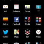
Another icon-filled screenshot looks like it could be a home screen or the apps tray. It’s a bit odd as you might only expect the clock widget on the home-screen, yet there seems to be more than 4 rows available. It’s possible HTC’s launcher has been updated for larger, higher resolution displays in order to fit that much onto one home screen. The other possibility is that this is the apps tray, though with folders and a widget there’s a lot of doubt to be had in that thought.
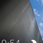
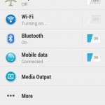
The other screenshots in this latest batch don’t show anything we haven’t seen before, but it’s nice to get another look at the settings menu and lock screen regardless. Check all of them out above and below, and be sure to stay tuned as we anticipate seeing a lot more between now and late February when the first Sense 5 device — the HTC M7 — is expected to be revealed.
[via XDA, thanks to everyone who sent this in!]







I want HTC to make another Nexus device, Although I do like these sense 5 scenes too.
another one?
Nexus One
It looks….. glorious. Gone is the 3D CGI rendered style in favor of something a lot more flat and minimal, but still kinda 3D. Love where HTC is taking Sense. Now, let’s just hope it’s finally as fast as TouchWiz or LG’s UI.
I’m curious to see if they changed the multitasking UI at all and I wanna see the other integrated Sense themes :)
din’t sense gain a huge speed boost with their last update ? I think it was like 4.0-4.5
IDK, then what’s the point of Sense, if it’s not 3D..ish. Might as well go CyanogenMod or just stock.
the point is Cyan and stock aren’t HTC. If you’ve owned an android device for more than 1 minute you’d know each dev has their own skin. It’s part of their identity for their devices. Pretty simple.
Yeah, I get that. I was just thinking that this looks, to me anyway, to be so minimal, like CM or any other theme. I actually liked the HTC sense of the EVO days. :) Don’t shoot me. ;)
for people who dont root?
True. See above. I should have elaborated. ;)
I miss the scrolling wallpaper feature on Sense 4 though… it looked very good and it made Sense stand out among the crowd… Many third party launchers copied this feature just so users can have it on their non-HTC phone… Also, this goes for their widgets from Sense 4+. I hope they have the option to keep the old widgets and the option to disable/enable scrolling wallpaper.
Other than that, Sense 5 is gonna be hawt.
Edit: After some thought… I actually like the new clock/weather widget… Looks appealing to the eye, just like their previous clock/weather widgets.
Yeah I enjoy the scrolling wallpaper on 4.2 on my Nexus 4. Everyone should have it.
they took a wonderfully functional multitasking system and made it almost unusable. samsung is the worst when it comes to vomiting their UI all over android, but at least they didnt make multitasking retarded.
It does look cleaner… But if its not +5inches then I don’t want it…
That’s what she said
Perfect timing sir
Knda ugly if you ask me, I like that wallpaper tho!
I got mixed feelings for Sense 5, that is, if this is Sense 5…
I actually love HTC’s widgets in Sense 4+… It looked modern, somewhat minimalistic compared to previous Sense versions, and it was very functional, and it was the envy of many people (and had to settle with Third Party widgets that tried to mimic Sense widgets). I believe these new widgets will be just as functional, but I think they are too minimal… They could have just upgraded the widgets from 4+ and make it a little more minimal and cleaned up and have it look similar to 4+…
But I like what HTC has done overall to the UI… A lot more cleaned up, icons looks good, and the new lock screen looks very good and finally gets rid of that weird orb that was there since Gingerbread.
Kudos to HTC for continuing to make their phones and UI lookin’ sexy, and I can’t wait ’til I get this baby on my Evo LTE!
based on these screens i still prefer sense 4.x
This version of Sense is actually tolerable. It’s not great or desirable by any means, but it’s tolerable nonetheless.
they should change the notification bar icons ,they are ugly
Still a little ugly… especially the icons.
fugly
well the earilier screen shots looked ok, but these look much more refined and I am liking what I see here. Looks like HTC is going minimal at most and finally I see the task bar icons are finally touched up a little and look smaller and refined.
This new sense is looking a lot like miui!!
Looks like something from a 3rd party launcher..
New sense is UGLY. I hope it is fake.