We’re all wondering what HTC is looking to bring to Barcelona in order to help turn recent financial woes around in 2013. The OEM’s latest flagship — what we know to be the HTC M7 — is said to be the first flagship device for the new year, but until now we haven’t had much of an idea of what to expect from it other than the obvious belief that it’ll be a high-end smartphone with an updated version of HTC Sense. Well, it looks like we could have ourselves the first early and clear look at the device from a couple of different angles.
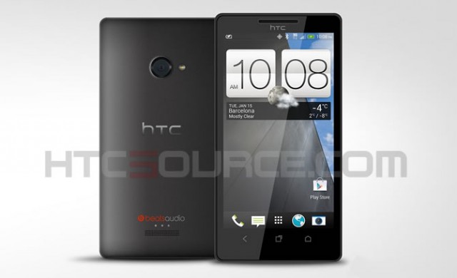
On one hand is a render, the one you see just above, procured by HTCSource. Skepticism regarding its legitimacy whisked across our plate at first, but it’s worth talking about anyway. This render suggests the phone borrows a lot of design elements from HTC’s Windows Phone 8 flagship, the HTC 8X. They look so similar, in fact, that some have suggested that the Sense-based home-screen and standard set of Android buttons for Home, Back and Recent Apps were photoshopped onto an 8X.
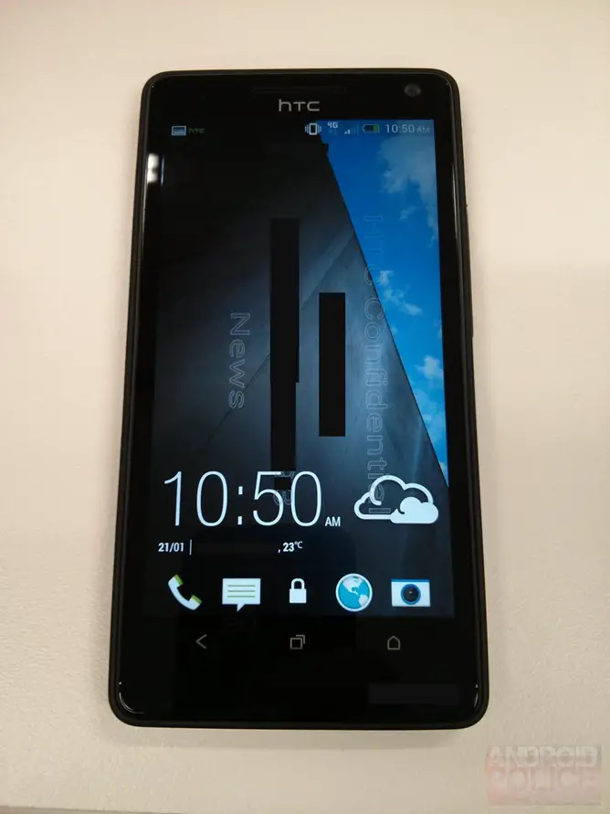
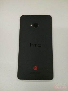
The folks at Android Police threw a small wrench into the fold, however, as it also seems to have procured some solid evidence of its own. This leak actually produced in-the-wild shots of the M7, and a few things seem to match up. For starters, the new configuration of buttons — where the Home button now flanks the right side of Back and Recent Apps — is the same. The backplate design is also very similar in look and feel, though it seems the Beats logo is a bit different and the camera flash moves to the left side.
We suspect the discrepancy could be due to the fact that either the render is an earlier design or the phone shown above is an early prototype. The possibility of HTC coming to Mobile World Congress with more than one variant also exists, though we doubt the changes made between different variants would be this subtle. The truth of the matter is that we won’t really know for sure until HTC announces the phone itself, so we’ll have to wait until Mobile World Congress for that road show.
The other side of the equation involves HTC Sense, and it looks to match up with what we’ve seen from previous leaks. Something new we haven’t seen is the clock/weather widget and a few starter widgets designed to help people get started with their phones. The new clock widget employs a much more clean and modern design than the popular style HTC has used since Sense on Windows Mobile.
Other than that, we can see that the default dock icons are identical between both of today’s leaks and leaks in the past, so there’s little doubt that this is what to expect from HTC’s latest software. We could bicker about what’s real or not all day, but I’d have a hard time imagining the M7’s design would be a far cry from what we’re seeing here. It’s a safe bet, but we’re not in Vegas — we’ll look to late February to get the official word straight from HTC.
PS: there’s also the little guy below that we were slipped, but we have a feeling this particular image isn’t what we’re expecting to see at Mobile World Congress.






Not sure how I feel about the look of Sense 5…If this is real, I much prefer Sense 4’s icons/widgets…
What you need is a Windows Phone. :)
I hope you are joking lol…The reason I’m not digging Sense 5 is because it’s kinda looks more like Windows 8 UI…
My co-worker has the HTC 8X. Really unimpressed with Windows 8 Phones. No google apps, far worse selection of apps in general, little to no customization options (example: no launchers), and the screen is too small.
I also need G-Mail push for work which I can no longer get if I use Windows phones…
well u do have a point there…. but windows 8 icons are sick! has this virtual cartoonish look feel
ur crazy the only good thing about the new sense besides Widgets is the new look! I much prefer pure vanilla or touchwiz my self
Like I said, I’m not a fan of the way Sense 5 looks. Def not a fan of Win 8 phone UI (and I have Windows 8 on my PC).
I simply don’t like the live tiles for a phone UI, I prefer Android style widgets and app icons, but that’s my preference and certainly just my personal opinion. Nothing crazy about feeling this way. And since I sit/work directly next to a guy who has the 8X, I have borrowed his phone multiple times to try it out. Just not a fan. I also find that contrary to what websites say about the smoothness of Win 8, I find it lags more than I expected it to. Side by side with my Jelly Bean HTC One X, Jelly Bean UI seems alot smoother to me than Win 8 phone. (Then again it could just be the 8X, I haven’t tried any other Win 8 phone)
Also I dislike TouchWiz. Really don’t understand why Samsung doesn’t support simple stock features such as dragging app icons into other icons to create a folder…
I prefer Sense 4+. Alot more customization with Skins and social widget integration that TouchWiz doesn’t have.
With that said, my favorite is still the stock google nexus launcher…
I think HTC is really using a spice touch of windows here for sense 5
Nothing too exciting… More of the same…
I wonder what effect a sealed battery has on resale value? Hmm?
Beautiful as usual, but unacceptable without microSD & replaceable battery. Sorry HTC, you lose my support again.
i think design wise even if htc stuck with what they had with one series, they would be okay provided that they simply beef up the internal hardware and promise better software support. really don’t need to waste resources revising the look and just focus on giving their customers phone with solid hardware and software!
not use to htc sense anymore but this looks sick!
White one looks nice. Hopefully they learn from last year’s mistake and always have a removable battery and SD slot.
I doubt it.
still using a green battery meter….