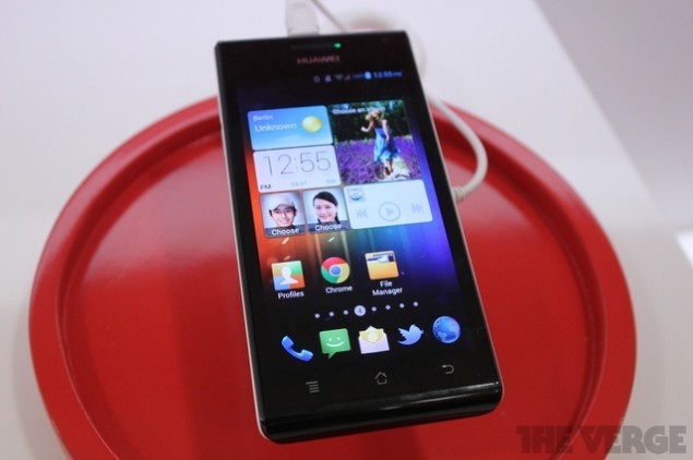
The unfortunate truth is that manufacturer skins are here to stay. If the beauty of ICS or Jelly Bean couldn’t put an end to them, nothing will. While I don’t mind certain aspects of some of the skins, some additions seems just pointless. Take, for example, the latest iteration of Emotion UI from Huawei, which has decided to get rid of the app drawer completely.
Apps are added to the home screens itself, from where they can be deleted or moved around. Widgets are added in the pre-ICS way of long-pressing an empty area on one of the home screens and selecting from a list. A lot of stuff that Huawei has done with their skin points to an aim to make the handset as easy to use as possible to a first-time Android user. But does removing the app drawer really make it any easier to a user? I’d say it doesn’t, and in my opinion it makes it worse.
Once you install a ton of apps, it can be easy to forget which home screen you pinned it to. At those moments, its just so much easier to just open up the drawer and scroll through an alphabetically sorted list. Personally, I’m against paginations in the drawer too as it just slows me down way too much, and I still use the vertical scroll option in Apex on my phone. But hey, I’ve got no design degree so I could be wrong.
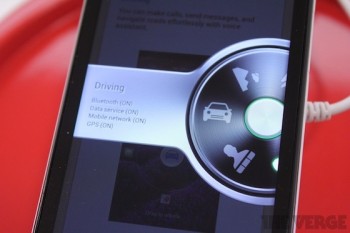
Personally, I’ve got no beef against skins unless they (a) significantly slow down updates or (b) significantly alter the vanilla Android experience. Huawei falls into the later in this category, unfortunately, though I must admit I’m glad that they’ve included a “profiles” feature which allows you to change a bunch of settings together based on, well, profiles such as driving or outdoors. As the writer of the source article on The Verge mentions, profiles were popular on feature phones but never really took off on smartphones.
I’ve never understood why, especially considering the popularity of apps such as Tasker and Llama. While The Verge mentions that currently they tested Emotions UI without automatic profiles, it seems like it would be added by the time of production. Hopefully it’s done as well as Llama, which I’ve highlighted in the Uniquely Android series.






its things like this that make me enjoy the launcher replacement feature even more…
Does someone working over there have a brother in law working for Huawei or something?
lame, hope this catches on like square wheels
It is not ICS or JB that is at fault but Google. They need to lay down the law about these skins or they never will disappear. The end user doesn’t care 90% of the time
I don’t think that Google could do anything about it, because android is open source software. That means that manufacturers have all the right they want to do that. But, it would be nice to be able to disable the manufacturer skins and just use stock.
Just because it is open source doesn’t mean they have to let anyone who messes it up to still call it Android.
If it is based on Android, it is still Android. No matter how messed up it may be. That is just part of the package I guess, no matter how much we don’t want it to be.
But if they can’t call it Android, they’ll be less likely to mess it up since who wants a phone with HuaweiOS?
I completely see what you are saying. With these crappy skins and stupid modifications, it gives the Android experience a bad name.
At least they seem to have worked with the fundamental design aestheic of Holo, similar to how recent MotoBlur does and how Samsung (notoriously) and LG break shamelessly.
Just get a launcher..
I like my apps organized by alpha. And what about when the phone 1st loads and it’s preparing the apps? Yea… I don’t think so. I don’t see how throwing your apps on the home screen in random orders is going to make it easy.
Fail
so take out the app drawer then everything is a cluttered mess on the home screen Im sorry but that would feel too much like an iphone
To me it looks strangely like MIUI… The question is… Will it run as smoothly?
MIUI has no app drawer either and I actually quite liked that after getting used to it.