

Okay, throughout this entire legal quarrel between Apple and Samsung, I’ve done my best to remain impartial. But after Apple’s latest evidence presented to the court, I’m sure even the biggest die-hard Android fanboy will side with Apple on this one.
Apple is sticking to their guns when it comes to the argument that Samsung “copied” the iPhone when they released the Galaxy S (and subsequent devices), and while I admit, I saw some definite similarities in hardware design, I found Apple and their attempts to patent the rectangle absurd. Today, Apple moved onto software, showing the court how similar Samsung’s TouchWiz icons were in comparison to their “world famous” iOS icons and really, it’s pretty hard to dispute.
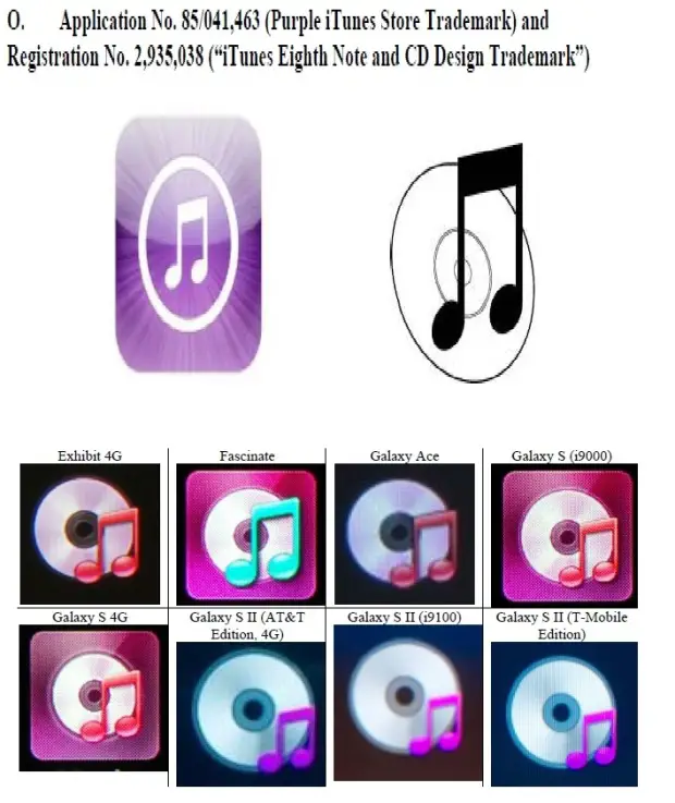

As someone who’s always loved the stock Android experience — including UI — it was always tough for me to adapt to Samsung devices and (even in my eyes) their attempts at imitating iOS with TouchWiz UI. For comparison, here’s a few of Google’s stock Gingerbread and HTC’s Sense UI icons:

![]()
Sorry, Samsung. You’re on your own with this one!
[Cnet]


So…. I hear NASA landed a rover on Mars.
they landed what on me >.>
what the **, land rover on Marsg,,, that would be ugly scene,lol
i would be dead on impact that thing weighs like 1600-1900 kg
actually, it weighs only 900kg, but it’ll still kill you :D
if i was on the moon i could bench press it lol
only 900kg, only is the key word here.
Yes the Pathfinder landed on Mars 1997. And now everyone goes apeshit about curiosity.
awww great, the iphans will be all over this…….. stupid samsung and their crappy touchwiz………
Lol… Never noticed but wow.
Oh damn Chris it’s like that? I guess when the going gets tough run………:p
*slips out back exit*
Yes, I see similarities. I am sure intentional, too. But they are not exact. Except for the phone, I can’t see any real violation.
Yeah that was really dumb of them… Like i said in prior post i never liked the original galaxy s because it reminded me too much of the iPhone in appearance; those ugly icons especially. For the sake of consumers everywhere i really hope that they don’t lose this case, however maybe this case will force them to embrace stock android more.
I agree that they look similar but are they so similar that someone might confuse a Galaxy s for an Iphone 3gs, that’s what apple is trying to prove and they are asking for 2.5 bill in damages of sales because of people buying the galaxy s thinking its a iphone, i posted a pic of the two below, anyone can find similarities in just about everything they found 6 of them but what about the rest of the apps on the galaxy s for instance the SMS app or the browser or even the email. which are also shown in the picture and they look nothing alike between the two.
Yeah these law suits that apple are carrying out seem to be less about protecting IP and more about using the courts as a tool to damage the competition. This is all too apparent seeing as how many of the patents apple is suing over (besides the fact that many should never have been granted in the first place) seem to be common place in smart phones, both past and present; so why is android ie Samsung singled out. Although i do believe apple is being anti competitive there is no denying (in my mind) that Samsung took some ques from Apple, however, they are so far evolved from one another that the idea of a law suit is plain childish; in my opinion the folks over at apple are scared.
No one is denying that Samsung was influenced by the iPhone’s design even during the trial Samsung admitted to it but there is a fine line between influence and blatantly ripping off another product. So far in court apple has shown pictures that favor them and leave out images out of their charts that don’t, like why when showing the before and after pictures they purposely left out phones that are aesthetically similar to the iPhone, phones that Samsung had designed before 2007, or why when they showed these icons they left out all 30 of the pre installed icons, if only 25% of the icons on the Galaxy S look similar to the iPhone than its hardly solid evidence, even in my composition class the teacher accepts any paper with 70% or more originality because there’s a high chance someone somewhere had written something first but it doesn’t mean i copied the person it only means we had a similar thought or influence. Apple has attacked HTC and Motorola as well but I believe that they made Samsung a priority because of the fact that Samsung is now outselling them and gaining a lot of ground. At first Apple dint even care about Android even though Android has been selling since 2007, so why in 2010-2011 they all of a sudden started caring and claiming theft ? because Android became more popular and outranked them. And for further evidence that Apple is singling out successful Android manufacturers, i posted a pic of the LG OPTIMUS ELITE VM696,
not only does this phone look a lot more like the iphone 3gs then the Galaxy S but it also has nearly the same dimensions (height -width) as the iPhone and the same screen size. All its missing is a home button at the bottom.
Except for the Phone icon, I don’t see anything else being “copied”
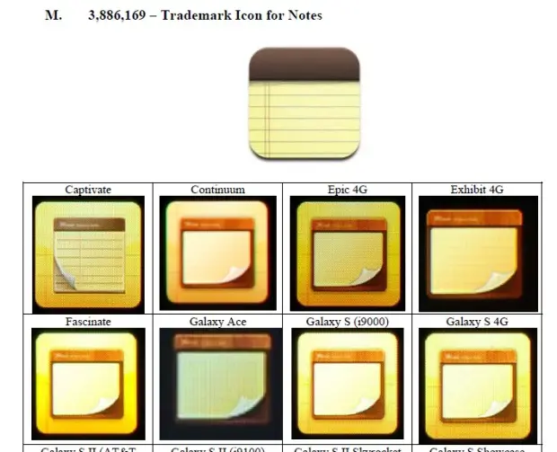
It’s a note app, what else are you supposed to make the icon? a computer?
See Play Store apps: https://play.google.com/store/search?q=notepad&c=apps
There’s a variety of ways. Spiral notebook, something with a pencil or feather pen. Tons of options if Samsung really wanted their icons to look different.
And you don’t think that will be trademarked by somebody else? Its all the same thing. A notepad or a pen and paper in some non traditional style maybe as an outline with transparency or maybe on a background or just a notepad by itself. Why should any part of these things be trademarkable?
Keep in mind it’s not the Note icon in of itself, it’s when you combine that with the rest of TouchWiz’s icons that you begin to see the bigger picture.
I will say that some people could mistake a GS1 original for a iPhone 3g if one were to open up the app drawer on the GS1 original and then showed apples home screen next to it but then where else besides that is there a copy can anyone mistake a gs2 or gs3 for an iPhone or even just the interface? I think its different enough when people find they will need to do more than just hit a low center button to go back home
Yeah, but I think Apple’s going to try and prove to the court that it was always Samsung’s intent to copy the iPhone and/or gain success by associating with consumers familiarity with it. “Diluting the brand” or something like that.
Pretty much they will try for whatever they can get so that they have less competition.
Apple’s evil, no doubt about that. I guess that’s why it used to bug me so much that Samsung was trying to copy the iPhone with the OG Galaxy S. :p
Evil sells, I always thought the OG droid had an evil way to it with its advertisement like as if droid was going to become an actual android and enslave the apple heads. Of course I was right but in a different fashion lol
The solution that I would like to see is that the stock experience is what you get and then leave the customization to 3rd party developers. I’m not buying touchwiz I’m buying super amoled, cpu, and storage. I bought the samsung vibrant first weak out back in the day and strangely felt like I had bought a girls phone. I had a lot of problems with gps that the G1 didn’t have but the display was beautiful. The problem I think is that we have to go back to Android 2.1 to fully appreciate why they did touchwiz and made the Galaxy s so girly. Not that there is anything wrong with being girly Anwyay, since Gingerbread the manufacturers really don’t need to mess with the ui as much.
Honestly though the Original Galaxy S was a buggy failure it wasn’t until they remade it and became successful because it was powerful.
Icons are created that reflect real world physical objects. That’s a pretty basic design queue for them that everyone is following. The only icons that look the same are the phone and maybe the music icon. All else is just as different as everyone else or using pretty standard universal symbols on the icon.
Chris do you even realize that ones without the pencil all look very similar? and the ones with the pencil all look the same even the ones with clip boards? The only ones not similar are the ones that uses the company’s logo. Come on you have to be able to see that!
Even then, why yellow lined paper? Why not white? I agree there are only so many ways to make Note icon but it’s obvious what Samsung was going for..
Most people associate yellow with the legal sized notepads though. White is more associated with a notebook-I’m not totally disagreeing with all you say, but the notepad icon is a poor example.
They could have gone white like windows but yellow is more so the color i think of when i consider notepad. Maybe thats just me though.
Here in the UK we have yellow and white notepads. In fact you can get blue, pink, light brown, grey etc. It seems the problem you’re mentioning is that they shouldn’t have used yellow (as if Apple own yellow now as well). Why not use yellow? Yellow notepads exist. ..And yes Jamille I think of a notepad as that sort of yellow colour…even though in work there’s more white ones.
wow dude have you never saw a yellow legal notepad? I would find it weird if they didnt use yellow..
That’s quite ironic. The link you led me to has almost the exact same icon as Samsung but it has note written on top.
Is the Siri icon a rip-off the Google Voice Search icon?
Really? Ok lets say that the phone icon is similar in many ways lets dissect what it actually is… A telephone icon… on a colored background. Its like trademarking a Underlined Times New Roman font for a logo.
I agree it’s dumb to patent an icon, but Samsung didn’t have to make the icon green. Out of all the colors in the rainbow Samsung had to choose from… they chose green. -_-
I agree with you there they could have done more differentiating with the phone icon but i believe all of the other were different enough
Yeah, and that’s the point. Samsung didn’t try to make their icons look different, in fact, they actually tried to make them look similar to iOS’s..
Similar is not the same. Copying would be same. Though in some arenas, degrees of similarity can imply copying, such as with corporate logos; I don’t think interface icons can qualify here, as certain images evoke certain ideas. When it comes to icons (an image representing an idea), Samsung is not using the icons from iOS; they are not copies. They are similar to the iPhone icons, which in turn, are similar to icons used on operating systems and GUIs that predate and are unrelated to iPhone.
Of all of those icons, the phone icon is the most similar, but I don’t think that proves anything, as the myriad arguments in the opposite direction in these comments demonstrate.
In my opinion only the phone,note and contacts app’s look similar, if only 3 apps out of the 30 or so that come pre installed with the phone kinda look like apples how does this prove that Samsung is out to copy them? If they went with this mindset they can even take moto razr for having a notification bar too similar to the iPhone just because the wifi icon looks the same, now if 20 of those icons were similar to the ones on the iphone then it would be a different story
The fact that Samsung chose to put squared backgrounds behind ALL their icons doesn’t convince you?
Maybe the fact that Samsung — for reasons unbeknownst to us — decided to change the scrolling of the app drawer from vertical continuous to horizontal page-by-page?
lolwhut?! So Apple should own horizontal scrolling now, as well?
I hope you realize just how ridiculous that is…
That’s nonsense, Samsung’s icons are only similar, but no more than Apple’s iPhone is to those that it copied, which by the way, is without question. Similar
things are done all the time in many industries. For example, look at the Lexus and Toyota crossover vehicles, they have strong similarities but you don’t see them accusing each other of copying. A perfect case in point is Nissan, when they developed the Titan, admitted to the fact of looking at Ford’s F150 to improve on the specific design, features and overall concept.
The real thing to consider is why Apple really filed suit? Apple did not invent most of the unique features of the iPhone, they simply improved upon them and packed them together and called it their own. The fact is their close and control philosophy is keeping them from any further advancement and innovation, only to continue releasing an old car with a few extra features and a new paint job. Not unlike U.S. automakers of old that needed to get their butts kicked by foreign automakers such as Toyota, Nissan, Honda, to name a few to cause them to change their long term business plan and outlook. Ford, GM, and Chrysler tried to lock them out but had no other choice but to get their acts together. Yes, U.S. automakers were originally the innovators, but because of a closed and captive market there was no cause or need for improvement. Remember what the “Big Three” did to Tucker’s improvement over their stale versions of automotive engineering.
So, once again here we are, a U.S. business scared to death because their one sweet Apple is beginning to cause a sour taste in people’s mouth’s (punn intended) because it can’t keep up with its competition. The truth is, in this technologically advancing world stagnancy will never be tolerated, regardless of who you are. An old saying is “If you can’t run with the big dog’s, stay on the porch”.
Uhm, you do know that Toyota owns 100% of Lexus, right? It’s their luxury class division.
Green has always meant go or connect. All my phones over 15 years mobile and another ten or so landline phones have used green to represent connect or call etc. Red or black (usually red) means to hang up or end call. I really don’t see that because they made a phone with green on the phone icon that they can say that everyone else (Samsung for now because they are competing) is copying. Apple must’ve seen Green on a phone icone before…therefore copying from somewhere right? They are just standard.
I see your point, but it’s not like Samsung chose a green phone icon with white background. The chose a white phone icon with square green background (and rounded corners) and stripes. I call that blatant.
Why shouldn’t they choose green? Mobile phones have had a green “Call” button for about 20yrs now. I agree that it looks like the iPhone icon, but I disagree that Apple should have a monopoly on a green coloured phone icon.
If this is all apple has then they don’t have a leg to stand on.
There’s more. See latest post.
Is that the GNOME foot I see as part of the HTC set of icons?
yes, that whole screen is an HTC screen… look at the email icon… GOOD JOB APPLE!
Maybe Samsung will change their icons now on touch-jizz —er— TouchWiz.
Just saying, this is personally my least favorite manufacturer over-lay.
I like that the UI is smooth (no need for butter) but don’t dig the cartoony look. =/
Google image search phone icons look at all the iterations of phone icons and tell me you don’t see many with similarities from one to another. There are many ways that phone icons are created but all have the same basic type of components of which is a Phone with or without a background. There are only so many ways to create them before they all start to look similar now granted Samsungs phone logo is almost exactly the same but there are small differences.
It’s not the fact that they used a phone (you’ll notice Google and HTC both use phone icons). It’s how Samsung used it. Same color scheme and whatnot. They even had boxes around all their icons just like iOS (before recently getting rid of them).
This is how samsung used it and this is how apple used it http://cell-phones.tradetang.com/wp-content/uploads/2010/11/samsung_Galaxy_S-vs-iphone-3gs.jpg
If you look at things individually sure things can look near same but nobody is going to only look at one aspect of a device and mistake it for another. Its about the whole bigger picture. Apple’s home screen vs Samsungs app drawer is stupid. Apple’s home screen vs Samsungs home screen displays completely differently.
I understand the Icons look very similar but i thought Apples whole case here is about proving that Samsung products are too similar to Apples which in turn have caused it to loose sales because of the confusion >.> with all that said what shopper do you know that buys a device based on the look of the icons completely ignoring that the s-s2-s3 have a good .5-1.5 inches on the size of the iphone not to mention the Samsung logo on the front >.> to me it just looks like apple is trying to find even the smallest similarity, whats next OMG the galaxy phones have a screen just like the iPhone
Yeah, what Apple is trying to get at is that customers could have mistakingly purchased a Galaxy S, thinking it was an iPhone 3G.. S. Seems silly to you and me, but apparently Apple has records from Best Buy showing people returns from people who thought the GS was the 3GS -_-
In those documents though it wasn’t a large number it was just a small minority and those that did happen to get them confused like you said did return it for a iphone so there was no harm done, those documents also counted all the customers that exchanged the galaxy s for the iphone even though some of them could have exchanged the galaxy s for other reasons like malfunctions or even unsatisfactory experience’s with the handset. Actually the specialist (Dr. Van Liere) Apple hired to run the study and to testify just the other day took Samsung’s side saying
“association as it relates to dilution is a different concept than likelihood of confusion. Those are two different concepts.” Even the person Apple hired who ran the study agrees with Samsung, Apple must have been surprised but then again Apple never actually asked for his expert opinion they just took his statistics and ran with it.
Heres an article on it :
http://news.cnet.com/8301-13579_3-57487506-37/samsung-attacks-apples-claim-of-marketplace-confusion/
they must not have paid him enough to say what apple wanted.
Those people were idiots honestly how do you accidentally buy the wrong type of phone? You have to ask them to get it for you right? and the spec sheet says the product information. Its beyond silly to think of, of course with the exception of blondes were any of them blondes?
Just watch Apples Genius ads even they agree with you on the opinion that their customers are idiots.
Given how bright most Best Buy employees are, it wouldn’t surprise me if they made up something, said it was iPhone/iPad-like and sold it like that. Then when they got home and found out they couldn’t use it with iTunes, they brought it back disappointed.
Samsung also showed that only 9% of people really mistook it for an Apple product, and 90% were brought back for other reasons like defects and performance issues. I don’t think it’s out of the realm of possibility that at least 9% of consumers are dumb.
first 3, yes, plain and simple copying… the rest. generic and not copied. some not even close to being copied. (picture and video) and sorry but settings being represented by a “gear” was around WAY before iOS so good job patenting that one. i see no similarity on that one
settings app before uses a wrench and screwdrivers
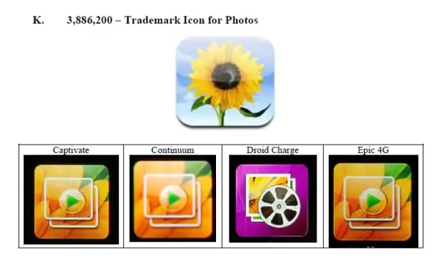
But did Samsung have to use an image of a flower for their Gallery icon? Could have been a horse, a frog, a puppy, a tree even. Why a flower? And why that flower? Why not a rose?
its at least a different type of flower and windows has used a flower for its images since forever. its nothing special that APPLE came up with, so if anything apple followed the same trend samsung did on that one
copied or not touchwiz is an ugly ui, so if apple forced them to change it I wouldn’t be too sad. Really though, you can tell that some of the similarities are intentional, but others are just coincidence.
For the past 15 years the “call” button has been green on cellphones, and has often had a phone logo. There are boatloads of prior art here. The music icons on windows 3 also looked just like a CD and note. These are pointless comparisons. You cannot patent functional information. Using the exact same icon would be theft obviously, but they did not.
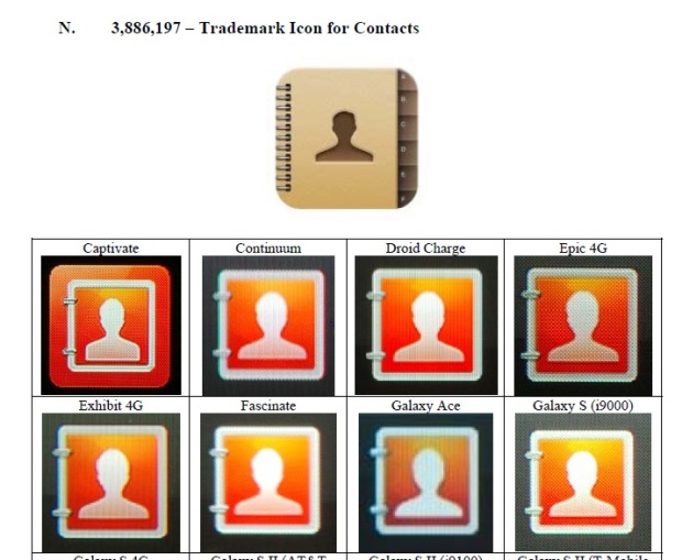
I don’t see a problem here for any of the above. A cog is always settings, and a notepad always looks like that. The empty contact picture in outlook and Facebook also look like the silhouette of a man.
And the “call” button always had a green square background with lines of some sort behind it? O_o
At least Google spun the direction of the phone icon and HTC used a different color altogether.
i hope apple win about Touchwiz UI, so samsung will make another better “touchwiz ui”
yes, sometimes i do feel that samsung is trying hard to copy iphone (to make it an easy transition for iphone users to move to their product).
look at that silly physical home button…
As someone who works directly in user interface design, I disagree that this is obvious evidence.
There is a de-facto standard amongst icons in applications. A 3.5″ floppy disk means “Save”. When was the last time you used a 3.5″ floppy? A clipboard means Paste. Why? An undo arrow faces leftward, while a redo arrow faces to the right. A puzzle piece means an add-on or extension. A globe/earth icon means refers to the Internet.
Of the sampling offered above, the white phone on the green background is the most egregious thing I see here. The “old handset” icon is a common metaphor which significantly predates the iPhone.
Using a notepad icon for a notepad app is not an invention. The color choice here shouldn’t be a problem, unless this physical notepad on my desk is also an infringement (to be perfectly honest, the notepad was likely manufactured after the iPhone was launched).
Using a “gears” metaphor for settings is extremely common practice. The Tango desktop project used this metaphor quite frequently in 2006. http://tango.freedesktop.org/releases/tango-icon-theme-0.7.2.tar.gz
The music note and optical disc icon elements are extremely common. Again color choice is similar. Both music note and CD are also present in Tango from 2006, albeit not combined.
Using flowers in a photo gallery icon is an extremely common practice that predates the iPhone. Most tend to be either flowers, a beach, or a sailboat.
Using a silhouette of a person as a contacts icon is extremely common practice that predates the iPhone. The iPhone’s icon more closely mimics this BlackBerry 4.1 icon: http://cdn.itproportal.com/slideshow_images/ITProPortal-BlackBerry-Curve-9320_1_displaywatermarked1v3.JPG BlackBerry OS 4.1 predates the iPhone.
You’re telling me you have a notepad on your desk with yellow lined paper that pulls from the top?
And no ones arguing that Apple wasn’t the first to come up with a green phone icon, or yellow notepad icon. We’re trying to figure out if Samsung was intentionally trying to recreate iOS with eerily similar icons.
Cool thing is eerily similar doesn’t defined copied. A copy would be an exact duplicate of the original. If anything is different well then its different lol. CrApple just wants to whine and complain like my 3yr old because it isnt getting its way. Pathetic of a company to be so childish and immature. Which is why there will never be anything of theirs in this house. Id rather go without that support.
I don’t think they sat down and said, “lets make something so similar the the iPhone that we trick iTards into buying it”. I also don’t think they were oblivious to the fact that it’s very similar either. I think they thought the design was so generic (and it is) that it was okay to make it.
The point is the choice of icon look comes from common experience. Yellow legal notepads have been around for decades. Using musical notes to depict music can be found in comic books dating back to the early 20th century. AT&t has a better case for the phone icon since they designed the actual phone it was based on; a phone design that was pretty much in every house until the mid-70’s and still quite common throughout the 80’s.
try reading groklaw once in a while and you might find out that everyone uses the same icons because they’re public domain, moron. Seriously when I see you post it infuriates me. I know that it’s going to be: incorrect, apple favoring, and generally misleading. I’d sooner get information from fosspatents than you.
Most of the notepad app icons are actually sticky notes, not legal pads. And they are defaulted yellow because that is the common postit note color, and the default in pdf editors like Adobe Reader. You don’t see those companies compaining.
I see what your saying and I get it. I just think its all a bit weak. I can see the complaint in the call button. I can see the complaint in the music button ONLY because they have the trademark on the CD eighth note combo, which is surprising to me.
BUt the photos have the play button or the reel indicating that its a photo album and it is accented with flowers. The flower isnt the focus. Claiming that they were the first to use a gear for settings is pretentious. The contacts icon fits the theme (which i guess is what your saying is the inherent problem) of the icon set. It’s a simple enough design. I mean the stock android one is a little book with tabs too. Just turned 90 degrees with an android face on it instead of a human silhouette.
Isnt it the point of a custom UI to make everything intuitive? There are certain guidelines that graphic designers follow to ensure the the purpose of the icon is clear. Both companies did a good job of making their icon sets obvious for the consumer. I guess they’re just similar.
the only thing we can conclude from these phone wars is that Apple is way better at thinking of things to patent, succeeding, and exploiting the patent/trademark system in america. they fact that they (among everything else up to this point) have a trademark for a square picture of a sunflower and a CD with eighthnotes by it is ridiulous.
Why is it everyone looks at it from the angle that Samsung tried to copy Apple when the truth is that Apple copied a ton of other sources long before Samsung followed suit?
Exactly. Let’s take a step back and put aside the current case. Is it ok for Apple to copy the exact look of another developer’s application? A UI that is now up front and centre in iPhone and OS X?
That’s what Apple did back in 2004. I know we’re dealing with this current lawsuit, but the sheer amount of flack Samsung are getting for “copying” Apple is kinda rendered moot, for me, when Apple did the exact same thing, and are still using that poor dev’s UI it in their software, without any compensation, or credit.
I have a weather widget app on an old Mac which predates OS X/iPhones ever having such a thing. It has the same layout, colours, and functionality. Apple copied this, no, Apple ripped this whole widget look back in 2004 and are still using it without being called out for it.
Couldn’t agree more.
+1 Endoverend! I agree the phone icon may be infringing because it is sooo close to the iPhone icon patent (even if the patent should never have been granted in the first place…) But the rest of the “evidence” is a theme followed nearly universally by other OEMs OS’s and Apple (despite their obvious belief to the contrary) was not the first to use the very common icons. That’s like saying I should patent the universal bathroom logos and sue every rest area and restaurant in the freakin’ world!!
Apple is just trying to show that Samsung tried to use the success of the Iphone to gain recognition for its galaxy S. This is one small piece(battle) to strengthen Apple’s Claim(War), and what Chris is saying is that it is working in this case.
Well… I’m usually on the fence too but…touchwiz icons are not something I’m really fond of either…
People- you either see the avoidable similarities or you don’t. I suggest that those who don’t see it are making more excuses than those who do.
doesn’t matter. As long as icons aren’t trademarked, icons can be similiar. There are only so many ways you can make an email icon, a folder icon or a web icon. You also need to make those icons similar to what’s the norm because users need to easily identify them. That’s standard UX crap that Apple can’t shove in people’s faces. Also, Apple shouldn’t talk. They’ve ripped icons throughout the years…the latest one was iCloud.
Square icons were around long before iOS. OSX didn’t even use them so they must have copied that but whether they’re square or not shouldn’t be an issue. They don’t own rectangles.
Green ‘phone’ icon. Green usually means go or connected in phone terms so showing green and a phone naturally go together.
‘Notepad’ icons are like that on many distros. PC’s have been using them for years. Showing a notepad for the notepad app makes sense.
Icons like ‘settings’ where they are cogs showing the inner workings etc. are in every distro I’ve used and every theme and ROM too so again I don’t see that because it’s a cog that automatically means they copied.
The music one…I remember seeing a linux distro (may have been themed) with the CD and a single quaver rather than the double one Apple have used well before Apple used that. The CD was more white though and I think the quaver was black but it was very similar, in the same place etc. There’s only so much difference you can make without people knowing what it’s meant to represent.
Seriously look at all the icons though. If you can’t see a difference you need a dumb phone and white stick.
as far as I’m concerned a phone icon or button with the colour green is ubiquitous to making calls and has been since long before this touchscreen generation of phones
But it’s not a green phone. It’s a white phone, with a square green background and stripes. I mean, look how Google and HTC pulled it off. Google at least had sense to rotate the icon…
I didn’t specify a green phone, just the colour in association with making calls, Samsung used a more defined phone and removed the stripes, Google rotated the image and switched the colours, it’s still essentially the same, symbols that are so engrained in everyday life shouldn’t be under scrutiny. It’s a non issue, calls have a phone, notes have a notepad, settings has a cog, messages what are now a text box, music a CD/music note, email an envelope, calendar a desktop calendar. This uniformity is important, it means you don’t need to learn a new set of symbols or icons every time you switch phones or OS or manufacturer. 2 icons that perform the same function look similar? GOOD. Once you get into that app and they both look the same, then there’s a problem.
Holy crap dude..
Green = Connect/Go
Red = Stop/hangup
Everyone knows this why don’t you?
The thing is when you look at the examples you can tell which is Samsung, which is Apple, which is Google and which is HTC. Without reading which icons are from which phone you can just tell…you can recognise what’s what. They may show similar things but you can tell who made the icons simply by looking. I think if I showed a 6 year old some icons like these and asked them to spot the difference they could. Can you spot the difference?
Boy apples lawyers are gonna have a field day with this one… The point is that Samsung knew exactly what it was doing yet deliberately did it. Seriously, you’re
Gonna tell me those icons don’t look almost identical? They couldn’t at least have changed the color? Lol
this phone icon has been on the side of pay phones for 30 years ,,,, apple is really reaching
these are all such generic icons , settings icons are always gears , the notepads is a pic of a damn notepad lol so pathetic
I don’t care about Samsung coz they’re responsible for TouchWiz, not Android
Since the trial is all about pictures… how about another… remember these things… Unless Apple has a patent on the color blue or the 45 degree angle I think GTE should sue Apple… too bad GTE doesn’t exist anymore.
Chris: you need to read this article: google ‘there is only one cloud icon in the entire universe’ and it should be the first result that appears.
I invite phandroidd to search for a photo icon used in ios that’s exalt the same as windows xp.
And this, my friends, is why Apple is the laughing stock of the computer technology market. You don’t see Microsoft whining like a baby because Linux also uses COMMON icons for certain applications. The concept of “user interface” is completely lost on Apple, and I hope they realize soon that they are hammering in the nails to their own coffin. Good riddance, you are costing the entire industry money and time.
these are all fair use. This is why phandroid isn’t worth reading – they don’t understand what they cover.
see public domain:
http://www.wpclipart.com/telephone/phone_icons/telephone_symbol_green.png.html
or public domain:
http://www.clker.com/cliparts/d/2/3/c/11949848961789922052telephone_sauvetage_yves_01.svg.hi.png
Please don’t post articles Chris, it’s an insult to a website about android things because – you are not partial, and you’re never even correct. Goddamn man, please just leave. You are the reason I no longer read phandroid unless it accidentally shows up in my stream.
Before smartphones, all my cellphones had a send button, which was green and had a picture of a phone on it. Quite frankly, I think Samsung copied the icons Apple used (at least the color scheme), but “green button with a phone in it” isn’t actually new.
Some are worse than others, but the People/Contacts screen shouldn’t be included. The head outline has been used long before the iPhone. Its the image in my high school yearbook for anybody who wasn’t there to get their photo taken, and that was 15 years ago.
“I found Apple and their attempts to patent the rectangle absurd”
Obviously, anyone following this trial and reviewing Apple’s patents KNOWS that Apple hasn’t attempted to “patent the rectangle” (which is not patentable).
There are many other phones and tablets that are rectangular, that do not mimic the design of Apple’s products… and Apple is not litigating against those products for that reason.
For example, manufacturers of car tires cannot patent a “circle” or a “wheel”. However they can (and do) patent their unique tread designs, and any new compounds they develop, or new production processes.
You really should review each of the Apple patents that Samsung has infringed, to get a better understanding of what this trial is all about.
The sprocket has been associated with settings since the flip phone. It was either the sprocket or a tool box. Maybe even a sprocket poping out of a toolbox. The Icons are more or less public. Its like the power/on symbol. How do you claim someone infringed on that icon when it is widely used as it is. How can they copy a clef on a CD when the same icon is on windows with the exception it is only missing the second hanging note 1/4 or half note i forget. Still on top of a cd in the same fashion. It is also used in several other fashions on Windows 1/4 followed by a whole note on top of a cd. Should MS sue apple for using a trash can as a recycle bin? It serves the same purpose just without “recycle” looks nearly identical down to the color. Apple did state that other companies should stay away from the rectangular pattern when they were disputing the Ipad/Galaxy tab.
The annoying thing is that they made it worse. I hate the cartoonish look and feel of IOS and its one of the reason I dont like the custom skins on most phones, they just make it look cheap and cheezy.
Really? Apple created the phone symbol? the memo pad? a gear for settings? I can’t read this anymore, im getting too angry. F U Apple.
I’m sorry but I saw tons of differences, any two year old could.
too bad their judge is dumber than one
The philosophy of familiarity. Certain things trigger thoughts that make us feel familiar with what we’re looking at. Prior art would be a big factor here. Obviously green trigger the go feeling and a phone icon, that has been used on payphones since their invention, tilted counter clockwise 30 degrees and placed in front of a green square should hardly be patented.
http://journals.lww.com/academicmedicine/Fulltext/2006/03000/Familiarity_Breeds_Comprehension__Going_with_What.18.aspx
Oh, forgot to add the developer’s comments about what he thought of Apple ripping off his widgets idea back in 2004. Remember folks, it’s the look and feel that is important ;).
http://news.cnet.com/2100-1045_3-5250692.html
Damn, my original post hasn’t appeared yet. It contained an image so I guess it’s awaiting moderation.
Apologies if this post appears twice, I think my original one has been lost in the ether. Mods, if it does appear, really sorry and you can delete this one, since the original contained an image pointing to Apple copying the look of their widgets, which one can see in the iPhone/OSX of years gone past. Here’s what I wrote:
Samsung copied Apple’s icons? Oh really? Ok, fine. What’s that? A million Apple fan-sites blowing their loads on how Samsung are shameful ripoffs, with no morals? In amongst this, these fan-sites liberally quote a known Apple shill –John Gruber of DaringFireball.
Let’s take this to the heart of these fan-sites cheerleading —that Samsung copies.
Oh really, really? Well, how about Apple copying the exact look of another developer’s application? Yup, this happened way back in 2004 when Apple showcased their OS X Tiger and a new thing called Dashboard. It was basically widgets that we know today. The developer behind this other product, Konfabulator, had been developing his software since 2000; blasted Apple for ripping off his work. Konfab featured rich interactive widgets, with a look and feel that we are used to when we use an iPhone, or some other phones today.
Let’s go back to this Apple shill guy, Gruber. He’s one of the many out there, every single day guffawing at Samsung’s copycat routine. However, back in 2004, it was a different matter when it was Apple doing the copying – and getting caught at it, and Gruber being a hypocrite in the current patent case.
Basically, Gruber went into a long rant about how Apple didn’t copy Konfabulator’s widgets, since Apple had already done something similar way back in the pre-historic age, albeit with a much, much different look and functionality. That’s great, Apple did have desk accessories, etc. However, comparing those to konfab is like comparing a Nokia from the 90s, to an iPhone. Gruber even mentions that Konfab had rich, colourful, anti-aliased graphics. Much like the current court case arguments.
Now, before Konfabulator, widget type things weren’t full-colour, and beautiful, and highly interactive – they were pretty dumb and… well, let’s just say that comparing pre to post-Konfab, is like comparing pre to post-IPhone. Oops.
So, let’s apply this logic to the current case. Are people correct in lambasting Samsung with being plain old copycats? Well, if it’s good enough for Apple, it’s a tasty treat for Samsung.
Before the iPhone, in fact before OS X/Windows ever had these rich widgets, some other developer had them. Apple ripped off the entire look, and got away with it.
The image attached is from Konfabulator. Look like anything? Yeah, looks like the OS X/Windows/iPhone weather widget, except, this was created years before Apple ripped-off that exact look.
I’m not even talking about functionality, since even Apple, and their fans, are just condemning Samsung as rip-off merchants. This is about the UI, much like how Apple are talking about the look of icons right now in court.
Point being, God knows if Samsung copied, hoever; the sheer bias from the Apple sites is unbelievable when they themselves were defending Apple when Apple was in Samsnug’s shoes.
If you read gruber’s blog, replace widget/gadget with mobile phone.
But still, patent on a green square icon with a phone on?
Samsung sucks, I’m completely with Apple on this whole thing.
However, they make the Nexus, the only Android phone worth buying as it’s the only one that gets updates.
Bunch of lame crap that makes me suspect any thing this author writes in the future. Icons are used to give an idea about functionality and should not be trademarked for common tasks like making a call, playing music, text messaging or recording notes.
You know what, as descendents of Adam and Eve I say all of us humans should sue Apple for using the bitten Apple as their trademark. We all have a right to that design since it got us all kicked out of heaven. You see how lame that sounds Apple, YOUR icon claims are even lamer.
I think cases like this between companies from different countries should be handled by international courts in a third (non-involved) country to remove any suspicion of bias and should be judged in addition to persons knowledgeable with the law by industry people who have the common sense to realize bull crap when they see it. As we can see from the majority of the comments below there are still many people in this world who can recognize bull crap when they read it.
I am not a Samsung fan or an Apple hater (I have bought devices from both companies for years and currently own iPhone 4, 4S, iPod classic, iPad 2, Google Nexus, Galaxy S2.
But from now on based on this illogical crap Apple is pulling to hinder the success and competition of other companies, I will NEVER buy Apple products again. I’d rather go back to using dumb flip phones, or even worse a smart dumb phone based on Windows 5 OS than purchasing anything made by Apple.
A phone icon looking like a phone receiver, OMG! Put them all to death immediately!!
I think we’re all being blinded by our fanboyism here folks. While the specific graphic used for the call button is pretty universal and does out date the the iPhone, the specific combination of a WHITE handset on a green gradient square background with rounded corners is very commonly recognized as an Apple icon. In fact the Apple design standards for icons in apps is a square with rounded corners and a gradient background. If your App doesn’t have such an icon it’s grounds for rejection from the market.
That aside, I agree that individually none of these icons can be considered Apple ideas and most pre-date iOS in general. However when you put them all together using a standard very close to Apple’s design standard for icons, throw a grey background behind the bottom row, and look at it as a whole. Throw in a similar shell design and the whole thing screams iOS KIRF. This is not Android, it’s TouchWiz. I’ve always said since the very first time I’ve seen Samsung’s TouchWiz that it looks WAY too much like iOS and that they were skirting very dangerous legal ground. Individually the pieces are different. Together its enough to cause some confusion even though Samsung is right there easy to read. But grandma is not likely to notice those subtle difference when buying her grandson a nice birthday present. THIS is what Apple is getting at.
It’s b******* that one can patent or trademark images of phone receivers and cogs but nevertheless I have to say that I find Samsung’s attempts to copy iOS’ ugly UI ridiculous and stupid. HTC might have made some mistakes with their newer phones but one has to applaud the fact that their icons look sooo much better than anything Samsung ripped off.
The images no. But the combination of a square shaped icon with rounded edges, a green gradient background, and a white monochrome phone icon all together can. Individually they aren’t patentable, but combined in that specific way they become Trade Dress. Alone these pieces are fine for the most part. Its when all combined you can tell that its trying hard to appeal to Apple fans. Believe me, I am never one to ever defend Apple. But they might actually have a good case with Samsung and TouchWiz.
Those Icons look a lot like they came from a Palm, LOL! It would be alright if Apple actually invented some of this stuff but they didn’t. iPhone would have never been possible without being able to put together a bunch of things others invented.