
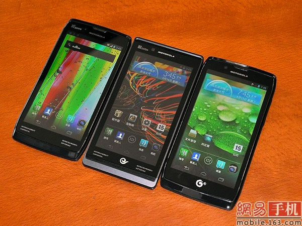
Motorola recently showed off three RAZR-esque new smartphone designs destined for China. The XT885, XT889, and MT887 will land at China Unicom, China Telecom, and China Mobile respectively, but will feature largely the same specs aside from radio configurations. Notable is the presence of Ice Cream Sandwich and the absence of physical Android buttons, eschewing the older Motorola style for something a bit more in line with Google’s current vision. Otherwise you will find a 1.2GHz dual-core processor, 8MP camera, and 4,3-inch qHD display.
The three phones will debut in China on June 2nd, but might hint at what to expect from the upcoming Droid Fighter rumored for Verizon, particularly the M887 (far right in the above photo). That device has yet to be officially announced, but it should be coming sooner rather than later.
[via Engadget]


Looks nice!
Same damn design since the DX.
the one in the middle just looks like the bionic, the two on the outside look more like the razr, and still looks like a ton of wasted bezel for having on screen keys.
Word. The ones on the outside look like the photon
Why so much bezel at the bottom?
What bugs me more is the squareness of the edges. I liked the RAZR for the short time I had it, but it was so boxy and unwieldy.
Looks like a sticker over the hardware keys on the regular droids with an Ice Cream Samich Rom. If not, then thats a whole lotta wasted space with all that bezel!! ahaha I’ll pass, NEXT!
Right there folks is the 2012 photon, bionic, and razr. I hope not. They could use that space for more screen
Moto makes by far the ugliest Android phones imo. It’s not even close. Their phones are so boxy and always have too much bezel. I owned an Atrix and that phone looks like a step up compared to the Razr and Bionic. And let’s not even talk about Moto Blur lol. Maybe Google will help out in the design department now that Google owns Moto.
Pick up a SGS2, Rezound, and Razr and tell me which Gingerbread skin is then best. Blur wins easy.
But put any of them next to a Nexus and see how all those skins look like crap in comparison to stock ICS.
I’ll agree with that. I was just saying that anybody who says Blur is the worst has not played with a lot of phones recently.
It’s certainly a matter of opinion, but I think Blur is the worst compared to Sense and TW. It offers the least amount of customizations. But the bigger issue with me in regards to Moto is how crappy their hardware designs are. So much bezel. It’s just a terrible waste of space.
The Droid Fighter will be released 6 months before Jelly Bean… which means it will never see an upgrade.
The top and bottom bezels are too large to not use hardware keys.
Droid Fighter? It looks like Moto designers need to fight for a better-looking Droid.
I like the design of the middle one the best. Shucks =/
Did anyone else notice that the wallpaper “bleeds” into the area reserved for the on-screen buttons a little bit? Personally, I like it! After comparing it to my Nexus, I realize that the abrupt transition to all-black is a little harsh.
i think the abrupt black works only for the Nexus, considering the whole front face of the phone is black. And I agree, the bleeding wallpaper looks nice, although kind of reminiscent of WebOS and it’s black to transparent gradients.
Scrap the devices on each end and touch up the one in the middle. Change the color that grey is old school. I think the black bar beneath the soft keys is real estate that could be made available, it appears to be apart of the screen.
Better screens, no locked bootloader, less bezel, updates. How freaking hard is it? Battery life wasn’t even that bad on the og Droid and Droid X. It’s like they don’t even listen to their customers.
ugly, alright, ugly (looks like RIM)