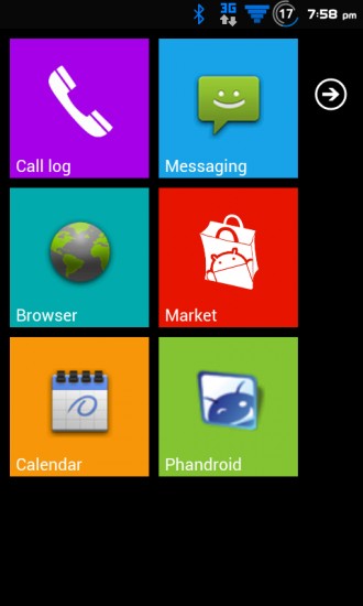
The readers have spoken. The results of a poll we posted yesterday say that the majority of folks out there are perfectly content with Android and won’t be purchasing the Nokia Lumia 900 or another Windows Phone any time soon. For those looking for a bit of both worlds we present the WP7 ROM. The custom-built ROM features a launcher that attempts to mimic the Metro UI made popular by Windows Phone 7, though from the looks of it it doesn’t come across with quite the same polish. It actually does a pretty good job of making Metro, which most will agree is visually appealing while functionally flawed, pretty darn ugly.
The ROM isn’t available in a widespread format just yet; the latest build just hit the ZTE Warp. For more information and installation instructions check out the AndroidForums link below.
[AndroidForums via WinSource]


Looks pretty bad.
Ew.
Do not understand at all! Why would anyone who already has the best mobile o/s out there want to contaminate their phone with what is (and always has been) the least popular mobile o/s in the world?
To try something different, and be open minded about other designs. That’s what’s so great about the openness of Android. You can make it whatever you want, including making it like another OS if you want to try it out.
I would try it just to see what it’s like. If I end up not liking it, I could always flash back to a different ROM, or even change the launcher since that seems to be all it really is.
There are over 6 billion people in the world.
Android is the best OS out there right now for the purposes of modifying the phone to anyone’s desire.
The law of averages alone dictates we’ll have WP7 on Android sooner or later. Someone, somewhere will make it happen.
There’s nothing you need to understand, it just is. Android caters to the phrase, “Different strokes for different folks”.
“Metro, which most will agree is visually appealing”Really? Why would anyone think so? I reminds me the colored shapes my 16 month old kids learn. In my opinion, there’s nothing more plain/boring/mood killing than Metro.
I agree. I don’t think it’s visually appealing OR functional, but that’s just me. That doesn’t mean I wouldn’t try the ROM just to see if my mind changes after using it. Especially since I have Boot Manager.
What’s so visually appealing of a bunch of off-centered tiles?
Agreed, I’ve never found WP7 look/style to be appealing. I think it looks rather boring, plain, and ugly. Please keep the tile look outta Android.
Metro is precisely why I have no interest in WP7…
I love android. I like the iphone. I can stand WP7. Metro is the best reason to like it. The styling on the entire OS is better than anything out there. The apps maintain the same styling and it just fits soo much better. On anything else, the apps are annoyingly different from one to the next. Even Google is starting to agree and “forcing” the removal of the “menu” key.
I am sorry, but how is this even News? Throwing “launcher 7” (downloadable for free through the play store to ANY device by the way) into a ROM does not make it a WP7 rom. sorry, but its a LONG way away from that. needs a different theme completely, different lock screen, music player, calculator, phone/people app/ messaging app ect….pretty much all of which are available in the play store for free (music player costs $$ though)
I used launcher7 for a week, its unique launcher. But I’d hate to be stuck with it for the lifetime of the phone.
I agree with all you guys!
I think the Metro UI will tank. I don’t like the way it looks at all.
I tried to use Win 8 on a desktop for a few days but in the end, Metro is awful on a desktop at least.
Nothing new, there is a rom like this for Sprint Nexus S that is based on MIUI.
No thank you!
why on earth this deserves to be a front page Phandroid post is baffling….
to me at least
The Metro UI continues to make my eyes bleed, cool on the devs though for cooking up something different. As the saying goes, “to each their own”
WTF why? This is terrible, if you want WP7 get a Nokia. This is awful.
There are people out there, and this is gonna blow your mind, so make sure you are sitting and have nursing staff on hand, but there *are* actual people out there who like the WP7 interface but prefer the underlying functionality and features of Android.
This is for them. You don’t need to like it…but you also sure as heck don’t need to spit on them.
Thanks for the warning I sat down, my heart skipped a beat :P
I am aware that some people install this, but there are also people who dip their steak in chocolate sauce.
I was not spitting on people, I just think the implementation is terrible. WP7 is a great OS, but it’s major advantages are that it runs extremely smooth, smoother than iOS (which this will not, compared to the real WP7 OS), and the tiles in WP7 are animated (in this version they are nothing more than an oversized icon taking up too much screen real estate).
“there are also people who dip their steak in chocolate sauce.”
…and now I’m hungry. Thanks…
Bonne Appetite :)
I doubt even half of you commenting on this have even tried WP7. I walked away from my Tmobile SGS 4G to the Lumia 710. It’s amazing how much better/faster the Lumia is. I still have an android phone but I tend not to like having to master reset on a weekly basis. Took me about a week or so to get used to the tiles but they are way more user friendly.
I believe this is what we call ‘Treason’. :( OFF WITH HIS HEAD (the dev’s head… duh)!
The most interesting part of the poll, to me, is that only 58% of those polled checked “Android for life,” and this is Phandroid.
it is appealing because is simple, the more simple things are the more people like it, take for instance the UI from the iPhone, people like it because is straight, simple and clean, Android comes second closer but i have to say i seen overcharged screens on XDA, certainly not my taste; I helped develop a launcher call iida UI , the launcher comes from japanese phone Infobar from KDDI, it is the same concept as metro except its visual fit more with Android; Metro is very nice in my opinion
Unlike WP 7 or iPhone, it okay to utilize the look, and the tomorrow use something else. At least with Android it’s all possible. It’s not a bad look. Very streamlined and modern.
Wow. Didn’t realize that so many people have such strong feelings for the look of the Metro UI. I love it – It’s simple, uncluttered, and clean. It’s modern and in-style. What’s so wrong with that?
i like the metro UI, but the problem with android is you could only emulate the metro homescreen.
what im looking for is the same UI with all the apps i download from the market too.