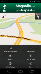
Google Maps has received a minor update bringing along a simplified menu UI when using Navigation. Gone is the standard ICS menu button. In its place is a menu launcher build directly into the Navigation UI. When accessed menu items are now displayed in a grid along with graphics as opposed to the list format of the previous release. The new look harkens back to pre-ICS versions of Google Maps. The larger buttons and visual elements should make for easier access to Navigation features while driving (not that we should be playing with our phones while driving in the first place). Head over to Google Play to update to the latest version now.
Google Play Link: Google Maps
[via DroidLife]


Great. I hope google restores more of that grid menu. Much better than the new “list” one.
Still sounds when you say Google Play….
this broke the navigation on my phone and tablet.
People continuously refer to the Store as Google Play. It’s actually the Google Play Store. Sounds a whole lot better. On Android the app name is Play Store. On the web link here is is play.google.com/store.
Really, if you wanted, you could just say, “Head on over to the Store to pick it up.”
It’s Play Shop for me (UK), is it different in the US?
They would have been hard pressed to find a worse sounding name for their app store
next they will reveal that navigation is to be renamed google wander
Why don’t they follow the ICS design guidelines, and not use the old style at all?
Because bigger buttons are easier to hit while driving. Even though you shouldn’t use it while driving, Google realizes people do.
Looks great btw the Market is called Play Store in North America and Play Shop in the UK why not call it Google Market?
Weird that Google isn’t following ICS design with Navigation, could it be that Jelly Beans will Chang the look again?
i like this menu better, that list was garbage – for sure