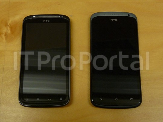
We have already covered all the leaked images of the almighty HTC One X. Some of you may be interested in a mid-tier device like the HTC One S, though (formerly known as HTC Ville). It is very hard to start calling these devices “mid-tier.” Just a couple of months ago, this smartphone would have been a beast, compared to the competition.
Times are moving, though, and so must we. This round of leaked images give you a quick look at the HTC One S. We must say that it looks really good. And that speaker grill gives it some style (while it does look a bit extraneous). As you can see, the menu button is also gone. The look is not bad, it is just different, and might take some getting used to.
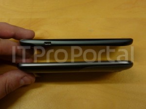
 In case you have forgotten, rumored specs include a 1.5 GHz dual-core processor, 1 GB of RAM, a 4.3-inch display and an 8 MP camera. This also seems to be one of the thinnest HTC phones in existence, as portrayed in the image, being compared to an HTC Sensation. As you can see, this is still a rocking smartphone, and it may be a great option for those not willing to pocket out all that money for the Tegra 3 HTC One X.
Are any of you considering this to be your next device?
[Source: IT Pro Portal Via: Android Community]


Uh this has physical buttons… has HTC not heard of ICS and its software buttons? Fail!
I prefer capacitive buttons over the on screen buttons, so I’m happy. Plus, means less of a chance of the on screen buttons burning into the screen and taking up precious real estate.
Uhhh, are you not aware that onscreen buttons are optional? The GNex doesn’t have them, because that’s a new feature that android 4.0 brought to phones as an option. The reason the Nexus phones don’t have microSD cards is similar, phones with no external storage were new too. I don’t hear people complaining about their phone accepting them however.
A lot of people still prefer capacitive. Myself included. I want my screen to be dedicated to important stuff, not buttons. Before you say that the buttonless design allows for a smaller phone with a bigger screen, prove it. So far, the GNex has not.
It’s larger than the 4.7″ Sensation XL and the 4.5″ Skyrocket. Both of which have a larger screen when you subtract the buttons from the GNex.
http://phone-size.com/?s=82%2C3%2C16
Thank you…
Why do some ppl think on screen buttons are a requirement now that ICS is out? Of the things I liked about ICS on the G Nex I had…on screen buttons were near the bottom of the list.
Why is it that some ppl want to take away one of Androids biggest strengths IMO: choice?
And for the record…I miss the hard buttons on my Droid X1. Too many accidental presses on my RAZR and G Nex is the reason.
The menu button is deprecated since Honeycomb. ICS supports the capacitive/physical button as legacy.
Proof of Google’s intent:http://developer.android.com/guide/topics/ui/menus.html One may “like” the menu button, but it’s being actively shunned by Google. You can find interviews where Matias Duarte, head of the Android GUI, saying the menu button is going away. Specifically they found people don’t know when to use the menu button because it’s always “on” so it has no contextual clues. Sometimes it works, sometimes it doesn’t. The menu button functionality is learned through experimentation or experience, rather than the GUI making it clear from the moment you use an app.The action bar essentially solves this user issue because it’s on when there are options and off when there aren’t. Plus the scheme scales from phones to tablets naturally.
I’ve personally found apps that still haven’t implemented the action bar, when it clearly should, to be kind of annoying.
I forgot to mention that…I did like the menu button being in apps on ICS.
I’m just not head over heels about the on screen buttons at the bottom.
This is the first HTC phone I’ve been interested in for over a year! But…
I will reserve final judgment for an evaluation of the display.
Looks pretty interesting to me, although qHD resolution sounds like Ville’s biggest disadvantage.
How do you know it’s qHD? The specs aren’t even confirmed yet. Or even leaked.
The Ville/One S specs have leaked like crazy, with a qHD screen in tow.
You know, if cpu benchmarks are to be believed, the One S will be more powerful than the One X.
Dual core S4 > Quad core Tegra-3
True true
http://www.anandtech.com/show/5563/qualcomms-snapdragon-s4-krait-vs-nvidias-tegra-3
At this point…I dont really care about power. I want better battery life.
Will be interesting to see which one offers the better battery life.
If you’re looking for battery life you shouldn’t be on here…htc is the worst for battery life. Go with a Samsung or a Motorola.
lol…true…
HTC might have done ok with battery life with the Rezound tho. Especially considering its running at 1.5Ghz.
I just read recently the S4 is 28nm, uses a 2nd gen LTE chip…thats mostly why I made the battery life comment.
Would be interesting seeing how they stack up against each other for battery life…a Tegra 3 and its 5th core.
OMG OMG OMG, Engadget is reporting the One S is coming to T-mobile with an S3 processor, not the S4. Nooooooooooooooooooo
Where the heck did all these S4 rumors on Phandroid and Androidandme start from? I hope Engadget is wrong, they better be wrong!
Incredible ugly looking phone. Why use the same design as in 2010?
Because, unlike you, people love HTC’s designs.
I guess thats why their Q4 profits were so good, or was it.
There has to be a menu key. If it doesn’t have software keys, and the hardware keys have no menu button, where’s the menu button for legacy apps?
good question…I’ve been wondering this myself. I don’t think that menu should be there, for the sake of novice users/non-technical people, but there are a lot of old apps that you need it in.
They are wrong. The icon on the far right is the menu key not the search key. They dropped the search key. That’s the same icon they use for the menu on the G2X.
correct me if im wrong but according to image…there IS a menu button… whats missing/taken away is the useless search button
I actually use my search button a lot, and am sad to see it gone in the new design philosophy of Android.
and there is no menu button in the picture. one is back, second is home, third is to switch between recent applications that you used.
I actually prefer this phone over the OneX in terms of size. I think the 4.7 or 4.8 screen or whatever it is on that one is too big (given a choice). 4.3 is big-enough, and at the same time, small enough.
What would sell me on this phone is if it has a removable battery, preferably microSD (but not a must, I guess, if it has 32gb mem), and a good display. If it doesn’t, then neither it, nor the OneX are on the menu.
if anyone at HTC reads these forums: the iPhone is not successful thanks to a non-removable battery, but inspite of it. do not imitate Apple!