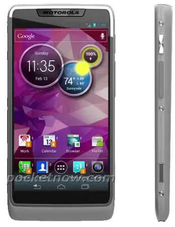
 Just like Hollywood celebrities who attempt to hide their estranged lovers from the public eye, the tech world works very much the same way. Sometimes for OEM’s, despite their best efforts, the truth eventually comes out. Especially when it’s a secret as juicy as this one.
What you’re looking at in the above image is Motorola and Intel’s lovechild, to be later officially unveiled at Mobile World Congress in just a few short weeks. The device will have the eyes of it’s father — Motorola’s Motoblur — mixed with soul of Google’s Ice Cream Sandwich and powered by Intel’s Medfield processor (seen in a few devices at this year’s CES).
Whether we’ll see a few more surprise partnerships from Intel at Mobile World Congress in a just a few short weeks is anyone’s guess. Either way, we’re officially hyped for MWC and I have to say, I’m a little jealous of our fellow Phandroid staffers who will be attending this year. I honestly can’t wait to see what other surprises emerge. How you guys liking the thought of Motorola getting into bed with Intel? Does it change any of your opinions on making a Motorola device a future purchase?




if that’s the ICS that Moto is going to push out then no thanks
No skinned ICS looks good. *GNEX*…..
I agree, its gorgeous. About time a vanilla version of Android looked pretty.
i totally agree with you
me like…. been eligible for months…this looks like my next phone:D
It’s hideous
Does it change my opinion on buying a Motorola device? Not unless it ships with an unlocked bootloader. Hardware was never the issue.
+1.
I’d quite like the Droid 4 at the moment, it’s a tasty little qwerty. But locked bootloader = no sale.
Ugly as fuck!
After seeing Moto’s performance in 2010 – NO.
square … check
touch screen … check
apps, stuff and such … check
can make calls, texts, and all that other crap … check
it’s a phone
something about it just looks off maybe they should just keep the akward moto hump all the other droids had… i dunno not a big fan of moto phones and qhd screens anyway
they are making the android UI look like a child’s phone.. what are we, 4?… if we wanted a child’s phone we would of bought an iPhone but were not! I hope this is not the actual user interface…
I thought the same thing. I had to double take when looking at that photo because those circles at a glance looked like Mickey Mouse. Motoblur with Mickey, from Motorola
Replaceable battery? Not necessary if it has Razar Maxx battery…
Locked boot loader and the inability toremove blur is the deal killer.
looks boring
Locked boot loader and blur is the deal killer.
It looks like a fake image. That’s my 2 cents.
I hope it’s not real. All other Moto phones look amazing, this just looks like some cheap 3 year old crap with an ICS theme.
I need someone to kang those widgets, asap!
otherwise this phone is sh**
No way, both the UI and the phone itself are ugly! Look at this, then look at the Galaxy Nexus. Why would I ever buy this?
That looks terrible…
I just had barf :D
I fit in the minority here it seems, but I think the phone looks great. After seeing what some of my friends went through with some Droid X’s though, I’m a little scarred with Motorola, but who knows.
I want so bad to like motorola, but good gawd their devices are so ugly. They need to overhaul their entire design philosophy.
why did Google buy them :(
patents
Lol, I knew when I looked at the comments, people were going to say it was ugly. You want pretty? Buy an iPhone!
I actually think it looks good, but what’s on the inside is all that matters to me.
And what is on the inside is a locked bootloader and blur. A turd by any other name is still a turd.
fake…. looks like a half assed render.
I have to agree. The section with the “Motorola” logo is what gave it away to me.
Anyone like ‘blur?
I like it. Better than touchjizz
Blur vs. Touchwiz, that’s like asking would you rather step in dog poo vs. stepping in cat poo. Either way you are stepping in poo.
I think the thing that disappoints me the most about this article is that Chavez isn’t going to be at MWC. Hopefully he still writes the coverage, LOL
“Just like Hollywood celebrities who attempt to hide their estranged lovers from the public eye, the tech world works very much the same way. Sometimes for OEM’s, despite their best efforts, the truth eventually comes out. Especially when it’s a secret as juicy as this one.”
I found this part of the article extremely gimmicky and overly redundant. Honestly, you were better off without a tacky hook, plus the simile used is ehhh
There always has to be a complaint…
Let’s see your article.
Nah, I appreciate the effort, makes it more interesting. No need to complain.
That actually looks kinda nice hope fully sprint will get something like this, if it has an unlockable boot loader, and hopefully a better camera, this might be a nice upgrade to my photon. I really hope this phone or others from motorola are sweet cause i will never go back to another shitty Samsung.
Look! It’s the Motorola Devour 2!
Or is that just a bad flash back… what a technicolor kaleidoscope.
No me gusta. >.>
Bring the power!
bad:
-google has yet to start influencing moto hardware or software. so not interested.
-really hesitant about ICSx86.
-ICSx86 locked down in any way = epic fail
-this is very fat for a modern moto phone
-this looks like a TERRIBLE render. also very reminiscent of that uberfake samgsung render a while back
-blur’d ICS still not as good as stock ICS
good:
-if this is blurICS, well, its the best motoblur so far. i actually kinda like this one.
-onscreen ICS keys FTW.
It’s a good looking phone from the top but the bottom with the bezel and the Grey hump things they put on all of their phones looks bad. One or the other and this would be a pretty good looking phone. Still though not happy about the locked down bootloader and their skins. The pure ics I have on the my nexus is pretty damn sexy.
Don’t like motorola. Nor do I like Intel and I certainly don’t want x86 in an ultra mobile device (phone,, tablet, ultra book, net book).
I guess putting iOS on it could make it worse, but then I wouldn’t even bother commenting, I’d just chuckle at the patheticness and move on to the next article.
too much bezel
I would get it once they made a keyboard variant. Intel is going to make sure these are really price competitive.
I wouldn’t bet on it. An Atom platform costs about $85. That translates to about double as much in the retail product.. On the other hand the high-end ARM chips are somewhere around $20-$25. I’m a lot more excited about Krait and Cortex A15/A7 chips than this.
Lol, guess it’s already a unliked phone for the most part …maybe if it had a bigger screen…
i don’t mind moto blur, i’ve had it on my droid x and its not that bad. actually, the phone in its self has been great since i got it. in fact, both the droid X and the original droid i had were good phones.
give this phone a quad core processor and it would definently be one of my top choices. though i can’t tell of the color compliments it, or makes it look cheap
Hey , at least out of all the OEM leaks of their new ICS phones , Moto’s blur looks the most like ICS so far. The phone itself doesn’t look too bad, I just don’t like the cartoony look of the icons. I am really interested to see how well (or bad) an Intel chip will run android 4.0 though. One more thing, at least it has software buttons ;)
My Nexus one running miui/gingerbread has “looked like” ICS for months. It is not ICS though. Blur may look like ICS, but the question is what is it doing under the hood. My experience with blur is that it manages memory poorly, slows things down, increases lag….. Maybe with 4 cores it will work better.
I dont understand all the hate, even if this is render. For the stock Android lovers, fanboys….
Look at this and look at what might be coming for the HTC Ville.. This could be mistaken for the G Nex with the screen. The Ville didnt even have the search bar up top.
Take off the clock, weather, battery widgets and its damn near stock ICS.
probably not final…plus lets wait and see, intel looked impressive.
BBBBut ICS looks so nice already?
This phone is FUGLY and doesn’t looks like a Motorola phone. i’m still waiting for a thin Motorola ICS phone come to AT&T
I really like the look and design, and hope this comes to fruition. As it stands now, it looks more girly for my taste, but I have a couple on my plan who would love this.
What carrier(s)
The UI looks ugly. But most people hardly use the main ui of a phone. So, people who think it’s ugly. It’s really not about the UI. It’s about the CPU, RAM, OS.
If it’s fast it’s good.
If u hate how the main UI looks. Just download GO Launcher EX from the Android Market.