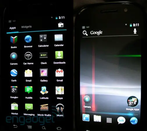
It’s not quite finding an iPhone in a bar, but when one smartphone shopper purchased a Nexus S on eBay Ice ream Sandwich was the last thing he expected to find. That’s exactly what happened, though. Rather than the expected Gingerbread installation, the new version of Android was installed in all its glory, featuring build number IRK48 and kernel 3.0.1. The user quickly put together a two minute video preview and shipped it off to Engadget, where it has been posted for all to view.


Hmm, could the Google apps icon just be the new look for folders? I hope so, looks nice.
Soon I will have 4 phones running ICS a Nexus One, Nexus S, Nexus Prime, and a rooted Vibrant.
Mwahahahaahhaha!
Why do you have four phones? What’s the point of that?
It seems that having phones with stock Android is pretty rare these days. Also I have three now. I use the Nexus S and the Vibrant as my back up and the Nexus One is being used my someone else. When I get the Nexus Prime on day one I will probably sell my Nexus S and spread stock Android all around, of course they will have to be worthy of a Nexus.
my next phone willl be the G3, ICS will b on that for sure, especially since its probably not coming till late next year…..all the goodies just coming out now like NFC and google wallet and tegra and high end processors will also be on the phone…ill wait for that than buy phones only to sell them later when something new comes out…i love my G2 and nothing right now surpasses it in my view…but its my opinion so its subjective.
i have to agree im still on my g2 and im the envy of everybody’s phones i have not yet seen a phone i would trade for although i do see nice technology coming out i cant wait for the g3.
looks kinda cool, but don’t see why it’s taken them this long to do what a ROM dev could do in a month, unless they’ve added a ton more APIs
Most of the workmak will have been behind the scenes maintaining compatibility for all screen size variations.
I think most of the work is behind the scenes in combining honeycomb and gingerbread too increase compatibility with more devices etc.
However I do agree that it has some nifty features, but it can still be a fake.
I am not sure….the main reason being that ICS was supposed to be released on the hardware-button-less Nexus Prime. So far I see no way of using the “home” / “back” / “multitask” options when inside of an application. Where are the onscreen buttons for those options when you are using an app?
How do you get out of an app if you have no “home” / “back” / “multitask” button?
The Nexus S has the softkeys at the bottom, so its obviously not going to have the softkeys as well as the on screen buttons. The Nexus Prime will have a persistent bar across the bottom like Honeycomb does as will all devices lacking designated buttons, but its not a requirement.
Do you have a link/source for that? Or is it more speculation you google sheep love to post over the internet?
WTF? No, it was confirmed by Google themselves. Also, Google never said ICS would be the death of off-screen buttons. OEMs can still use capacitive buttons if they want.
I’m referring to his claim about the Nexus Prime having a persistent bar across the bottom.
Again.. do you have a source for that? Because i haven’t read that anywhere.
Still crying I see.
http://robdamanii.com/macros/Waaambulance1.jpg
Its gonna be able to run on phones and tablets with or without buttons. The OS will check if there are hardware buttons and configure itself. Do you know how pissed people that just bought Bionics, Sensations, GSII’s, etc, will be if they couldn’t run ICS just because their phone has buttons?
You mean what a themer can do in a month? What Google does is a bit more involved than changing some images
I think it’s a cooked rom
So this is the major UI overhaul you android fanboys have been gushing over?
Boring. Another disconnect in the books between what the fanboys think Google will do, and what Google actually delivers. I need to find somewhere that will allow me to bet on events like this.
at least they change it every time a little bit, not every three years! go be a troll somewhere else!
ooooooo a blue line!
Change doesn’t always mean its good, numbnut. Try again.
Then enlighten us oh wise and unbiased one.
a blue line is better than no line. at least google innovative and changing and not having the same look since the beginning. and guess what? the ui has changed like 3 times since its released. iphone? zip zero nada. so you rather your iphone ui stay the same? atleast we have the ability to change it whenever we want to.
hey wackjob, maybe you’re one of those simple minded iSheeps that can’t handle change. maybe it’s not good in the beginning but it makes way for future innovation. I don’t see any point arguing with you, a stupid will remain stupid unless they let go of their ignorance. so believe whatever pleases you. but from the comments I can tell no one thinks like you. doing the math 10 people can’t be wrong but 1 can!
Well you’re just so cute, aren’t you? So what do you do for a living? Are you another one of those petty Android developers? The ones who can’t get a real job and make real money? Keep voting for Obama, dude. Maybe he can continue to make it rain on you unemployed losers.
I don’t wanna make you feel bad but no I’m not a dev, I’m a rocket scientist, and if it wasn’t for those devs we wouldn’t have this much goods on our phones. so you better be thankful for what they are doing for us and stop whining or you can stick your phone in your big sorry ass and keep your opinions to yourself. and btw get a life and stop complaining.
You’re an idiot who has missed the whole point of ICS. It’s intended to blend phones and tablets, allow for the end of the dreaded fragmentation (oooOOOoooOOOoo scary) and continue improving the Android OS as a whole. *If* this is actually ICS I see quite a number of changes and optimizations that are quite interesting. If you can’t tell the differences between existing versions of Android and this iteration then go back to your iphone troll.
I don’t use an iPhone. I use a Nexus S.
Sorry if I have higher standards than most of you. I guess that’s what happens when you have taste.
Lock screen and multi-tasking alone merit a major upgrade. I love it. To bad you hate your life.
The only thing I see your “high” standards achieving is setting you up for disappointment. Most of us are actually look forward to this. You on the other hand will face disappointment after disappointment with your so called “higher standards”.
Also saying you have “taste” is the maybe the dumbest thing you could’ve done. It’s like saying that your opinion is somehow more valuable. Frankly, if anything, it should be less valuable after the crap you just posted.
Ritish, I have just seen a picture of you on the internet, and I can definitely say you have no taste.
Khaki belt with a blue shirt? Man.
Looking at your comments, is that all you do? Going around on phandroid and engadget posting flame-baits?
Get a life.
ad hominem is not an effective argument strategy.
sounds like you have an iphone the way you talk about android
More people would be on your side if you didn’t comment like a whinny b*tch all the time and acted like an adult.
I don’t care about adding people on my side. I know I’m right, and that’s all that matters. If you’re so happy with your life, why are you stressing over what I do bro? Live. It. Up.
Damn you my friend are the perfect troll, you just do it because you have nothing better to do.
Thanks, wakkoman. Because of you, I won the bet that there would be trolls showing up in this thread.
Sweet bro. Who took that idiot bet?
Your ugly and your momma dresses you funny. People with personalities like yours, make the world a shitty place.
As opposed to the people with personalities who call others “ugly?”
That’s rich.
Looks good accept for that teal blue color that keeps rearing its ugly head in the notification bar and the app drawer among other places.
It’s supposed to be similar to Honeycomb in that regard. In which case I would attribute the “teal” hue to the camera used to shoot the video. The blue is actually a much darker more purple-blue shade in Honeycomb, I would imagine that’s what color it will be in ICS…if this is real and Google ends up using Honeycomb design elements.
I read somewhere that ICS would be theme-able. I hope that means the areas where we see the teal highlights would be able to change to the color we choose. Personally I would prefer it to be green. That way, the icons stay the same and its still has a unified look but you could still add some personal flavor.
I don’t understand why people keep saying this. I think the teal and black is a cool look. Very…Tron.
This video must be getting pounded. It’s buffering ridiculously slow for me.
They’ve also put it on youtube because their servers couldn’t handle the load.
http://www.youtube.com/watch?v=h3Pb6IyFvfg
lol…load.
seems fake too me….
Looks fake to me.. at least I hope it is..
You hope it’s fake? What would you rather see?
My god thats is sexy
I would have taken a NAND backup to share before shipping it out if it were me
It was just the video. He still has the phone.
Too bad, if engadget or phandroid had the phone, I bet they’d eventually sell it to the XDA developers, who’d create the rom quickly for the rest
I think it is legit, they need to tweak the shade of blue though
I also say it’s a fake custom rom.
It looks nice but the only function I’m seeing that is amazing and new is the recent apps menu.
And I hated that implementation in honeycomb…It wasn’t halfway as functional as it should’ve and could’ve been.
It looks 100% legit to me. I don’t know why people think it’s fake.
But now I HAVE to wait for the next Nexus!
I’d say that this is likely real. The screen rotations and animations in the menu are too good not to be.
I’m also hugely unimpressed. I was hoping they’d move away from the hideous Honeycomb look. It’s very cheap looking. It’s like going back to the 80s and asking them what they think the future looks like.
Black and blue is one of my least favourite colour combinations.
I like the color combo but the overall design doesn’t look much different from 2.3 to me. Ohh well…
Yeah, I think it looks great. But I understand that aesthetics are completely subjective. I’m just happy that I’m one of the people who likes the teal on black look.
Yeah! I think the black/teal/blue look is awesome! I always (secretly) disliked the green from 2.3 =)
Black/Blue is awesome, teal not so much, but I have always HATED the Green!
Looks pretty legit to me, but I dont know if I really like it. The new touchwiz looks better than this..
A bit of investigation (Reddit) suggests that this is probably just a port of IceAndFire Rom for the Milestone/Droid
http://www.youtube.com/watch?v=amh39vLtHKo&feature=player_detailpage#t=389s
No it’s not. IceAndFire only have the ICS launcher by Syndicate Apps.
This shows a lock screen, a different app drawer, a different notification bar. It’s ICS no doubt.
But the launcher and running tasks are identical. How could Syndicate Apps have perfectly guessed how the launcher would look and behave?
This is not the ‘glassy’ finish which the guy from 4chan described (and either Samsung or Google confirmed as being legit – I forget which one). Nor is there a games drawer.
The browser icon is also inconsistent with what the 4Chan guy said is coming.
Google has Motorola in its hand….
May be they have took some knots from it… ;)
But surely, this is not ICS…. :)
Get off your butt….well actually stay on it, just take some time to google it man. Here’s the link to the Syndicate guys’ launcher, they even mention that they guessed what it would look like based off of honeycomb’s feature. Why is it so hard to believe that they would be right and that’s what Google would end up doing?
http://www.syndicateapps.com/main/ICS_Launcher.html
You think they guessed, with 100% accuracy. Every single design feature? The exact placement of the titles, down to the letter?
I’m not saying it’s impossible, but if they did, then fair play to them!
100% accuracy ?
About running tasks : Rectangles ≠ Squares.
What custom rom has categories in the general settings menu ?
This is sexy
This isnt the real thing its rooted. Why Google would have a black search bar?
The search bar on Honeycomb tablets are black. It is part of home launcher vesus being a stand along widget
It’s not black, it’s transparent, and it’s permanently embeded on the homescreen like in Honeycomb.
Dble-Post
no way this is ice cream sandwich it doesn’t look legit I seen plenty of themed and custom roms all over xda developers there is a bunch of honeycomb and gingerbread and rethemed roms everywhere and this smells like it.
That’s it?? Jesus I hope it’s a fake. If not, then who fuckin cares about Ice Cream sandwich? At least on a phone.
This is a frustrating video to watch, you can’t see the whole phone, the camera is shaking the whole time, and not much of ICS is shown. What about the new browser? The new GMail? He HAS the phone, he doesn’t need to rush out a 2 min video, when he could record a 10 min one.
wow, its sad that something like this translates to “frustrating” to some people.
I think I am hoping it is a fake. I want ICS to be better than that.
ditto. I hope this is fake. The tron look is a little too …. ummm… not me.
Says the guy with a robo as an avatar. Ha!
But in all seriousness. I dig the The Day the Earth Stood Still rep goin on there.
Not much to get excited about. A new lock screen and cumbersome task switching. Yay. -_-
This is awesoome!
IOS looks exactly the same for 4 years, copies features from Android and WP7 in the next unreleased version, and people complain that ICS hasn’t changed enough?
Gimme a break. You can keep your stagnant glass brick. I’m hungry for an Ice Cream Sandwich!
this isnt ICS i had this installed yesterday on my phone it was a developer that made a ice cream sandwich look like launcher and he made his own stock rom build so it looks like its official but it really isnt
So how bout you link us to what you had so we can check it out. Real or not, I’d like to get that up and running on my phone.
http://www.syndicateapps.com/main/ICS_Launcher.html
And I disagree with James. This launcher is completely different then what’s happening in this video. This video is showcasing ICS, I’m almost completely sure of it.
If everyone thinks it’s fake and is a custom ROM, why is there no SU app?
It’s pretty easy to hide or uninstall the SU app. With that being said, I still think this is real.
this looks like a rom with a launcher
http://www.youtube.com/watch?v=fRQXD4YYHyw
I don’t get it… GB was a disappointment to me, because there wasn’t too much updated about it. What is super different about this?
http://crazyassvideos.blogspot.com
Well, it only looks like they’ve changed the lock screen, the camera app (was that a panorama mode?), the launcher, the settings, and the notification area…i.e. *everything* shown in the video.
A better question: what were you expecting?
Not sure what RL was expecting, but I was expecting something more like Honeycomb. I get the colors and what-not but the launcher isnt that much different.
Om Nom Nom
It wouldn’t be a “userdebug” and “test” in the buildnumber if it was real
No convinced this is genuine, but not a big disappointment if it is. The new lock screen and app draw look pretty good. Judging by the Nexus S background I’m wondering if this is still an early build and maybe not final.
Even if it is final, I don’t think a Nexus S would do it justice, to me ICS is all about the buttonless display which we don’t see here at all. Only a couple of weeks to wait!
The shaky camera made me vomit.
Was Michael J. Fox holding the camera for that video?
Well this has been proved to be real check it out here
http://forum.xda-developers.com/showthread.php?t=1281442&page=57
So, why was there not a segment where shaky-cam went to About Phone> Software to show that it’s 4.0? Anybody? Bueller?