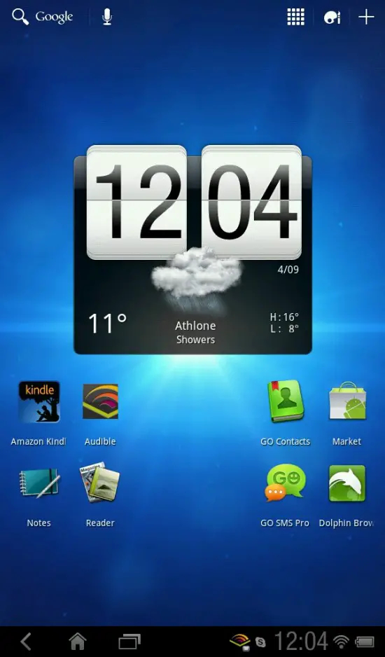
Wondering how much your HTC Flyer would be transformed once the manufacturer brings Android 3.0 to your device? Developers at XDA got their hands on the RUU for the Flyer and have been hard at working hammering away at a ROM.
While everything on the functional side may not be perfect yet, we’re just happy to see it and know that it’s officially coming. HTC’s added their style touches here and there (namely in the status bar and in the settings menu), but you can clearly see Honeycomb shining through.
Keep your eyes on the Flyer section at XDA as we’re sure you owners will want it as soon as it drops. Anyone suddenly wanting one of these tablets now? [Thanks Joe!]







Settings, looks Bugly (= But ugly)
I love you <3
What horrors shall await us?!
From the first pic, I thought I was looking at Windows 7 with HTC’s widgets.
The flyer is intriguing… i’m a htc fanboy, lol, but think i would rather go with the 10.1 if i getting a tablet
It all looks fine to me
a big clock occupying 90% of the screen, and boring static app icons under it.
wp7 mango cant get here fast enough.
yes this took months of complex programming
Sounds like your describing about 75% of all Android devices homescreens………..
Don’t like the look? Change your widget(s)……..
Like I said, It looks fine to me. It’s nothing spectacular and it isn’t making me vomit. Looks like a typical Android homescreen which looks just fine.
90%? not as much space taken up as your tiles on WP does.
and that clock widget is *removable*
sure, your rectangles with gifs are much more entertaining.
finally with mango you’re getting copy and paste.
*sigh and pats back* its okay, WP isn’t really that bad.
IT’S COMING,….
GET THE LATEST NEXUS PRIME NEWS:
http://googlenexus-4.com/
-JosephInEgypt