If you fancy yourself a music aficionado but the current crop of music players for Android just aren’t doin’ it for ya, a new challenger has entered the ring. UberMusic was just released today onto the Android Market and comes to you from the creative force behind Launcher Pro, Federico Carnales. Obviously, Mr. Carnales knows a little something about customizing and this is where UberMusic receives arguably, its biggest feature: themes. Yup, it’s possible to get 3rd party skins from the Market that will allow you to completely transform the whole UI of UberMusic, even adding custom themed widgets and an “uber” nice live wallpaper. So if you have always been into the look of say, the Zune music player (guilty!), you can finally have your cake and eat it too.
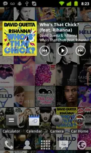 UberMusic is available right now in the Android Market for $3.50 and if you’re one of “those types” that doesn’t like paying for their apps or simply can’t because of your region, Mr. Carnales mentioned today via Twitter that a free version of the app could be in the works.





I’ll give it a shot in a bit.
What he should do is make it compatible with MIUI and the lock screen somehow.
Yeah, I’ve been saying the same thing about Google Music =/
Chris, my google music is controlled from my MIUI lockscreen. You have to set which music player you want as default. Menu -> settings ->(programs tab) -> default application settings -> change default music player to “Music”. Music Beta controls from the lock screen =)
the same would work for any music program. I use to use uber music beta with miui lockscreen.
Running 1.7.22 (MIUIAndroid version) on my og Droid and the lockscreen controls will appear when music is playing….period. It doesn’t seem to discriminate between Google Music, the MIUI player, Winamp, or UberMusic.
Hell, I even have a Grooveshark streaming app that the controls work with.
Metro is ugly.
I love Zune/Metro UI. Clean, clear and undercontrol.
Yea, but you also like miui. Nuff said
Miui is an awesome UI, whatchu talkin’ ’bout? As far as the MetroUI, I think it works great for the Zune, not so much with WP7.
You don’t like MIUI? Weird.
that or you already paid for POWER AMP
Yeah thats kinda why I wont buy it. Love the Zune UI though.
OMG! YES!
I’ve completely gave my launcher a clean, “metro” look with the minimal white theme, Bobclockd3 widget, and circle battery widget. This will make it even better.
I sometimes am guilty of wishing the Zune/Metro look would be in Android. I love it…
I don’t think I would want it by default –but the coolest part of Android is that we can make our OS look like however we want =)
There are several WP7 style launcher options out there…I’m sure if it hasn’t been implemented already, there’s bound to be one eventually that mimics the Zune HD interface.
While the UI might be fancy, it’s still way behind Winamp. Returned and refunded. Will purchase again when it catches up with at least Winamp. My biggest missing feature is lock screen controls. While Ubenmusic has an option to disable the lock screen and always show its Now Playing screen when I wake up the phone, it not implemented right since I can press the back button and go to the home screen. It effectively disables locking to prevent accidental input from launching apps/making calls.
Hopefully Fred will fix it to work like Winamp where if you wake the phone you go to a player screen, but if you hit back, you go to the lock screen. Winamp even works correctly if you have your custom lock screen like WidgetLocker.
Buying now, this player is much more sexy than PowerAmp, the style of it is getting old… But I will miss my dear equalizer… Made the music sound amazing. ;(
Once this includes some kind of equalizer….. it will be GAWDLIKE :D
I know right? :D
I gotta throw in a request to Fredrico for that….
Another game winning feature would be the ability to exclude certain folders from the library. Even when you do the SD scan.
If I could keep my ringtones/alarms/notifications from appearing in the lists I would be a very happy camper.
No streaming? No bueno.
I don’t see much difference in this and the beta that went out there a while back. No lock screen controls & still a bit of lag. Looks good but until it has LS controls and ability to be default player certainly not worth paying for. Should still be in beta or free mode IMO. It also seems that this music player has come at the cost of Launcher Pro rewrite. I was anxiously awaiting the LP rewrite and release but have given up on that and gone to Go Launcher.
While I do like the app and have used it through its betas I will not purchase from the author simply because of the promised launcher pro rewrite that basically was blown off.
Hive Player, a Honeycomb tablet music player has been out for over a month. It’s only $1.99 ($1.50 off than this player for phones) and phandroid.com can’t post it. Nice. Real nice. Scrollable widget with full music navigation…….
I don’t see much difference in this and the beta that went out there a while back. No lock screen controls & still a bit of lag.
Cell Phones