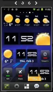
This probably seems small, but one of the biggest annoyances I had with the web version of the Android market is how frustrating it was to navigate screenshots. Previously, if you opened a screenshot you had to close it before you opened another one. And you couldn’t just click away from the screenshot to close it – you had to specifically press that X.
Google’s made a quick change, however, that’ll make viewing screenshots far more enjoyable and efficient. You’ll get arrows to go back and forth between shots and you can even rotate them. And yes, clicking away from it now closes the screenshot. Like I said, not the biggest change in the world but it was a much needed one. Go ahead and try it out for yourself at market.android.com.


what are the widgets shown?
The Weather and time one i mean
https://market.android.com/details?id=com.levelup.beautifulwidgets&feature=search_result
My god, those widgets… they’re beautiful.
The thing I really want to know is when will the Market refresh happen on the mobile device. I remember seeing on this site (I believe) a redesign of the phone market. I really liked what I saw. I hope it happens soon.
The Amazon App Store (mobile) is the kind of refresh the Android Market should be looking to. Amazon’s store is really clean, uncluttered and simple to use and a lot easier to just search through the market.