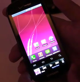
Last night’s Samsung mobile event brought exactly what we thought it would – the Samsung Continuum on Verizon Wireless. We got a chance to play with the phone, which will become available on November 11th for $199, and I would describe the experience as awkwardly interesting.
The Continuum is much like the other Galaxy S phones but instead of a 4-inch screen its main display is only 3.4-inches. The Home/Menu/Back/Search buttons are below the main screen, and a secondary 1.4-inch display is below the buttons. It’s definitely an attempt by Samsung to innovate, and I applaud them for that, but I’d have to categorize the result as more gimmick than practical.
Check out the Continuum commercial:
In my opinion, I’d rather just have a full sized screen and turn it on and off when I want to check my notifications, text messages, twitter or whatever else. A regular status LED indicator light does a fine job at alerting me when something is waiting to be read. Do I really benefit from having a dedicated widget area on the hardware side? With a full sized 4-inch screen, you’ve still got the screen real-estate and the ability to place a social media widget on your phone through software- isn’t that good enough?
One advantage could be battery life savings, since instead of turning the entire screen on and off, you can choose to only turn on the smaller widget screen. But in reality, that may not be the case; although they function as 2 separate displays it appears that they’re part of the same screen, which would mean regardless of how much of the screen is “lit up” they would be consuming equal levels of energy.
I do like how the ticker screen lights up when a new notification arrives, which is more subtle and practical if you’ve got your phone at your desk or on the table, but I’d still prefer the larger screen. Although it attempts to add functionality and usefulness, I personally think the phone’s secondary ticker display is unnecessarily confusing.
 But that’s just my opinion, and I can see how some people might be attracted to this phone for it’s quirkiness or maybe they really like the Ticker display. But that’s the thing- this phone is all about the ticker display. The Continuum will be sitting next to the Fascinate in stores, leaving consumers with the option, “Do you want this 4-inch Galaxy S phone, or this 3.4-inch Galaxy S phone with this little widgety ticker thing at the bottom?”
I’m guessing most people will choose the 4-incher, but I suppose time will tell. After looking at my video a few times, I can see how grabbing your phone, touching on the grip sensors and seeing just that one area light up could be cool/useful, I’m just not sure it’s a big enough feature to overcome the loss in screen size.
One function where I can see this being of GREAT use is for multimedia. When listening to music, you can have the widget screen feature audio controls like changing tracks or pausing. I can see the value and cool factor in that, and if there were more uses like this, perhaps the Continuum would stand a better chance. When doing Turn-By-Turn with VZ Navigator, the widget screen will always show you the next turn you’re supposed to make. That’s 2 unique implementations that I actually enjoy, but they’re usefulness is still limited.
Maybe Samsung will add more custom widget implementations in the future to further the value of the ticker screen, or perhaps even open up an API for developers to leverage the uniqueness, but I don’t really see that happening.
So there you have it… the Samsung Continuum: another Galaxy S phone that tries valiantly to put its own stamp on the face of smartphones, but in my mind, I don’t think the ticker/widget screen concept will continue on much longer.


first
soft phone
Some people might gravitate towards it but its a little to weird for me.
But the resolution of the screen is the same as a 4″ screen, so actually you’re getting the exact same amount of screen real estate — functionally in higher resolution — with the addition of the ‘ticker’ display. So the overall screen real estate is greater than the 4″ phone, practically speaking. Do I have that right?
Looks like a unique idea. I think it’s success all hinges on how much the ticker can be customized and what information it can provide. I do agree though, sacrificing screen size on the main screen is a drawback.
I agree that this is a gimick phone. I think I’d prefer my 4″ Captivate. Although, I’m interested to see what the devs at XDA do with that extra screen.
meh
Looks a lot like HipLogic *Spark except that *Spark gives you multiple widgets on your home screen and runs on any Android phone or version of Android. http://www.sparkmyphone.com/
Actually, because it’s an OLED display only the portions that are lit up are using power – so you do get some power savings by only turning on the bottom screen. I’d also point out that they have a mostly black color scheme for most of the bottom display, which saves energy with OLED as well.
On another note, there are some cool hacks for the Galaxy S line ON XDA that will turn a single pixel on the display on/off when it’s locked to mimic the functionality of a status LED (since they don’t have them built in), and these use almost no additional power.
I like the concept, especially if the widget screen doesn’t lock. I find it annoying to have to go thru 4 steps (wake the phone up, unlock the screen, pull down the notification drawer, choose the notification that just came in) every time I get a Tweet, message on Facebook, etc.
Double meh, with extra meh on top.
Junk! !!
I really like the concept but it needs to go in another direction. How about in the phone setting to have your phone change to 3.4 inches and have text or another thing you like. I thought it would be nice to have a screen on the back of the phone or have a slider with a screen, but that might be to much work. I really like the concept . If I was using it only for business it is a wonderful idea. I give samsung 2 thumbs up.
If I’m correct it is infact one screen… not two. I’d just scrape some paint off and cyanogen mod, they we have the first 16:9 Android phone :D
One continuos Super AMOLED screen would have the same battery saving effect by only powering the area of the screen that contains the ticker informnation. Except now you (Samsung) lose the option of changing the widget (at least in size) in future software updates. Seems a little dumb.