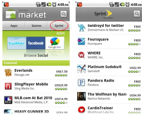
Sprint – like Verizon, and other carriers – has gone and taken that nice “Downloads” tab and converted it into a list of apps they suggest users download. Don’t freak out just yet: your downloads are still accessible by tapping the menu button that we know and love. This probably won’t sit well with you if taking that extra half of a second to get to your downloads is too much to endure, but you’ll just have to deal with it. To Sprint’s credit, most of the apps are quite good so try some of them out if you haven’t already. [Thanks, Heroid007!]


I was just thinking to myself, I was downloading some stuff earlier today, I didn’t see a Sprint tab!
I just went back to the market and its definitely there! I don’t mind either. I think it’s pretty cool. Gives the market an exclusivity feel for us Sprint users
I don’t know how I feel about it, since at least you can still get to the tab via the “downloads” menu button.
However some of the suggestions could be better, like twicca is far better than twidroyd, but I suppose it is all just a matter of opinion.
Which is why I don’t see what was wrong with going through the different categories of apps that are sorted by popularity instead of one companies opinion. But it isn’t a big thing either way.
tmobile has the same thing on the vibrant. i wish you could turn it off
I don’t mind the change too much but there was one minor thing that irked me. They changed the app without my permission in order to promote/advertise their suggested apps. It’s a small change that doesn’t bother me, but I hope they leave it as is and don’t make any large sweeping changes to the market to promote their own goods. If they were evil, they could saturate it with their own paid apps.
I can see a benefit to new users who might want to explore apps. Having a Sprint suggested apps list is a nice feature.
I was excited to see the Sprint tab on the market because I thought maybe Sprint would have their apps up and maybe allow us to uninstall the crappy apps that we didn’t want…but I guess I was wrong…and very disappointed.
If carriers understood apps and software so well, they should have designed an o.s., they didn’t because they couldn’t so they shouldn’t fuck around with what they were unable to accomplish themselves.
i agree with dman977 if they quit putting there bloat on maybe we could get an os update faster than 6 months after release
If a carrier does that to my phone then that’s it, I would not buy it. If carriers continue crippling Android phones I might have to flee to safe iPhone-land, at least Apple know how to put carriers in their place!
Wow! Exactly like the Verizon market tab. Amazing! How do they do it?
It is for them to distribute their service oriented offerings that only work on their systems. For instance Verizon has a ‘Verizon Account Manager’ where you can check your minutes and stuff. All told there are about twenty verizon specific apps and most of them would not be appropriate to realse on the general marketplace. What would a Sprint customer do with a Verizon account manager? Or vice versa?
You guys are that bent out of shape because they have a dumb tab in the market?
I mean you can access downloads in the menu so whats the big deal?
I agree with Matt. Big deal. For the average Joe this is probably a Good Thing (R). They will get a warm and fuzzy feeling about the apps being recommended by their carrier.
FWIW, I have an AT&T tab. You may be able follow the instructions here (http://briefmobile.com/how-to-remove-att-from-captivate/) to remove the market restrictions — this involves providing modified identity information to the market which fools it into thinking you are not on AT&T. The same procedure might work for you, if you want the Downloads tab back. I use AppBrain for the most part, so I don’t care that much.
Matt, although I agree with you, a little bit, the problem is “control”. It’s annoying the invasive lengths the carriers will go to and the ever present “in your face” crapola is like sandpaper to the skin some times. If I wanted to see what Apps Sprint might be recommending, I could go to their web site and not have it shoved in my face! The Market (Google) should not be carrier specific or shall we soon be only seeing the app’s which our carrier will allow or recommend? I rooted just to get rid of the ridiculous bloat-ware they stuff onto your phone so take it for what it is… Sprint Junk! If I need a function on my handset, I search for it. If it does what I want, I keep it, buy it, etc. Maybe Sprint should have put their suggestions in the menu selection, rather than forcing everyone the extra button press to get to theirs (downloads). Like I said, it’s all about control!
I see this as the step necessary to allow billing through my provider. It was the concession needed from Google to manage the new payment.
T-Mobile has had this tabs forever, it’s not just a Sprint thing and oh ya….SPRINT SUCKS!