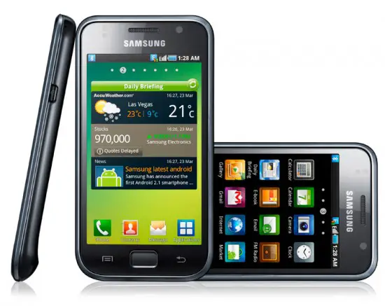
The masses were at CTIA 2010 and gravitated towards a few new Android handsets, the Samsung Galaxy S being one of them. We took an intergalactic ride around the interwebz looking for Samsung Galaxy S videos and impressions and we lay our findings before you:
Revision3
MobileCrunch called it a beauty, saying its the most gorgeous screen of any handset they’ve ever seen.
Intomobile said, “Even underneath some seriously bright flourescent lights, the Galaxy S’s Super AMOLED shined flawlessly”
MobileBurn
PhoneDog
ikejhamb
PhoneScoop
PhoneArena
The overwhelming conclusion is that the Galaxy S screen and display is simply stunning. Whaddaya think?


OMG ! NO LED Flash ! Have the gone crazy ??? can’t be true…
uhmmm..pretty disappointing..looks EXACTLY like an iphone. Talk about having some creativity..they should get sued..
Sorry, can’t hear the videos, is this Bada or Android?
Like if you look at the Samsung Superwave phone, it runs Bada, and has a similar looking interface. I’m thinking that Samsung might have put their Touchwiz 4 interface on android for this phone.
OK, so after all that went into this phone- did they seriously not put an LED flash in there for the camera??? I can’t see one- hopefully I am missing it. Is there one???
Turn to 3:46 of the 4th video. “Samsung I900 ..”
Do you see a LED Flash?
Samsung just has too many phones named Galaxy.
Galaxy (1)
Galaxy 2
Galaxy Spica
Galaxy S
I’m pretty disappointed in Samsung. I expected them to be making the best Android devices, but all of their devices seem to be just half-hearted attempts. They don’t even bother coming up with new names.
That said, if this phone gets rooted and gets some ROMs with better UIs, or just stock 2.1, this would probably be a great phone. Still, another disappointment.
And Galaxy Lite.
i lol’d at you expecting a good phone from samsung.
The screen looks pretty cool.
I want to know the specs of the device.
Its a pretty good phone. 1ghz, 4 inch screen. 2 cameras.
I think the form factor was more impressive on Samsungs Omnia HD, but I’d still rock this phone. (Lol, Looks TOO much like iPhone)
the only thing going for it is the screen and interface, but…. no directional touchpad it is ONLY a home button and no led flash and it doesnt have a search button like every other android phone and the interface is nice but it is custom so you know your stuck on 2.1….
i just saw the last video and there is a HUGE difference in brightness at 1:45 between the iphone you even hear them say woah! lol
Ok there may be some sort of similarity but then don’t forget that the view of the programs can be changed to list, iphone can’t. As long as google apps continue to grow and make sense apps is what I mean not 150000 and 100000 useless apps or the same exact app with a different color. It doesn’t look like and iphone because the home screen has widgets that can be done and iphone’s home screen is the program menu so please lets stop judging blindly and see what the phone is which is exactly what the Nexus one is and with more spice for a better experience.
@phoenix i know right, lesson learned.
I want to like this phone, I really do. The screen is the biggest draw though. I was so blown away by the HTC EVO 4G that I haven’t had time to think about any other phones. I still am drooling over the EVO but I wouldn’t mind having a phone with that screen. Sadly the design is a little too iPhone-ish for my tastes though. I love the EVO’s lines, oh my is it a beautiful device.