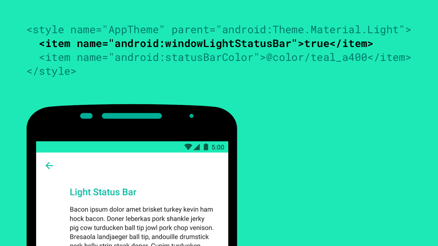
Android M will have a lot of cool new features, but one of the smaller ones Google didn’t mention was for app developers. Roman Nurik has revealed a new windowLightStatusBar flag that will tell the system to make icons and text in the status bar a translucent black color instead of the usual white.
This flag will be useful for apps which use light-colored tint for their status bar where white icons might be hard to read. It’s small, but developers who remain mindful of these small details tend to earn loyal userbases, so be sure to use it if your app needs it!
[via Google+]


Nice
I think the white icons in the status bar look the best…
…until there isn’t enough contrast to properly see them. Being able to actually view your status bar content is pretty vital.
One of the small things with Wanam that I appreciate.
Nice touch. Although I do loved the color status bar in Android, some of the apps have a light or white color making the icons hard to see, glad they will fix this.
Am I in the minority when I say that the toolbar should just not be ever present? One of the best things about alt launchers is a degree of immersive mode. It would be great if even at the very least there were an option for a pull down toolbar. Hell, even on windows I have the task-bar set to auto-hide. There’s no reason for me to have an ever present reminder of what I’m running, the weather, time or battery state if I’m in an app or cruising my widgets om the home-screen. Again, this is probably just me, and I’m needy apparently.
You’re in the minority.