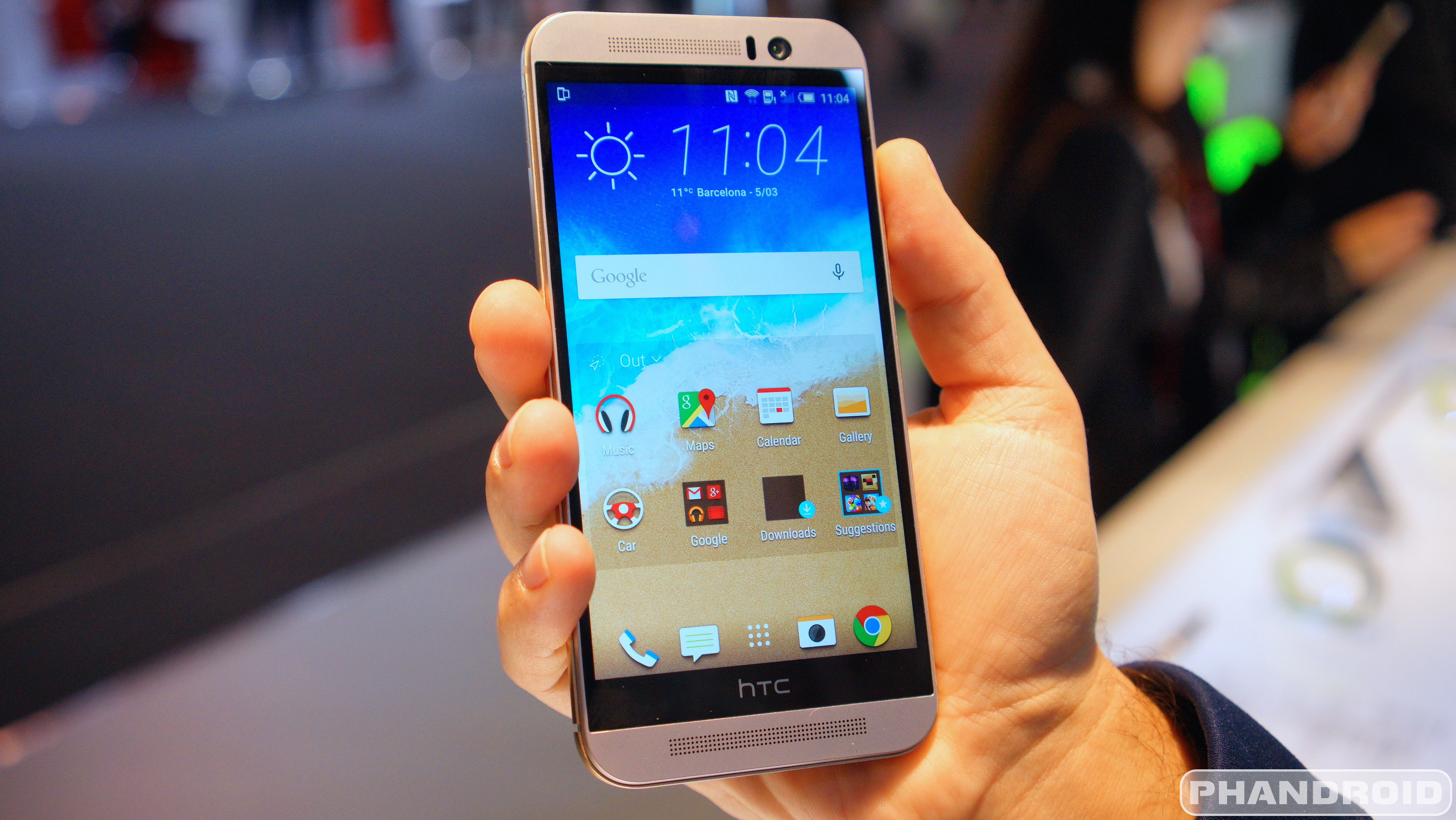
We’ve got to spend a lot of time with the HTC One M9 these past few days. During this time, we’ve been exploring all the ins and outs of its new software, HTC’s new and improved Sense 7. One of the more noteworthy new features (we already showed you guys every single new theme) we found was the new custom navigation bar.
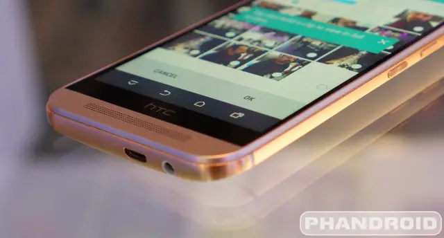
Now, on most Android devices you have the typical Android software buttons — back, home, and recents — that rest along the bottom of the screen. For Sense 7 update, HTC is finally putting those software buttons to good use by giving users the ability to customize, not only their placement, but squeeze an extra button in the nav bar as well.
The function of this extra button can be changed to a few options: turn off screen, auto rotate, notifications, or (our personal favorite) hide the navigation bar completely. We know what you’re thinking, if the navigation bar is hidden, how will you navigate around the UI? Easy. Simply swipe up from the bottom HTC black bezel bar (see, it does have a function) and it reappears again.
Also worth pointing out is how great the “turn off screen” and “notifications” button could be for those with smaller hands who have difficulty reaching the notification drawer or power button on their device. The best part, once Sense 7 begins rolling out to older devices — like the HTC One M8 where the physical power button was tough to reach even for us — you should have no problem at all using the phone 1-handed.
Apparently this feature can also be found on the LG G3, even if HTC believes hiding the nav bar is a never-before-seen feature exclusive to the One M9. You can take a look at the new custom nav bar in our video down below.
Update: A previous version of this post incorrectly stated this feature was exclusive to the One M9. We’ve since updated the post to include the LG G3 as well.





Lol, if they really wanted to expand screen real estate, they could’ve just moved the buttons back to the bezel next to the HTC logo, like the M7
Yeah, not understanding the need for the black bar. What changed after the M7?
More than two buttons. :D
Srsly though, look at a teardown for the earlier phones. People keep saying amplifiers but it’s also where the screen wiring harness is.
Plus, hold a headphone jack up to the bottom of the phone – easy to see that it penetrates to just past the halfway point of the black bar.
Losing the capacitive buttons, by itself, doesn’t allow removing the bar. Other device layout changes would have been necessary.
I think people would have been happier with just a smaller black bar.
this should be on every phone really…..
I still don’t want virtual buttons.
And you don’t have to have them. TA-DA!
-HTC
P.S. You’re welcome.
I’ve been using this on my Nexus 7 for over a year now. Same functionality, on any device.
https://play.google.com/store/apps/details?id=com.gmd.hidesoftkeys
If you’re interested, it requires root.
Does it act wonky in some apps? I use Power Toggles and they have some root functions. One of them is to remove the navbar. However, when I do that, some apps act wonky. They don’t allow me to touch or interact with the app. The moment I swipe back up the Navbar, they act correctly. It’s only a few apps.
I’m wondering I use the built-in phone function if I’ll have the same issue. Hmm… I should probably try again. I’ve tried this quite some time back and there’s been countless updates. Things *may* be fixed this time.
When I was initially looking for this functionality, I went through many different apps that gave similar things. Some of them mostly worked but with a few hiccups. I never used Power Toggle’s root functions (only normal) so I can’t say how it compares but so far this one has worked very well on my Nexus 7. I haven’t really come across any issues in normal usage or games.
Rooted users are probably shaking their heads right now trying not to laugh…
Actually, this is good. As time goes on, I slowly find a reason to not root my phone anymore.
Oh I definitely agree with you on that.
“As time goes on, I slowly find a reason…”
“Slowly” is putting it mildly lol. This should have been a thing in the late JB or early KitKat days for OEMs. Better late than never I suppose…
Bit of gratitude deserved for those that don’t root. Nice little treat here.
But the real beauty of root is, someone will take this idea, and make it for any device like the S6. But, you will need root to do it. So fine, maybe you don’t root the M9, but then I will root the S6 and get this same function.
Rooting brings so much joy doesn’t it?
Orgasmic.
If the HTC bar is capable of detecting input, it would allow people to assign back and home to the left or right sides of the bar. Is it the bar that is doing the sensing, or is it simply the screen?
I think it’s just the screen. It’s the edge of the digitizer that detects the swipe motion and brings the nav bar back into visibility.
That’s what I was thinking, but the wording in the article is unclear. In the end, as with everything, time will tell.
I’m loving that you can add a “sleep” button. This means I won’t need to use Sweep2Sleep functions. This is SO lovely!! OMG!!
Every software update is making it one less reason to root. I think at this point all I need is to root my device. I’m starting to not even need custom ROMs.
Yea, manufacturers such as HTC are finally putting in the customization that we would otherwise be looking for in a customer ROM. My M8 is the first android device I haven’t rooted, because it does everything I need it to out of the box. But after closely looking at all the features Sense 7 brings, they brought just enough to make it a very useful update over Sense 6
I agree.. I rooted my GS2, GS3…but not touching my Xperia Z3…it is beasty just the way it is…and its not worth rooting if my camera quality diminishes…that’s why I bought the damn thing!!
You can root it without affecting the DRM keys.
Unlocking the Sony bootloader removes the camerafea tures though. Massive fail.
You can root it without unlocking the bootloader…
But can I add Search, Menu, and Last-Window-Viewed buttons? Let me add 5 or 6 there, then I might be happy.
How about 10 while you’re at it?
Or 1,000,000,000,000 while your at it!!
If there’s 1 billion buttons there, some idiot will always say he would like 1 more lol.
I think you all would be satisfied with 1 and should just use iPhone.
These guys are hating. What they fail to realize is the fact that Android prides itself on customization so poking fun at something like this is counter-productive and stupid really.
Hell…Get me a scrolling nav bar pronto! (I think certain launchers have had it years ago)
It’s over 9000!
Shut uuuup!, it doesn’t matter how old something is, what matters is if its useful and not a gimmick… So back off, this is useful
Love the idea, but i’m somewhat of a perfectionist, at least I would like to think so. Where I’m going with this is that, though I love the feature, the animation doesn’t look quite fluid or smooth as I would hope it would be.
The icons on the dock just “drop” lower, instead of gliding or sliding down as the nav bar does the same. And same thing when the nav bar is brought up again. The dock just jumps up, where as I feel it should glide or slide up just as the nav bar does. This would give it a more fluid look, and make it feel like it just wasn’t a last minute feature they decided to throw in.
Thats just me though.
The details definitely count!
Ah I was worried they changed the simple 3 button setup, where the home button is centered. That’s ideal IMO.
Honestly….now I’m not worried about the bezel… My concern has always been the notification reaching…
Use a custom launcher like nova. Then set the “swipe down” gesture to open the notification. After that, a swipe down anywhere on the home screen drops it down.
I do this and also swipe up for settings.
My swipe up is for the app drawer.
Then double tap to turn off the screen (because LG has it figured out.)
Never had a problem reaching the top of the screen. Even with the Nexus 6 just have to move your hand slightly, ever so slightly up the phone. I think notification reaching should be a First World Problem if i ever heard one. Geeez
Using Nova to bring the notification bar down from any home screen by swiping down from any starting point helps too.
Get me an M9 Plus and I’ll gladly enjoy this feature and the extra screen real estate.
This article is about HTC implementing the feature…where do u get LG from?
The article originally (incorrectly) stated that the G3 did not have the ability to hide the nav bar:
“While we have seen something similar on the LG G3, actually hiding the nav bar is a never-before-seen feature exclusive to the One M9.”
I posted a comment calling out the inaccuracy. Apparently they decided to change the article AND delete my comment, which seems like a bit of overkill.
See the update comment at the bottom of the article.
If only HTC would remove that black bottom space where their logo is, so the phone was a cm shorter. Then I would be interested.
This sounds so sarcastic… LoL!!
A cm quite a bit when it comes to a smart phone so I think he was serious.
That’s where the boom sound amps are located from what I’ve read. I was wondering the same thing.
The phone is 10 mm thick. There should be plenty of space, without a bar.
If your junk was a cm shorter would your wife or girlfriend be interested ? Thats how much sense your comment made. Think about it.
What a dumb ass comment lol
Of course, because mobile phone length and ‘junk’ size are one in the same…
If it’s the same as the M8, it’s needed for the radios.
What’s up with the charging port? Not centered?
Does that strike a nerve?
My jimmies remain unrustled
you keep your hands off my jimmies
htc likes to be off center? (generally in a good way it seems)
Am I the only one that dislikes the two-tone finish?
I think it’s a little weird. There is a black model with just polished black sides. If I get this phone, I think I’ll go with that one.
Oh my gosh no way, because this has never been done before… Pft please I was doing this on jellybean roms.
key word = roms… its always news when stock launchers adopt rom customizations
Wish you didn’t have to have a fourth button on there to do it. If you could just turn it on in settings, then when you swipe it up it only stays for a few seconds and goes away again that would be ideal. I don’t want to have to look at that down button, let alone have to keep pushing it over and over and over to keep the nav bar hidden.
That’s a pretty good idea!
My god! What has our society come to, how lazy can we be? Does it take much effort to move our fingers? I think an extra button, if you want it, is a good idea. It’s a phone, not a cinder block. Sooner, or later, someone’s gonna invent flying food, so we can sit there, and food will fly into our mouths, so we won’t have to use our hands. People have gotten so petty.
Either that or some people think it’s a good idea to not overstress the power button just for screen on (available with gestures) and off. If you’ve ever had a phone with a broken power button, this probably looks like a great idea.
nice, i haven’t owned a htc since they used capacitive buttons, and back when phones actually had 4. nice to see that is still possible
Fact is….phones will always have a top and bottom bezel ..not only for internal components but for speaker and mic. Its really on the sides that will get smaller and smaller.
So ..if you already have a bezel on the bottom ANYWAY…id rather had extra screen real estate by having capacitive buttons.
For all you “immersive mode” people…NOT ALL APPS SUPPORT IT. Many just replace the buttons with a dot..still taking up space.
^^^THIS^^^
pretty sure thats the m8……….
The feature is a new Sense addition, not a phone addition. The new sense comes out on the m9 first but will trickle down to the m8 and m7, features like this included.
How long will the m8 users have to wait? Never heard of the news of the new UI for m8.