
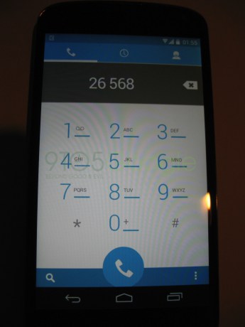

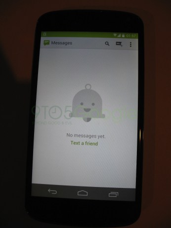
 A tipster did the kind deed of leaving 9to5Google with images showing a new dialer and messaging app interface in Android 4.4, along with a new icon for the messaging app.

I personally like the new look of the dialer app, since I prefer lighter interfaces. There isn’t much to say about the messaging app without seeing the way a thread looks, but considering it’s Google, I think it’s safe to say it’s going to be neat, tidy and gradient-free.
Also, it looks like the theming capabilities we had been expecting in Android 4.4 won’t be restricted to just the manufacturer or the user, but individual developers too. You can clearly seen in the images that the notification bar is a dark shade of blue in the dialer app and green in the messaging app.
As a developer myself, I would definitely enjoy the ability. Even though it’s only a few more pixels, it does seem to give your app a more immersive experience of having taken over the entire device’s screen, without harming the user experience of the notification bar.
One particular aspect of the message app that caught my eye (and I’m probably just reading a bit too much into it) is the notification bell in the center of the screen of the messaging app. You know you’ve seen it, but can’t put a finger as to where? It’s there on your Google+ notifications bar on the web and in your app. What I’m wondering is whether this little guy is an indication as to a Google+ Hangouts/Messaging app integration.
Remember, that is a wild guess based solely on the presence of that bell. I do realize that if it were a Hangouts app, we would see the Hangouts icon and name in the ActionBar, but I’m not quite sure why Google would place their own little “mascot” of sorts in what is meant to be a brand-free AOSP app.


Fake fake fake
I am following Android Police’s take on it, meaning: Fake!
i doubt it’s fake, it could be an early test version but not fake. i can tell you now, unless someone completely reedited all the layout files for the dialer..you can’t theme it like that currently….so i doubt it’s a theme engine job.
Theme + customRom should do the trick someway somehow…still going with FAKE!
Not a fan of the light blue themed dial pad. Like how the status bar changes color per app. Is it just me or is that Nav bar semi-transparent in one and not the other?
Yeah I see it too
Is that a unified hangouts/messages app I see? Please be true!
One of the screens shows 2 icons, hangouts and messages, so whatever this fake screenshot shows it is not a fake unified messaging app. ;)
Darn. Nice observation though
Not sure why having different icons for Messages and Hangouts negates Hangouts integration into Messages…. Surely there would be times when you’d want to go into just Hangouts, especially in the early stages of integration. Maybe in the long term Google will merge them into a single app, but I wouldn’t expect that to happen in 4.4
if anything I would suspect the messaging app to stay unchanged and the hangouts app to take over the use of sms more and more till finally they discontinue the messaging app.
Why make the messaging app more hangout-y when you will discontinue it anyway? The screenshots show the messaging app being heavily updated and using mr.Jingles, that doesn’t make much sense (unless they will replace the hangouts app with the messaging app, which frankly doesn;t make much sense either)
They can’t update the messaging app like they can the playstore keyboard, the hangouts app, chrome (which replaced the stock browser).
So while possible, it is not very plausible
they should put 2 themes in their apps, a light and a dark theme.
these light colors are nice if you have an LCD screen, but OLEDs are going to drain the battery much quicker with all that white on the screen.(not to mention a shorter life for the screen)
and some colors don’t go well with white, like the orange in google play music.
Putting two themes can be difficult, considering apps often have certain branding requirements, not to mention creating two complete color palettes can be a time-consuming task. I prefer the way things are now, leaving it to the developer to decide what is the best way to go about it.
Additionally, your point about the LCD screens brings up an interesting point: I know there have been questions regarding the authenticity, but a white-look dialer makes sense for the Nexus 5 considering if it is built with the G2 as a base, it would most likely have an IPS display.
actually, android has two themes. holo.light and holo. dark…it’s dependent on the app which it pulls from, for that matter, it technically has 4 themes in it. gingerbread dark and light and holo. dark and light….
I agree… I far prefer dark but I’m sure others far prefer light. Doesn’t seem like a complicated feat to accomplish both.
This makes a market for simple launchers, doesn’t it? I’ve never used an alternative launcher (other than whatever UI Samsung is and Sony was using…)
I love skeumorphism. I’d be happy switching between simple wooden buttons and Star Trek control buttons and crystals, etc. These don’t seem to be so popular now, though. How they work and how easy they can be removed is not well known.
I like gradients…
Why not allow for user created themes like MIUI so we can make it look like whatever we want?
It could happen, but I’m not sure if it would be in MIUI’s manner. I think it’s most likely going to be choosing one or two sets of colors that you would prefer to see on your screen in more of a Windows 8 sort of way
Yeah someone please tell them that Windows 8 sucks? I’m definitely thinking of switching to MIUI if this is the future of android.
One or 2 sets of colors is a joke. Android should be about Customization.
we should always have custom hard coded UI’s. they bring so much to the table and give Google ideas to implement into stock. what you should really be wishing for is just the ability to turn off the skins.
OMG! This fills me with so much….. meh!
Hideous.. I hate white themes. Isn’t that what IOS did with their new OS? YUCK.
I know. I HATE that Google has been changing this. I always like the inverted gapps packages. Black is so much better, especially With amoled.
Would be better if we saw real problems fixed, battery, information efficiency without having to open up apps constantly, and stock updates on all devices with 3rd party overlay option
Ill stick w/ 4.3 messaging and dialer theme :/
I personally think the notification bar may be transparent which allows it to take the color of whatever app you’re in. I don’t think Google went out of the way to make it choice of theme. Not that it’s a bad feature, but it’s unnecessary. I predict 10/7 is when it’ll be announced. Just a guess. I’m going off the time of the last leaked screen shot last week.
It was bad enough when they changed the “people” theme to white. I got around around it by using the phone app as my directory instead. But sheesh, leave white for apple!
The all black thing is getting old (Nokia, HTC, and Apple now all have colorful designs); plus it isn’t very Google. Google is removing the black bar from their websites and have already moved blacks and greys from the Play Store. It just takes time for Google to change AOSP apps since they cannot just update them whenever like the Google apps such as the Play Store. Not only that, just look at Google’s homepage: all white background with a touch of color!
I’m not sure what to think about the authenticity of these pictures, but I could definitely see Google updating the dialer app to reflect the changes the made to the “people” app a while back. I’ve never used the messaging app (Verizon charges waaaay too much for texting) so I couldn’t care less what they do with it…unless the announce Google Voice integration or something, that would grab my attention certainly.
I want more emoji options that is the only thing I love about the iPhone. Ps I don’t want to have to download an app.
awww there are like 3 people in the world who care about “emoji”… the rest of us don’t. I hope they don’t go with that crap.
Look pretty hidious!
The messaging bar is green in both, bright eyes…
You can find a lot more information here http://www.techradar.com/us/news/phone-and-communications/mobile-phones/ios-7-vs-ios-6-what-s-different–1179663
The dialer looks weird to me.
I don’t like that circular dial button.
OMG Android and Apple OS are looking so much alike! I hate this. I don’t want some colorful bubbly looking thing, I like a plain basic look. Maybe it’s just me.
Looking forward to my all green theme tho.
“Looking forward to my all green theme tho.”
Touchwiz to the rescue!
I sure loved my old GS1 Touchwiz!
“though”
I hope this isn’t real.
eww
One person wrote that this is an old paranoid Android rom?
Ewww! The dialer is hideous!
Does no one else remember?this was the original dialer on the G1.
I think you and I had very different G1’s
I hope that’s fake.
Do not want!
Please be fake! I want darker interfaces even if it’s just for better battery life!
Someone told me once, that all colors drain battery equally. Apparently, when you see a dark color, the subpixel is still on, thus draining battery anyway. (not confirmed)
If that were the case then brightness would have no effect on battery life (it does).
Separate LED’s give brightness to our screens, no? LED’s line the outer edge of the screen, and shine towards the center of screen. This is how we get bleeding light on dark screens.
It depends what kind of screen you have. Super amoled screens only light the pixels needed to show the picture. For example the 4.3 lockscreen notifications. Only the pixel needed to “draw” the notifications light up. All other pixels stay off, which uses less battery. Other types of screens light up all the pixels.
come on phandroid your better than this this story is at least a week old and it’s been proven fake already
I like it, but it looks like I’m in the minority.
It’s a fake!
Phandroid you should do a little more digging.
It looks horrible. Even a CM ROM from a samsung galaxy ace used to have this kind of interface, I hope they make other big improvements on this next version aside from changing UI .
excuse me while I take a break from WoW and beat off to this news.