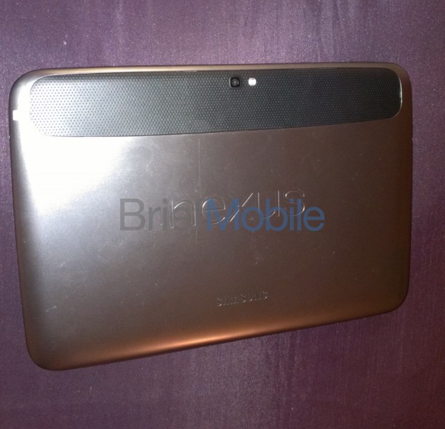
Somehow Google and Samsung managed to keep the Nexus 10 mostly a secret up, but just days before the tablet will be officially unveiled BriefMobile has managed to get their hands on a full gallery of pictures of the upcoming slate as well as a full rundown of specs. As has been suggested by the few leaks we have had up to this point, the Nexus 10 looks to be a high-end option to compliment the Nexus 7 in Google’s product lineup. It also will launch with Android 4.2.
The Nexus 10 appears to be largely based on the Samsung’s previous 10.1-inch offerings with a few tweaks here and there. It will utilize Samsung’s Exynos 5250 CPU, a dual-core Cortex A15 chip clocked at 1.7GHz and featuring Mali-T604 graphics. The processor, which has also made an appearance in Google’s Chromebook line, will be backed by 2GB of RAM. The 10.1-inch display is again confirmed to sport a 2560 x 1600 resolution, which amounts to just under 300 pixels-per-inch. Other features include a 5MP camera and NFC.
Some of the new features we can expect to see in Android 4.2 include an updated gallery, multiple user accounts, and a new quick settings menu accessible from the notifications pane. The specific build on this particular Nexus 10 was JVP15I, implying that the Android version remains under the Jelly Bean codename. Sorry folks, no Key Lime Pie here.
The biggest remaining question pertaining to the Nexus 10 is what price tag Google will apply to it. If the Nexus 7 is any indicator, Google may be willing to cut their margins pretty thin, but the high-end spec sheet still suggests we won’t be getting this one nearly as cheap. Keeping at an iPad-challenging $499 would be good enough, but undercutting that by any amount would make the Nexus 10 even more tantalizing.








Saw this on Engadget earlier, eh wasn’t too impressed with the design. Guess, I’ll have to see it in person.
edit; Just looked at all those scratches and dents in the back, that Samsung quality. lmao
Scratches?
1) It was a review unit that probably got passed around and abused a ton
2) Most people put folio cases on their tablets anyway; even their iPhads
True, you have a point.
I was gonna say the same. I was holding one the other day and I know there were probably a million more hands holding it before me and it didn’t have a case either. Altho mine was in better shape it wasn’t by much.
I hope the rear isn’t the crappy colour it looks like.
I hope it’s got one hell of a battery to power that chip for more than 20 minutes.
I hope that resolutions serves it’s purpose as a marketing ploy, because in my expectations, it’s made that tablet irrelevant.
Nope, don’t like it from this article.
I’m sad now! :(
I would love to trade my Nexus7 up to a Nexus10, but unfortunately the resale value of the 16GB Nexus7 isn’t enough to justify it… unlike how Ebay’ing my original 2-year-old Galaxy Tab 7 paid for our Nexus7. Ah well.
Huh? The most you’d probably lose is $100. It’s already low in price anyways. I see them going for about $180 bidding on eBay. Maybe I’m not understanding what a decent resale value is.
Not as bad as I feared. The new 16GB dropping in price to $199 probably hasn’t sunk in at ebay, as some used versions like maine are still selling for over $200 (w/freeshipping). By the time the Nexus10 is out, though, the used resale will have dropped quite a bit more
449 wouldn’t cut it, they have to go cheaper than that. maybe 349 dollars for 16GB wifi
Again…why is the screen so much smaller than the whole device? Why can’t we make screen all the way to the bezel? Waste of real estate.
It’s been explained thousands of times already. No one realistically wants a no bezel device for a tablet, especially for an ereader. You can’t hold on to anything but the screen then, and THEN you’ll be bitching about why you can’t hold your tablet without interfering with scrolling, touch gestures, random unintentional touch commands, etc…
If you want no bezel, go get the iPad mini.
I would like to point out that not everyone has heard the explanation for the need for bezel on a tablet, I would agree that the need is, in fact, there.
Now, the need for anything but a minimal amount of bezel on a phone? Non existent. Yes, non existent. ;-P
I thought that for second, then I realised why and Bob said it right, so I won’t repeat his words!
my 7 is imo the perfect design, I love the way it feels and the over all look. It is one sexy beast and we all agree on that. But samsungs rounded bubble like edges make this thing look like an htc phone from 3 years ago, thunderbolt g1 inspire and altho at the time cool, that time has passed.
iPad2 sells for 399 dollars, this has to be lower than that. Google needs to try and make that up via content sales or whatever.
I don’t think it would be. giving the spec sheet, it is comparable to the new iPad (better in some and worst in some specs) so the price would be comparable to the new ipad. unless google wants to introduce new line of budget 10 inch tabs, that would be even better for us consumers
They will. Even if the price ends up being more than I would like, I trust that El Goog will cut their margin to next to nil on the initial price, leaving only enough room to cut it to absolute nil a few months down the line (see: Play Store Galaxy Nexus pricing).
Strange that it’s using the ‘big phone’ style layout like the N7 rather than the proper tablet lauout.
Maybe it depends on how you hold it?
Yeah, agreed, that’s really weird. Currently Jellybean on 10″ tablets still gives the Honeycomb-style tablet UI. Is Google abandoning the HC-style UI completely with 4.2? That would be a tragedy.
I think I’d prefer the phone layout on a tablet, like how the nexus is in portrait, but have the bar stay there in landscape like it does on the phone. I don’t like having the bar on the bottom in landscape. It really cuts down the viewing area
I am hoping for a split screen like on the galaxy note, than this nexus would be mine
Honestly, its pretty damn ugly and only dual core? I’m thinking this will definitely be a budget tablet.
It’s an A15, hold your judgement on that until the benchmarks come out
Got it, I thought the Excynos chips were already A15, but I guess they are A9’s.
Yeah, I am thinking it is going for a budget tablet for streaming, web browsing, playing games, etc. Kind of like a Nexus 7 just with a bigger screen. Hopefully it will not cost a whole lot more than the 7.
Budget?
With those specs?!
PMSL@You
Well, that’s my opinion, we will see when pricing is announced. I have no doubt that it will be fast with that CPU, but the limited storage will limit what you can do with it.
I mean, I would consider the Nexus 7 a budget tablet as well (what halfway decent tablet can you get cheaper?). But it still has a pretty powerful CPU itself.
Cheap != budget
Google make their money through ads, services and data so they make no money on the devices themselves, so comparing the nexus price to other tabs prices is irrelevant.
Anyway, there’s a wall I can beat my head against, I’ll probably get further with that.
I don’t fully understand why you saying comparing one tablet to another is irrelevant It’s irrelevant on how Google makes their money. We’re talking about how cheap in price the tablet is. And also you have another flaw. If Google really didn’t care about the price, then why does their Galaxy Nexus have a higher price tag then their Nexus 7?
It’s because Google wanted to make a budget tablet, not a cheap tablet. So they made a low priced tablet that wasn’t cheap (quality wise).
the N7 is certainly budget. With the specs listed here, this is certainly not budget.
I fully expect I’ll be paying at least $450 for this bad boy, probably more. I’ll still pre-order.
ONLY dual?
LoL, if it was a quad you’d need to lug a diesel generator around with you to power the damn thing.
The quads will be for laptops and desktops.
lol
A dual core A15 would be MUCH faster than all the quad core A9s on the market.
It’s the architecture that matters, not the number of cores. Didn’t you learn that long ago with the Intel vs AMD race. I guess you are one of those people who buys 8 core AMD chips thinking they are faster than 4 core Intels, lol
AMD 8 core CPUs are faster than Intel 4 cores
at the tiny hand-half-full of applications that can max all the threads, are predominately integer based and where the computer is the rooms radiator
So there! :p
No they aren’t but keep believing they are.
You talk about someone not knowing what they’re talking about, then do the same?!
http://images.anandtech.com/graphs/graph6396/51137.png
http://images.anandtech.com/graphs/graph6396/51118.png
@peanutsrevenge:disqus oh please I’ve read those articles and seen those charts from every site including Anandtech and Tomshardware. You don’t have to point them out to me like you are showing me something new. I read those reviews and benchmarks probably more frequently than you.
Anyone can cherry pick a program that runs faster on the AMD. But you know it, I know it, and everyone else knows it…an Intel chip with fewer cores outperforms an AMD chip with more cores in almost everything and anything. AMD keeps pumping more cores, while Intel keeps improving their architecture and winning.
Back to Android. A dual core A15 would be much faster than a quad core A9, especially when you consider Android and the apps that run on it don’t really utilize multi-threads extensively.
I said cheery picked you moron, which part of:
“at the tiny hand-half-full of applications that can max all the threads, are predominately integer based and where the computer is the rooms radiator” didn’t you understand.
Give me my food back you boring idiot and move along so someone who can understand sarcasm can take your place, especially when there are tags pointing it out!
Ah it’s an A15. I guess I missed that. Just FYI I have an Intel Core i7 processor. I’m not sold on AMD, but if I were to build an HTPC I would definitely take the cheaper chip.
all the looks you’ll get when you use it with Google Wallet… priceless. lol
Man if that is true about the A-15 and the Mali T-604……*drool*
I’ll just leave this here… O_o http://youtu.be/hoXORtIibwQ
Lmao….don’t knock it till you use it haha.
Yeah, I hold off final judgment until I get one in my hands. Until then…. “You ain’t got no alibi…..”
I wanna tread lightly here but is it me or does it seem like this “Portrait” styling has been seen somewhere before Lol. Rounded corners, now this? Come on guys! Haha
Hot damn. You’re right. GOOGLE! STAHP.
the design of this tablet is not Samsungz, its sketched out by Google. remember when Galaxy Nexus got released, Google folks said openly the have designed the phone with assistance from Samsung engineers. they worked together at Google headquarters over it. the same happened for Nexus 7. Nexus 7 was also designed in Mountain View.
Yeah, I’m not blaming Samsung. Just don’t care much for the design but then again, beauty is in the eye of the beholder. :p
is that an a$$ on your profile picture?
Why yes it is lol…..look up BSGD(booty smell good doe). Bwahahaha
Maybe it’s just the colors… or maybe I’m just giving them too much benefit of doubt. *sigh* :(
Or maybe cuz you’re an iPad fanboy? O_o
Hey now, I don’t think it looks THAT bad. Besides, it’s a tablet. They’re all ugly.
Bezel-tastic!
Yeah, that bezel is HUGE lol… Wow.
not only the black bezel but also a grey bezel on top of that… just in case there wasn’t enough
they grey ares appears to be the housing that hosts the front facing speakers. how you guys expect to hold a tablet with no bezel?
I personally like the cradle-hold (you gotta treat it like a baby).
my phone doesn’t have nearly that bezel and i’d hold it about the tablet same way… i don’t need a couple inches all the way around it… maybe a few cms for the edge of my thumb to grab and palm
Thank Apple.
I wish Asus would’ve made this…it probably wouldn’t have been such an eyesore. *sigh* there goes the past 5 months of anticipation for this tablet.
If the Nexus 10 was simply a tablet dock for the Nexus 4 it would have been GAME OVER. Google could’ve dropped the mic and walked away..
US carriers would never allow it. They want to sell us multiple discrete devices so they can charge multiple fees to connect.
Well, they could offer the phone on contract for some. Meanwhile, sell the unlocked GSM version and tablet on Google Play. :)
Unlocked GSM version usually means no US LTE support
We can dream, but I have a feeling Big Red will freeze over before they allow anything like padfone on their network.
Dass truph nigga.
Ohh I totally agree. If they had gone the “padfone” route, this would be game-over.
the padfone tablet looks ugly with that phone bulge in the back, plus, there’s really no need to have it dock with the tablet, if you have a nexus phone, just tether it to the tablet, voila. keep the phone in your pocket while you use the tablet. perfect solution.
Pretty much perfect except for the phone being in your pocket, in tethering mode no less. Put it in your bag, and then you and your mitochondrial RNA can rest easy. (I know, it is not ionizing radiation, but with intensity diminishing at the square of the distance, one meter from your groin is about 20,000 times less radiation producing than it would be in your pocket.)
It just wouldn’t work. I loved the idea of the padfone when I first heard about it but then realised that as someone who likes to change their phone often I would also need to shell out for the latest tablet dock.
I’m not liking the rear styling, or the wide bezel on the front. I do like the front facing speakers though, that’s a good thing.
I’m not so sure about that. Asus’ tablets were nice, but they have been plagued with problems. (I admit I’ve never used the Nexus 7, so I’m not talking about that.)
If you want to see an eyesore use a Transformer Prime for a few months. It had an easily scratched and dented metal shell that interfered with wireless signal. The onboard wireless (GPS, WiFi, BlueTooth) were plagued with issues aside from that shell. Many of the units produced had an issue with the logic board that made the signal very weak. (so weak for the GPS that Asus stopped listing it as having a GPS, though they did send out a free GPS dongle to customers who requested it, but it too was still a bit lacking) The one I had one day for no apparent reason went FUBAR with its camera. After some research I determined it was a bad firmware update from Asus. This happened to several other units. For some reason many of the tablets suffered from severe lag when web browsing, no matter what browser was used. I actually could not perform a simple Google web search because of this. There was also an I/O bottleneck issue as well. The OS also seemed unreasonably choppy most of the time.
I know it might sound like I am bashing Asus, I am not. I loved my Transformer tabs (I had both the TF101 and TF201) but the second gen was rushed so proper testing was not done. I do respect Asus though, they had offered to repair my tablet at no cost. This however turned into a nightmare. It took several weeks for them to finally send me a response as to its status (I had called and emailed several times just to get that response.) Since it could not be fixed, They refunded me for the (almost) full cost of the tablet and dock. It was a nice gesture.
Asus has already produced a Nexus tablet. It is nice to see other manufacturers getting on board with the Nexus lineup. I don’t think it looks that bad, and it has some wicked specs too. Let’s wait and see how it holds up before we judge it.
P.S. I just read on Engadget that the screen is an AMOLED. That will be interesting to say the least.
It shares some design cues of the N7. Look at the smaller stripe on the back, looks like the back of the N7. I think Google are trying to keep a uniform line of Nexus devices; curves, different colours/design etc. If you had the 2012 Nexus devices next to each other, the 4, 7 and 10, you’d be able to tell they’re from one family. I think Google was behind the design of these devices. That is, if the 4 and 10 are real devices and not great big hoaxes.
SHUTUP AND TAKE MY MONEY ALREADY!
LMAO
ooOOOoo, Okay, that’s gonna helpa fair bit. Didn’t realise A15/Exynos 5 supported PSR.
Very nice. Very nice indeed, although the eally big gains will come with SPSR I reckon.
I really love google and nexus lineup, but this is one Damn ugly tab.
GOOGLE Y U NO CHOOSE SONY
Did you dream for an Exynos 5 nexus tablet? Well, your dream came to be true, and if you wanted this with Exynos 5, then Google had to choose Samsung.
I didn’t actually dream of Exynos 5. if I had to choose, I would go with more beautiful design (sony) and S4 pro and that is more than enough for me and better than even more powerful tab with that ugly look
Looks like a rusty can of assholes.
Also, is this the end for Android’s traditional tablet UI? This has got the same UI as the Nexus 7, which has the same UI as my phone.
It looks like Google wants the OS to have a more unified look across devices. That’s my theory anyway. Or it may have something to do with the aspect ratio? On the N7, do the navigation buttons stay on the side of the screen in landscape mode? On the N10, the pictures show them along the bottom in landscape mode. Maybe that’s because of the larger screen. Whatever the case, I like how it looks. My friend has a Verizon Xoom, and I don’t really like the tablet UI because it’s too different from my GNex. Whenever I use his Xoom, I have to retrain my brain to find everything like app settings, notifications and such. What’s wrong with having the UI look the same on all your devices if it scales appropriately (more room for icons and widgets) and has all the same functionality?
BriefMobile?? Dammit, that’s what I was gonna call my underwear-delivery truck!
They can’t be serious about that hybrid UI right? It wastes space having both software buttons AND a notification. What was so wrong with the current tablet setups? This just looks poorly done IMO. And i just came back from the Microsoft store to play with the Surface and was very impressed. Google… for the love of God, please please step the game up. I love my Asus Transformer Infinity, but the competition is circling around big time.
Then combine them. It’s not that hard. I for one prefer my notification bar to be at the top. I also don’t care to see the time and all that extra stuff when playing apps. I lyk that little black bar. It gives it a cinematic effect. Part of Android is changing it to what you want. You can’t really complain about something since you can easily change it to what you want.
The problem is when you are trying to compete with Microsoft and Apple with the average consumer you cannot put out junkie looking stuff like the Nexus 10 is looking like in those photos. Like it or not the bar has been raised by the industry and Google is not responding right now. I hope I’m wrong but this doesn’t look to great compared to the competition.
but for the user that bar is not easy to change.
you have 2 options: either use a dpi setting that makes everything too small and confuses the play store, or hope someone makes a custom rom or patch to force tablet UI.
for JB on my galaxy tab 2 7″ it took a while before we got consistently updated tabletUI patches/settings.
and I don’t see the point of this UI.
first they make a proper tablet UI so they can get rid of physical buttons, and now they bring back the old UI but they can’t get rid of the virtual buttons because tablets don’t have physical buttons.
and look at the amount of wasted space around the buttons.
I also don’t see the convenience of having those virtual buttons centered, for me that’s often the part of my tablet that’s the hardest to reach.
At lease the speakers are on the front.If it has a dual core that would just be silly
not really, the reports I’ve read over on XDA show that this CPU/GPU is very quick.
A quad-core i2 processor, or a dual-core i4 processor. Which one would you choose? Don’t sweat over quad-core too much. If the processes are small, it would help. But if the cores sux, then quad-core would be useless since it will still slow down. Dual-Core technology is further along than Quad-Core. At least in the mobile field.
That’s my 2 cents.
could the back of this thing be any uglier?
I imagine if it had an Apple logo on it, it would.
I have a TF101, it’s ugly as sin, but I never look at the back, I’ll probably do the same here.
Will this Nexus-Samsung have an S-Pen like the Samsung 10.1 Note?
hope so, but probably not, if it takes a special driver.
Will the Nexus-Samsung table have a S-pen like the Samsung 10.1 Note
Agreed that biiatch ugly. Come on Samy enuf with these round corners they just don’t look sexy compared to the straight lines.
I’m still going to buy this.
the worst thing I see from these screenshots is the nav buttons are in the middle, not left aligned, Google would do very well by making this an option for users, if they want to buttons in the middle, or right justified let them choose.
Where is my “search” button? Am I the only one that ACTUALLY uses the search button? LoL!! Thank you AOKP. =.P
>.> could it have any more bezel? i don’t feel it has enough bezel
who needs screen? bezel baby is the way to go!!!
I got a fever! And the only cure…is more bezel!
Even the bezel has a bezel…
Yea it does, wish the bezel on the bezel had a bezel though, its definitely missing a bezel.
And what’s with the camera on the rear?
Surely this is a scam SURELY, it’s just crap in so many areas.
holy fawk that thing is ugly. i mean WOW. thats just…DAMN. Horrific design. lololol i hope its a prank i really do.
my guess, $299
amazing..! jejeje.! two speakers. 300 ppi.. exynos 1.7 ghz.. this is a fuc* gaming tablet..
Well, I’ve had the OG Droid, the HTC Droid2, Samsung Fascinate, Droid Bionic, Nexus 7, and Samsung Galaxy S3. I’m seriously thinking about moving on to Windows8/RT, and with the ugliness of this thing and the total lack of sleekness….well let’s just say I won’t be standing in line for this one. It really pains me to type that.
I hope it has a keyboard dock, love my asus transformer dock.
Holy bezel Batman
5 inches of screen and 5 inches of bezel. I need to make myself feel better; this picture is NOT the new Nexus 10. They couldn’t be THAT stupid.
besides it being ugly…dual core? really?
That dual core A15 Exynos chip with Mali T604 will rape any of the current quad core offerings.
Any chance of this bad boy potentially being inside of a shell? Kind of like when they put the S3 in a shell to protect from leaks like this…..lets all hope so, cause if not this thing is dissapointing looks wise. But you know what they say, true beauty is in the inside not the out.
Damnit.. I was waiting for a 10 inch version of the Nexus 7… This wasn’t what I was hoping for design wise…
300 pixels-per-inch SUCK THIS::!
Awww… no GPS?
Oh gosh, that thing’s hideous.
come on guys its not that bad
This $#!T better be <$450
The brown color is fugly.
leave the worthless camera off of it and save us some money
Man that looks like the Touchpad. Idk what it is with Nexus devices and those large bezels…
It looks like it’ll weigh 5 lbs
Location of HOME & BACK is bad placement. Should be on the side Honeycomb style
That plastic insert sure is ugly…..For a company that copies Apple alot, they sure didn’t copy the iPad with the back of this Fugly thing….. That insert could have been made more sexy. It’s just sitting there like a fat slob.
I wish the back was more like the N7.
Never realized so many people care about the back of a device, especially the back of devices likely to be encased in some sort of cover. (phones/tablets) it just boggles the mind. the nexus 4/nexus10 are most criticized for how the BACK of it looks. lol.
The speakers on this thing are huge they are twice as big as the dual speakers on the Galaxy note 10.1
I too wish Asus would have made the Nexus 10. The design of the Nexus 7 is absolutely fantastic…and sexy too. This Nexus 10 by Samsung not so much. I like the design of my Galaxy S3 and love the phone to bits but when it comes to tablets I think Samsung just can’t pull it off.
The Nexus 7 looks far more sleek and high end than this.
I hate the look of the big phone ui. Much prefer the old tablet ui design.
They are sooooooo getting sued.
Interesting that the time stamp in the notification bar is on the right side like 4.1, while leaked nexus 4 images has shown the time stamp in the middle.
Yo dawg, I herd u like bezel. So we put a bezel on your bezel, so you could hold your bezel while you hold your bezel!
I hope thats not a gold hue and just due to crappy camera/lighting… If anyone is familiar with the recently released NZXT 820 computer case I thought the same thing in those early pictures, but thankfully it turned out to be a more pleasing “Gunmetal grey”
It’s definitely not a sight for sore eyes, isn’t it. It’s missing the Nexus “look”. This looks like the HP WebOS tablet.
apple is a beautiful girl with the most boring personality. android is an ugly girl with the best personality. i love android but the hardware always kills me.
If they can sell the 32GB for $399, or better yet $349, I’d buy one, but if they price them like iPads, forget it. I don’t mind the outward ugliness since I’d always keep a tablet in a case.
Ugly.
Damn ugly.
The worst part for me is the fact that JellyBean has dumped the tablet layout for the phone layout, I much prefer the notification at the bottom right this looks poorly thought out.
Fugly fugly fugly