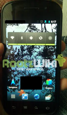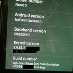
Don’t get too excited, though. Four images of the next version of Android running on a Nexus S have surfaced giving us our first look at the changes Google has in store for Ice Cream Sandwich, but unfortunately they don’t reveal much. While we get a glimpse at the new, bluer look of things, a Honeycomb-esque embedded search bar, and a new launcher tray, it looks like the redone version of Android might be a bit underwhelming. We hate to pass judgement based on a set of pictures showing off a few screens of the OS, but what has been hyped as a complete overhaul of Android merging Gingerbread with Honeycomb appears here to be more or less your standard iterative update.
Information passed along to Android Police and RootzWiki along with the pictures is a bit more promising. Though it is being said the Ice Cream Sandwich will consist mostly of UI tweaks (meaning older devices are still in the running for this one), several updates and additions are noted. The Android camera app will feature a panorama mode, Google Shopper will be bundeled with the OS and take advantage of NFC capabilities of future handsets, Gmail is re-themed to match the look of ICS, and the Apps/Widgets launcher borrows from Honeycomb.
The update will find its way to the Nexus S as an update, but the next Nexus device, referred to here as the Nexus Prime, will be the first to get dibs on the updated OS. Word is the build we are looking at is rather early and Google has no definitive idea of when the OS will launch. It has been suggested that we could see our first Ice Cream Sandwich devices in October.
[via AndroidPolice, RootzWiki]


WOW.
Cyanogenmod colours.
I just came.
lol
IMO Froyo looked so much better than Gingerbread and what we see of ICS. :(
What is that black box on the picture? Just censoring some apps on the desktop?
PROBABLY ICS apps that they don’t want to spoil or special widgets. It make sense
i still think even it’s fake , or it’s a BS , because google has been promising for a big update for about 2 years now , first it was gingerbread which was just a UI change and now is a ICS? …
GIMME, GIMME, GIMME!!! I’M SO HUNGRY AND THE ONLY THING THAT CAN SATISFY ME IS ICE CREAM SANDWICH!!!!
so, the icon at bottom right is for multitasking I assume. And something behind that black box that you shouldn’t know about yet I guess.
I wonder what that icon on the right of the bottom tray is?
Was wondering the same thing……….perhaps a widget selector instead of holding down on any home page…..thanks for the leak fake or not
Looking extremely fake. Under the “Android version” tab, it always has to show a number not the version code name.
Indeed. It makes no sense to write the name there, and written together like that. Also ICS will have kernel 3.0, not 2.6. I think it’s fake.
I hope you realize that this is most likely an early build of Ice Cream Sandwich. The kernel may not have been updated at the time this build was completed. This is in no way a final version of ICS.
Looks great and promising.. Nexus S users should celebrate just for the fact they get updates first. lol
Finally, the leaks start. Sorry GS2, was nice waiting for you….but Prime is right around the corner! (I hope =/)
I really hope that is fake. What a pitiful attempt at an “overhaul”.
Yes, finally, a system wide equalizer. And really, that’s all I care about.
FYI cyanogenmod has had this standard for a while, not sure if you can adapt this to other ROMs or not.
http://www.cyanogenmod.com/features/dsp-equalizer
Yeah, I tried it. It’s pretty basic, no presets, and hard to configure. I actually went to cyanogenmod on my N1 because of that, and the FM radio. I found it to be pretty buggy though, ended up going back to stock. Stock is the most stable ROM out there! So, I will stick with stock and nexus phones from now on.
PS, I did use Cyangenmod on my G1 when I had it. It was, then, a step up from stock.
Fake, The kernel version is the same a gingerbread.
Honeycomb has a newer kernel 2.6.36.3 as opposed to this “Ice Cream Sandwich” build which is 2.6.35.7
Totally agree with first commenter: “What a pitiful attempt at an “overhaul”. I can’t tell the difference between this, froyo or gingerbread! COME ON GOOGLE! GET A GRIP!
The signal strength bar and battery icon are exactly like those in the Liberty ROM for the DX. Weird.
its the first time we’re all seeing this and we dont know much about ICS yet, so i guess we cant really say much about his yet
So Google “stole” the TouchWiz dock?
Definitely a fake
Im not an expert in this kernel thing but if i remember correctly isnt ICS supposed to use the new Linux 3.0 kernel? Even Honeycomb uses a newer kernel.
And in ‘Android version’ shouldnt it say the version number instead of the name?
Judging by the source is a site where people root phones, its likely enough just be a custom ROM or something. Also the blue used in Honeycomb is much darker, the clock should also use the LED styling, this doesnt. This is also using the Froyo call button rather than the latest Gingerbread icon.
All the evidence is pointing this to be fake, However I would be extremely underwhelmed if it was real
how did i totally miss the nexus s coming to t mobile ?
o wait cuz the mt4g was way better and came months b4
-2
Damn, you’re a whole ‘nother level of Android idiot.
LOL that’s the major UI update Google is delivering?
If that’s real, it’ll be another half baked beta release from Google as usual. Boring.
How do you know this is the final version? It still looks pretty nice from the few shots cant wait to actually see it in action.
Dont feed or respond to the troll…. he wouldnt care it it printed money….he would hate it.
Ask him where is iOS’s major UI update. At least give credit to Google for trying to more forward…ala Honeycomb…
I have a nexus s, you idiot. Im not a troll. Just because I like to be a realistic and level headed user of Android, doesn’t mean I’m a troll.
Based on your comments on here over the past months….its sure hard to tell…
Like I said.. I own a Nexus S.
Just because I don’t like to participate in your Android circle jerk, and like to bring you giddy fanboys down to earth, I’m not a troll.
Like I said…based on comments on here the past months….even now….
Its hard to tell.
Picture proof. NICE!
No, no… You’re a troll. Don’t argue with the facts, just except them and move along. ツ
Your first comment is pure troll, especially since it’s blatantly fake, only an Apple fanboy fall for this
Like I said…based on comments on here the past months….even now….
Its hard to tell. Pic or no pic …its hard to tell.
Based on your comments….especially concerning Apple.
Just because you have an Android phone doesnt mean you cant be a troll.
Put it like this: your first post was a troll post. You might not be one, but you posted like one.
Is that better?
I think meh sums it up best. I really hope these are fake or an alpha version of an alpha version.
my thoughts exactly.
we need to go deeper.
There’s no way I’m going to upgrade to this. Look at all those obnoxious black boxes everywhere. They would totally piss me off.
You’re joking right? Those black boxes are edits to blank out content (who knows why) made by Phandroid.
im pretty sure he was trying to be funny
I dunno I wouldn’t be surprised if he was serious haha.
Dear God you need to get out more. He was obv joking.
well if its a weather widget with location info – it might tip off google as to who’s leaking it. But I think this a fake, and if its not then its kinda dissapointing
The boxes are from whoever took the picture trying to hide things. That’s not actually part of the ui lol. Its a common thing to use when leaking images. This is a fake to me.
LOL, funny.
Definitely a rip-off of iOS! Look at that “square” black icons!
I’m calling shenanigans.
please google, i love android more than anything but if this update doesnt deliver I’ll have to jump ship. please make this better than the iphone 5 please!!
so you are going to something that hasnt changed its look since it first was out not to mention ios5 is just a ripoff of google. Good choice though. smh
Fake
Interesting…they put it on a nexus s now but come ice cream sandwich time Google might say the nexus s lacks the sufficient hardware capabilities to run ice cream sandwich. This might turn into the g1 as it was not being “officially” upgraded past android 1.6. When Google releases ICS in q4 they might announce that currently only the nexus prime/3 will support ICS. I am no way and apple fanboy hating on android ( I have an EVO 3D) this can be a possibility but Google being Google might be able to work something out to make ICS run smoothly on the nexus s. But these pics defenitley look fake I say some sort of rom with a honeycomb themed notification bar.
Of course the Nexus S will get the update, if it can run honeycomb smoothly, why shouldn’t it run this?
Also, google always update their Nexus phones.
That power control widget needs to GTFO. Make it sleek, add some transparency and how bout some… blue nimrods!
Yeah, even with minor overhaul some newly designed widgets and icons would make a lot of folks happy.
Complete fake. There are too many things wrong with those pictures – most of which were listed above already. I am hoping the best for ICS. Froyo was a pretty major update (Dalvik JIT compiling, flash support, etc.) GB was more of a cosmetic overhaul unless you knew what you were looking for. I really hope that ICS truly integrates the UIs from GB and HC (yes, I know that is the plan, but not everything in the world comes out as planned). Until I have at least a pre-alpha build (preferably a beta) in my hands, I will refrain from using idiotic terms like “goodness” for something I haven’t even touched yet. Much like people who were dying to get GB after it was released and they kept referring to it as “GB goodness” knowing nothing about it or how it performs. I look forward to seeing what the future holds for ICS.
I still think that Google should require all carriers who wish to carry Android devices in their lineups (i.e., everyone) to carry a Nexus phone as well, so people have the option to have a non-blurred/wizzed/sensed device and don’t necessarily want to wait 6-12 months for an update after a new version is initially released. It’s not unreasonable, and most certainly can be done.
looks like cm7 cyan theme engine. cant be real
Looks fake to me….or a VERY early built….I mean the colors in the power widget…green? shouldn’t they be blue too?
I like having a dedicated multi-task button (should replace the search button)
The menu button needs to be removed too, in favor for onscreen menu buttons
The home and back button need an onscreen icon too (for the future buttonless phones)
things that ICS needs:
-implementation for dedicated camera button
-power widget built-in the pull-down notification window
-search button built-in the pull down notification window
-option to discard individual notifications
-Global audio management app/tool
-A lot of new customization options (I love customizing my phone)
-easier way to switch tabs in the browser (better browser options in general)
-lots of cool TRON-like UI changes
-other cool stuff
You forgot one thing on your list.
-Hardware Acceleration
I don’t want a search bar wasting room on my homescreen :(
This looks A LOT like the result of the lcddensity trick with honeycomb. I knew ICS would look something like this :p
I hope this will add new functionality and not just new UI stuff that I can get with ADW or LauncherPro
Wakkoboy= Troll
It looks like CM7 with a custom launcher skin of some sort and a custom app drawer. It could be an early build, but there’s also a reasonable chance its a fake, especially because doesn’t Google use their reference device (Nexus Prime/3) to test the OS? Remember how long it took the Nexus One to get Gingerbread, why would they already be running ICS on a Nexus S instead of focusing completely on the next Nexus device?
I think this is a FAKE but I think it’s been leaked by google themselves. Then we see the real amazing ICS UI – we’ll all be THANK GOODNESS the leak wasn’t real!
Lowering peoples expections, nice thought!
I really think this is fake…it just doesnt look real at all to me
Another thing that doesnt make sense is that why would you put the multitasking button only on the home screen? The main reason its useful is that you can easily switch from app to app. I seriously don’t believe this leak at all. And if this is real than I’ll just stick to sense or cyanogen(I’d use this anyways;) roms.
… And it still looks fugly.