The speculation is over. Today Motorola announced their first Android Phone, the Motorola CLIQ, running their custom version of Android called Motorola BLUR. After spending some time with the device we have both praise and criticism – which we’ll discuss in depth below – but first we should acknowledge the bigger picture.
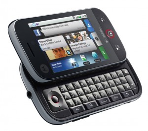 Congratulations to Motorola! Speculation set extremely high expectations for this event and although the best case scenario didn’t occur (multiple Androids, Verizon included) – don’t let that detract from this event’s importance. You can critique CLIQ/BLUR all you like, and perhaps the terms “portfolio” and “suite” were misleading, but the fact remains: a Motorola Smartphone that competes with the most elite devices in the industry is a serious discussion. That in and of itself speaks to the occasion’s magnitude and the product’s potential success.
Motorola is back, baby! Neither the hardware or software is perfect, but what device is? Its all about trade-offs and the Motorola CLIQ is an impressive first foray into previously uncharted Android territory. We’ll organize this review the best we can by starting first with the software (MOTOROLA BLUR) and then moving into the hardware and specs.
Motorola BLUR
I love how Motorola didn’t try to do everything with BLUR. They tried to do one thing and do one thing well – seamlessly integrate all your contacts, from all your social networks, and all your communication mediums in one consolidated and easy to use interface. Hmmmm… that isn’t really “one thing“, is it?
It isn’t… and that is exactly why and where Motorola succeeds: they’ve taken all these fragmented sources of external information and communication points and centralized them into what seems like ONE entity – your phone.
I love how BLUR “categorizes” and in a sense prioritizes for you in a completely logical sense:
- You don’t care about seeing every single TWEET or Facebook Status update, do you? Motorola BLUR groups these less important communications together as “happenings”.
- Certain types of “messages” are more important like EMail, Facebook Messages, TXT Messages, Twitter Direct Messages. These have an “escalated” sense of priority so BLUR groups them together.
So basically BLUR is simultaneously consolidating all of your external communication points into ONE central location, then re-separating them by priority level. Great concept. Love it.
Universal Status Updates
I use Facebook because all of my friends use Facebook. But I don’t use Twitter much. Why? It is one more hugely time consuming task in an already time-starved life. As explained above, BLUR has already helped consolidate the consumption of social content by displaying my friends’ Facebook and Twitter updates at one time via “Happenings”. But communication is a two way street.
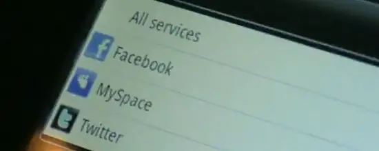
I’ve got something to say. Rather than telling my Facebook friends and then telling my Twitter friends and then telling my MySpace friends I just say what I want ONCE. And then press to post it to ALL my services or choose which ones to be updated.
The purpose and promise of social networks is to connect you with the people that matter and the information you care about quicker and easier. But the shear NUMBER of them sometimes makes it more difficult than beneficial. BLUR aims to eliminate the irritation and complication… and it is largely successful.
Syncing Contacts
Another awesome feature of BLUR is the syncing of contacts. It takes the information from your various accounts and intelligently combines them into single accounts. Perhaps your Mother is on Facebook, MySpace, Twitter and GMail – Motorola BLUR will cross reference the contact info collaboratively and automatically fill in that person’s contact info using these sources.
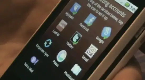
As you can see from the video still above, some of the accounts you can link are MySpace, Facebook, Google, LastFM, Twitter, EMail, Exchange, Picasa, Photobucket and Yahoo Mail. Question of the day: Why is your mom on so many social networking sites? Anyways…
What happens if your friend Adds/Edits their information on a given site/network? BLUR automatically makes the change and updates for you! BLUR also backs up your contacts and account data so in case something were to go wrong, you can always re-access/download all your info and settings through the Moto website. I was ensured that BLUR errs on the side of caution: they would rather NOT link accounts and allow you to manually (and easily) associate multiple profiles with 1 specific person rather than incorrectly merge them in the first place.
Where BLUR Falls Short
The below video starts off with the Motorola CLIQ freezing. When its clear the phone won’t respond, the guide pushes the device aside and aptly whips out his personal device. Let me be clear – I DON’T think this is indicative of BLUR as a whole and I think this is more likely the EXCEPTION to the rule. I had several different people give me “tours” and this was the first and only time I experienced any lag let alone a freeze.
But it DID happen. I wouldn’t worry too much but it is certainly something to keep an eye on. OTA (Over The Air) updates can often patch up little glitches like this and you’re never going to get an OS that runs flawlessly 100% of the time. I don’t think the “freeze” is where BLUR falls short.
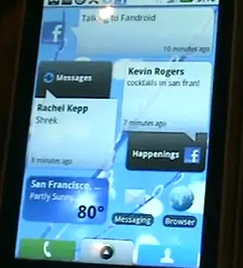 The power of BLUR is in the intelligent assumptions it makes about your communication style, preferences and priorities… but sometimes it assumes too much. For example I want INFORMATION and CONTENT on my home screen but how am I supposed to learn anything of substance when the widgets/boxes are confined to such a small area?
Unfortunately you can’t resize the Messages or Happenings widgets along with some of the other BLUR-specific widgets. What if I want an entire panel (BLUR has 5) to be filled with Messages? Or maybe my top half messages and bottom half happenings? In my mind BLUR should offer the option to resize in addition to the ability of relocating/removing.
Another assumption it makes is that content within a given section (Happenings/Messages) are equally important. What if I want to add a MySpace and Twitter profile because I love the contact sync feature but don’t want MySpace updates to appear in my Happenings?
You’re able to drill down to a particular source and view the updates from that source only, but there is no way to select which sources do or don’t make it into your happenings/messages feeds – they’re all included by default.
This might not be a huge issue right now but I think it will be a growing issue and Motorola would be smart to find an early solution. I am assuming that over time, Motorola will add more social networks and websites to the available options and at some point it becomes information overload. BLUR should allow you to customize and prioritize within these settings.
News Feeds
This is a down and dirty way to view news from your favorite sites directly from your home screen. Again, disappointing they don’t offer multiple viewing styles and sizes, but I’m sure we’ll get there eventually.
You can choose from a set of default news feeds or – my favorite part – simply type in the URL of the website and BLUR will try to figure out the RSS/News feed itself and apply it. Pretty sweet, especially for newbs unfamiliar with how RSS works.
The Bottom Line On BLUR
BLUR on the CLIQ is a GREAT start for Motorola. They chose to focus on the social networking aspect of your mobile device, created something uniquely theirs and owned it. Beyond that, they got out of the way and let Android do the rest of the lifting… and that’s a good thing.
Most of my complaints are trivial – Motorola can fix/improve BLUR over time with additional features and OTA updates. And honestly, even if I weren’t a fan of BLUR, I could put all the widgets in the garbage and pretty much use the device as if it were stock Android. But I’d be willing to bet we’ll see BLUR get better and better and better… especially with Sanjay Jha at the helm of Moto.
So how can you complain?
Motorola CLIQ Hardware Review
Hardware is often reviewed through a distorted lens. We want the best possible specs and the best possible price, demand both but neglect their inverse relationship. Hardware manufacturers usually try to find a healthy balance between options and cost and we can only assume Motorola has done that with the CLIQ. It certainly seems to fit into that “value” proposition.
As a great starting point of reference, check out this chart put together by Ross Miller from EngadgetMobile that compares the CLIQ with existing Android phone offerings:
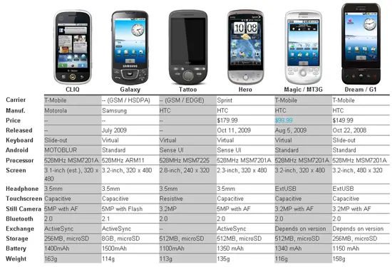
Assuming the CLIQ is priced competitively, it is arguably the nicest Android on the Market:
- Only the CLIQ and the G1 have a Full Slideout QWERTY keyboard and the CLIQ is by FAR a better looking device, hands down, up, over, around and everywhere else.
- 5MP camera equaled only by Hero and Galaxy
- 3.5mm headset equaled only by Hero/Galaxy/Tattoo
- 528MHz processor – mostly the same as all available Droids
- Weighs 163 grams – definitely the sturdiest feeling Android out there
Do the CLIQ specs blow away the competition? Definitely not… but Motorola never intended for that. Keep in mind that this is ONE PHONE being announced out of a portfolio. They’ll have higher end Android Phones. They’ll have lower end Android Phones. For their first ever Android Phone why WOULDN’T Motorola focus on the meaty middle ground to attract a mass audience and score a sure hit?
After some thought, I’m really digging the hardware choices Motorola made with CLIQ. Let’s take a peek around the device:
A few quick thoughts:
- Overall specs are very nice: 3G, Wi-Fi, 5MP cam, 3.5mm headset jack, MicroSD up to 32GB… you can’t do a lot of complaining unless its overpriced.
- Ringer Silence Switch is a nice touch – love it.
- Call/End aren’t hardware keys and instead are touchscreen options. Ultimately means less cramped navigation and a more clean overall look. Would take getting used to for a G1 owner like me.
- MicroSD slot accessed by removing the cover. A downside? Perhaps… but how often do you REALLY need access to your MicroSD card. Be honest.
The Keyboard
I’m a hardware keyboard kinda guy. When I first tested the G1 I HATED the keyboard. A week later I loved it. Now I’m somewhat obsessed. Aside from glaring issues, it’s tough to test a keyboard for a few minutes and make a split decision on the quality. That being said…
The layout appears pretty impeccable:
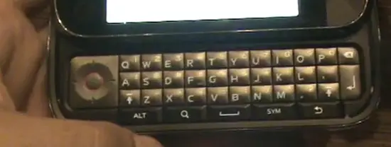
Doesn’t that just LOOK gorgeous? Everything is neatly in line with the D-Pad, you’ve got 2 shift buttons, a dedicated search key and copying/highlighting text is a breeze. At first I thought the bevel of the keys was a bit too much, but the only thing I can see this keyboard doing is growing on me. In fact, I already can’t wait to try it again!
The buttons are large and although the keyboard lacks numbers 1 to 9, the increased keyboard comfort might be well worth it. No funky angles or weird chin to get in your way here… just straight up, good ‘ol fashion QWERTY typing!
Touch Screen
I only had ONE possible concern about the Touch Screen – when you were flicking the screen to the right, would the phone involuntarily slide open? In the below video I’m purposefully pushing kind of hard to see what type of force it would require:
This potential problem could only be analyzed with some extended use, but I don’t see it as a huge concern. The touchscreen is sensitive enough that you don’t NEED to be swiping the screen forcefully but I would still keep my eye on this for future reviews. Given the heft of the phone and sensitivity of the keyboard I would hope it proves to be a non-factor.
The screen itself is made of glass and you can tell – it feels absolutely great to interact with and the phone in general has a good feeling in your hand.
Camera & Image Gallery: More To Blur
After my first guided tour of the CLIQ I thought BLUR started and ended with contacts and social networking… but I was wrong. I asked a different guide if he would demonstrate the camera for me and found out that the Picture Gallery is a custom Motorola BLUR creation:
You’re also able to share your pictures through an expanded number of sources that are inherent to your Motorola BLUR accounts. By the way he really did Email me that picture so we could get an idea of how the 5MP camera with auto-focus performs. What do you think of the below picture quality?
That’s pretty darn good! As for dimly lit areas this phone won’t do so well because it doesn’t have a flash. But whatever, arent’ you up past your bedtime anyways?
Rich Text Emails and Integrated Calendars
Two more features that Motorola has customized as part of their BLUR Android solution are Rich Text capabilities in EMails and the ability to integrate multiple calendars (Google Calendar, Work Calendar) into one view.
White Motorola CLIQ vs Black Motorola CLIQ
Pictures of the White CLIQ with the Black CLIQ… racially diverse Android Phones:
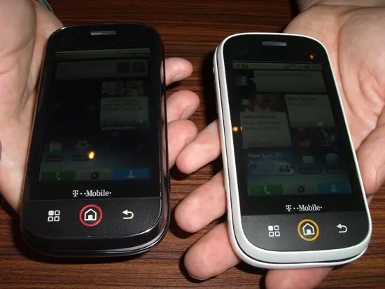
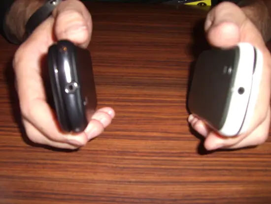
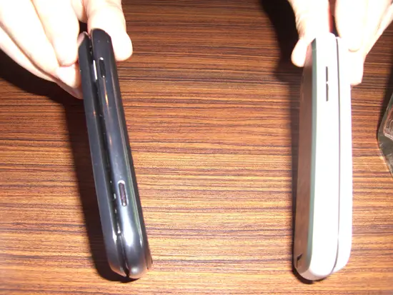

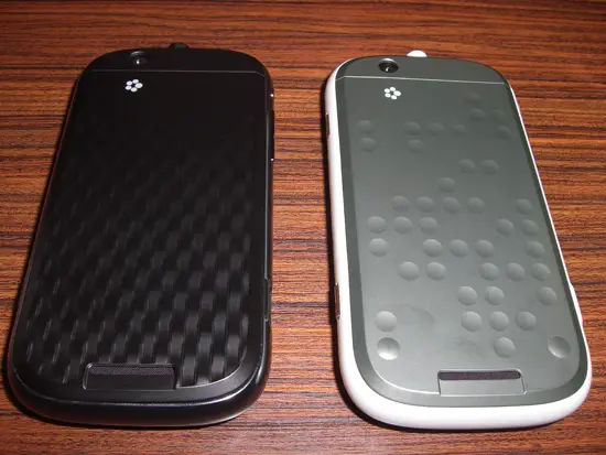
Side note: See the different designs on the back casing in the above picture? Which one do you like more? I’m not sure if they’ll be offering both when launch day comes or not. We shall see!
The Bottom Line On CLIQ
Motorola is BACK! T-Mobile is getting crowded with Android offerings so there is no guarantee the CLIQ will clean up shop, but it clearly illustrates that Motorola means business. Right now Android is the hottest thing on the mobile scene and Motorola just created an Android Phone that sits next to the biggest boys on the playground without flinching.
And if consumers buy logic then the CLIQ should see PLENTY of interest on T-Mobile. It has a better headset jack (3.5mm/ExtUSB), better camera (5MP/3MP) and bigger battery than the G1 and MyTouch 3G which are TMO’s current offerings. But more importantly, the CLIQ represents Motorola’s renewed capability to deliver excitement and innovation as a whole… beyond the CLIQ. I have no doubt they can extend this to the rest of their Android portfolio that will span carriers, form factors, specs and price points.
The CLIQ proves Motorola CAN be a leader in Mobile once again… now we just have to wait for the rest of that portfolio.





Looks like they ripped off Palm’s WEBOS features! All the integration of contacts and emails reminds me of the WebOS. Except the WebOS has exchange support built in.
Good review! It does seem to have a ‘chin’ from the side. Or at least the bottom is thicker. Maybe it’s more like a pear.
5 Android phones by the end of the year between Sprint and T-Mobile. Man if and when Verizon grabs one; 3 of the 4 heavy hitters in the states will have android offerings. This is great news.
For whatever reason I think the specs for the Hero screen size are incorrect on your comparison chart. The chart says the screen is 2.3″ but it’s actually 3.2″ and is actually given correctly on the graph that this article links too.
I will ditch HTC in no time.
Great review.
Id like to see multitouch though.
Oh; and in all the demos Ive seen, they seem to sdhy away from showing web browsing. Only as far as the google mobile web page. Did you see any real web browsing? Curious why it wasnt highlighted.
This seems like a decent phone. Rob, how much ‘desktop’ real estate is there for customizing with the MotoBlur UI running?
Personally I like the idea of a hardware keyboard, but with Sprints new everything data plan with unlimited minutes, it’s gonna be hard to justify the Cliq over the Hero!
It’s nice to have keyboard as oppose to screen keyboard however the screen is not big enough. 3.1 doesn’t cut it. that’s too bad.
There appears to be a typo in Miller’s chart. Hero has a 3.2 inch screen, not 2.3 inch screen. I think the only advantage over Hero is the slide keyboard.
Any thoughts on software updates? I wonder if HTC is better at releasing software updates/fixes than other companies such as Moto. I had one of the original Moto clam smartphones and they just were so slow at releasing software fixes. It took months and countless complaints to even get them to acknowledge there were problems with their hardware/software integration. I guess it doesn’t matter anyways since TMO doesn’t sell service to the upper Midwest…. Sprint still pulling me in now with their new pricing plan……
Great in depth review….best on the web.
Great features including the overall social networking and contacts aggregation, image gallery and camera quality, rich text emailing, power off button with GPS, Bluetooth, airplane mode and wireless toggles. Looks fast & sexy too! Wish they would have showcased a game with the gamepad. Overall I am impressed but will wait for a more powerful phone/processor before I consider making the jump.
One question: Rob, how does it compare in your mind to the HTC Sense UI?
One concern: I follow a lot of people on Twitter and I really don’t want all of them in my contacts list on the phone
Wow… very in depth review. I’ll have to dedicate more time to reading the whole thing!
In the mean time, I wanted to let people know that some of the functionality of Blur is already available to Android users. It’s a program called Pixel Pipe Lite. It allows photo, status and blog updates to dozens of services all at once. You can set your status on Facebook, MySpace, etc. and also update with a Tweet all with one click.
Keep it real, Phandroid. I pimp you often.
A good start for Motorola’s Android Affair ! The processor is a bit weak and UI, though useful, looks a bit cluttered. But overall a good phone. Now make it Free with a two year contract, and it will move off shelves very quickly…
This is what an in-depth review should be!
Kudos! I really want to get a Cliq NOW!!!
I dont think you got capacity of sdcard right, it shows as 256 mb its acutally 32 GB
The back of the white one is apparently mores code for something.
I don’t think it stacks up to the Samsung Galaxy, only 256mb of system storage is not enough! Its ok on the G1 because you can root and install on the SD card, but I’m guessing people will have to wait a while before motoblur is rooted. Also, without trying the UI I can’t say for myself, but it looks really cluttered, I like good ol’ vanilla android. Also, smaller screen and battery than the g1 but it weighs more? I dunno looks like the G1 is better to me, or Galaxy if you don’t mind the lack of a keyboard.
i’m currently with Tmobile but as my contract nears expiration, sprint is still in first place for me.
1. Personally, I still think Hero is the best device
2. With Sprint’s new plan, you get 250 million “faves”
3. Sprint’s 4g network is rolling out sooner than other carriers. That means the data, required by all these smart phones, will be faster, sooner with sprint
Great looking phone, but really missing the mark until it launches on Verizon or AT&T. In my world of high travel, T-Mobile and Sprint just aren’t options. Given the depth of Android handsets on T-Mobile already, I can’t for the life of me understand why Motorola would chose them as their first carrier partner. Mind boggling and deeply disappointing.
Now I’m sort of torn between the features of a few different phones. I’m not leaving my G1 until something with a physical keyboard somes along, so the Cliq is a huge relief for me- It means physical keyboards haven’t been completely abandoned. But I’m much more excited about the sense UI than Blur- I like being connected, but I’m not really interested in carrying information overload around with me. If I could scrap Blur and get sense (or stock donut) on the cliq, I think I’d buy it on launch day, and relegate my current G1 to a dev phone.
Seems like a nice phone, good job Motorola ! .. The unintentional keyboard slide seems like it would be more of a problem for left handed people. I think in most people there is better coordination in moving your thumb inwards toward your fingers (grip) than away from them.. So sliding your thumb to the right is going to be more controlled in a right handed person than a lefty.. But kudos to you for examining what may be an annoyance to some people.
I like the idea of Motoblur, but for people with a lot of friends on Facebook, Myspace, etc., it is going to create an “info-overload” as many people have been saying. I do like the idea of being able to update all your statuses at once or one at a time, but, from what I see, you can’t select multiple clients to update without doing them all which could be annoying. Since the CliQ will have motoblur what exactly does that mean for donut, eclair, and so on. Does that mean you get the update, but not the look? Because I personally like the original Android home screen way better. Is it also going to have the full marketplace? Or will it have a toned down version?
Forget that part about the market, hadn’t watched the second video yet. But I forgot, will this still have a 3×3 dot lock screen?
Actually the coolest feature of cliq is the option to remotely wipe your phone and also the ability to backup and restore your data from the cloud! You can see it in the demo page of motorola. Nice. As for facebook, twitter and other crap, i just don’t care and even if i did i think the homescreen is waaaaaaay too busy :P
The part that has me super excited is the D-pad. video game emulators are a must for me and using the G1’s keyboard as a substitute for a real D-pad leaves a lot to be desired. If i can throw a fireball or a dragon punch with CliQ’s D-pad i’ll be extatic! Motorola, don’t let me down!!!
yeah, i second shinobi-wan’s comment, the D-pad looks like it will be awesome for casual gaming. i’m glad it’s on the left.
v.good “preview”… almost palm-pre like integrated communications (email, sms) and social messaging..awesome.. but ui and hardware designs are to be expected more.. but overall v.good device, it seems… lets see how the final retail production performs, hopefully no glitches…
How can you claim this is the ‘nicest Android out there’ , when Sprints Hero or the Galaxy havent been released yet?
Its just the newness that spawns nonsense.
Look at the screen , its friggin cluttered and it looks like a dinosaur for heavens sake.
Pfft Sprint is the way to go.
Great job covering this launch, I liked how you pulled it together in this in-depth review. Great site, keep up the good work.
For everybody who keeps saying it looks too cluttered, all those widgets can be moved to other screens or even be removed just like any other widget. Also, the storage on the phone is 512 MB. Not all of it can be used but none of the others listed at 512 MB can use more than half of that either. The G1 has 256 MB but less than half of that can be used for storing apps.
Looks like MOTOROLA is BACK to the game, come on Motorola, beat Samsung and prove your self again !!
We dont want the Cell phone inventer getting ditched from business !!!!
Thank you Quasar! I am just about sick of reading comment after comment of people who think that this phone’s screen is too cluttered! This is ANDROID! You know, the device that is known for its customization and choice?! Remember?? You can have the screens look like whatever you want, seriously! The screen is not an issue, period. I am equally excited about the d-pad! Which btw, should only be on the left side. Been reading too many comments as well with people saying that the d-pad should be on the right… I just don’t understand that. If you are a serious gamer, you are going to be familiar, and much more comfortable with the d-pad on the left, just like every game controller w/d-pads that have ever existed. Phew! Sorry guys, just had to get that all out! lol This phone is really gonna rock!!!
Phone looks like what I’ve been waiting for. I hope the GUI isn’t laggy like the Hero is (was? is it fixed with an update?. It really makes or breaks a smartphone.
I’m liking the phone…it looks like it would be a marginal upgrade for G1 users: bigger battery, more RAM (though not quite as much as I’d like to see), way more ROM, higher res (and presumably better? camera, 3.5 mm headphone jack, light & proximity sensors, and it of course keeps the keyboard (which is a must for me)…
People should really stop making retarded comments! Pls people do some research before you make retarded comments. Plus moto blur its not the same as the pre or hero
The UI looks like the white-board of a pre-school, littered with random clippings. Though you can clean it up, but then you loose the benefits of aggregated social UI of MotoBlur. Time and again mobile companies have proved how clueless they are about a good UI. So far, only HTC Sense seems to get it right…
I agree the UI setup for the demo and personal devices shown were a tad cluttered, but it seems to me the demo device would have been organized to display as much functionality as possible…and a personal device would be tailored specifically to the mindset of the person giving the demo. Until you’ve seen the out-of-the-box default, a demo of the customization process for the new UI, and a demonstration of the potential for custom widgets you have no room to talk. Even the reviewer seems to be making unfounded assumptions based upon snippets of what he saw during the demo. There just isn’t enough information here to pass judgment.
very good review. however unless i have to try myself its hard to judge the phone because it doesn’t cover the browser, response time and how to stop subscribe for any account (Twitter, Facebook, etc,). Lets wait and watch review from actual user.
All the very best to Moto and Sanjay. :)
I don’t get all the excitement for the integrated facebook/tweet/email/sms screen in Blur. HTC already has that built into the Sense UI. This isn’t a new concept.
The latest HTC update to the Sense UI has fixed the lag issues. :)
Someone can correct me if I am wrong… but it looked, as if there is a Home screen.. and then he clicked the left button and it went to the “social app screen”.. that people seem to be complaining about.. So if I am understanding it correctly this is similar to a multi desktop environment ? .. If so, sounds like a reasonably organized way to do it, although I think depending on how active your social life is it sounds like a possible battery drainer.
I think the whole thing is cool for those who use it, but the facebook and twitter thing just never got to me.. Some SMS, email, and IM now and then is enough for me to handle. How much more involved do I need to be in others lives, or them in mine ? .. but again, to each their own, and this looks like it may be a nice feature for them.
Good job Moto…
@ #1 Sam
“Except the WebOS has exchange support built in.”
Erm…the Cliq has exchange support built in.
By chance my Orange (UK) contract is due for renewal on October 20th, and after 6 years of using WinMo phones I want an Android-powered handset with a hardware querty keyboard, happy days indeed. :)
“I think depending on how active your social life is it sounds like a possible battery drainer”.
From my understanding, the Motorola BLUR server handles social network communication and push the updates to the phone. This should results in better battery life compared to HTC Sense and the Palm Pre method.
I love the direction companies are taking with social integration as INQ has pretty much started.
The main problem I have with MotoBlur is the home screen. What I’m not understanding is the effectiveness of the Happenings widget. While it looks cool, I think showing the last one or two updates from all of your combined 300+ Facebook, MySpace and Twitter contacts is pointless.
Hopefully there is some ability to filter which social network, friends (perhaps friends groups per social network) show up both in the Widget and the Happenings application. Otherwise, what will the user experience be like for the people with 500+ friends PER social network?
question is where’s google in this ? i mean rumors that since hero isn’t google branded, the device isn’t allowed access to google’s app market ? this one isnt google branded either with a customised ui, so ? hopefully it isn’t true, in fact google should be proud that their “open” OS isnt only truly “open” but also truly powerful seeing manufacturers HTC, Moto, Sony Ericsson are having their own ui…. btw htc’s officially released hero’s rom upgrade (already in the nordics), having seen a few youtube clips, no more glitches no sluggishness….hero has become a killer phone, and its not an overstatement… am waiting for SE’s x3, but with the upgraded hero i’m having 2nd thoughts…
amazing phone.. waitin for it 2 b launched in india… this wil make my social life more easy.. beside the amazing advanced features.. given a choice i would neday wil switch to this phones.. :)
MOTOROLA DID NOT CREATE THEIR OWN UI ……..
….
They created a new home screen with lots of different panes and some navigation for that.
They also created four special “blur” widgets that you can place anywhere you want. These widgets get their data from the BLUR servers using your blur account. This data is pre-processed content from whatever social networks you setup on your blur account.
ditching iphone and pre for Moto Cliq. yoo that’s the way 2 go.
this looks cool. and my g1 is pissing off because it keeps breaking and screen wiggles after a bit use. idc abut bluer crap. ill most likely take it off. also i like,want and need the head phone jack and better battery and also in the internal memory of 512 should be enough i moded my phone to use apps off the sd card and a 512 was more than enough,(about 10 games and 30 or so app with about 200mb left) so im not to worried about that. i just want a srurdy phone with android to last me a bout an year. i wish it had a numbers in the keyboard but it looks good and i like the d pad.
What I could not see in the videos or read about in the review or any other page is: does it have the multi-touch capabilities that the HTC hero has? Meaning the zoom feature in the browser. I would love to have that on this phone
@fabien,
I think it does not have multi-touch. However, for your specific need of zooming in the browser perhaps they have implemented that some other way. Perhaps as a touch bar at the edge of the screen or maybe using the bottons?
I would think that using multi-touch for zoom is a problem in the browser because you might touch a link.
We really need a full review!
One other concern I have with this or any other phone pumping in info-PRIVACY. Say your significant other gets snoopy one day. Now they would not only be able to check calls/texts, but now view all your social website messages, etc.?
Anybody know a way around that, or anyone who has access to your phone has access to EVERYTHING?
I think it’s comparitive to the Hero, but it’s missing the trackball! I realize it has a trackpad for when using the slide out keyboard, but I use my ball so often on my G1 I can’t imagine having Android without one! I hate the slide out keyboard on the G1 so I rarely use it, instead I use the on-screen Sense UI keyboard (rooted G1.)
All in all, I can save about $20+ a month by switching to Sprint from T-Mobile, so I think I’m going to have to make the switch, especially since the CLIQ is going to be $20 more than the Hero.
This phone looks sweet and has alot of features but i still need to play with it more. the keys take so getting use to………the reason i have to play more with it is because of something the motorola rep. said then had to correct him self (he made it sound like it some times slows down)
the phone’s touch front was clear and precise, it worked really well. Even on the demo phone i played with for a little while the motoblur was exploding all over the home screen, very distracting and cluttered. the keyboard is terrible, with hard keys that are very rounded. The keys make typing difficult because they arent staggered like a real keyboard and the shape and hardness of them makes your finger slide off and hit extra keys. I feel that even my old samsung gravity had a superior keyboard, and the g1’s was far superior with dedicated symbol and number keys, key staggering, and good spacing. I would get the cliq if it was all touch screen, but the terrible keyboard ruins the phone for me. Instead i will get the MT3G. Its also unclear if motoblur can be disabled or removed from the phone to free up processor speed, extend battery life, and reduce home screen clutter for those of us who can live without facebook in a saline drip.
This is a wonderful review. I just purchased the Cliq a few days ago and I must say it is a great phone. I had to make a decision between the Cliq or IPhone. The fact that the IPhone doesnt have a interchangable battery and the camera isnt as good, the Cliq won me over! Not to mention the hassle of having it unlocked & jailbroken because I refuse to switch over to AT&T. I’ll just throw a 16gig memory card in it and call it even. Plus I like having the option of using the on screen or slide out keyboard. However, the on screen keyboard is not as accurate as I hoped it to be. Maybe it will take a little more getting used to. Overall, I am very satisfied with my purchase and will keep this phone for a while. Motorola made a good comeback!
I’m curious.. I like what the cliq offer but does it have aim and yahoo IM?
After Droid, Cliq is another confirmation that Motorola is back on the mobile market, http://www.itsagadget.com/2009/12/motorola-cliq-is-another-android.html
Andrei: The Cliq launched before the Droid.