LauncherPro. ADW Ex. Go Launcher Ex. SPB Mobile Shell 3D. All great launchers, no? Custom launchers help users get more desirable homescreen experiences out of their devices that they may not otherwise be able to enjoy.
There’s never a shortage of them because they all offer unique features that others just don’t have. The same will be true for the next new contender, TSF Shell Pro 3D, and in a big way.
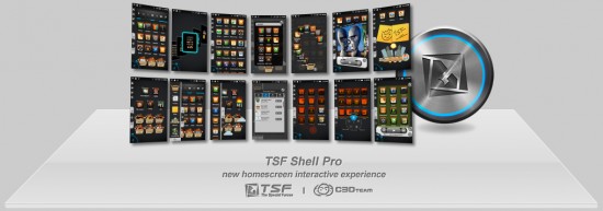
This launcher introduces a lot of innovative features that I’m sure market developers and OEMs wish they had thought of before. Free-style widgets and app icons allow you to lay your homescreens out exactly how you want to. If I need to rotate my app icons for whatever reason, I can do that. If I need to rotate a widget, I can do that. All of it is intuitive thanks to multi-touch.
Other features such as batch selection of homescreen items, quick and easy lasso-style folder creations, a slick homescreen jumpfeature, 3D widgets and more all come together in an aesthetically pleasing way.
I don’t think I’ve been this excited about a launcher before and unfortunately I’ll have to wait to cure that excitement as it’s not yet available for download.
The team, C3D, are working hard on getting things polished up and ready to go for an eventual release and you better believe we’ll let you know when they get to the Android market. Watch the 8 minute demo above. [via AndroidForums.com, AP]






This looks pretty reminiscent of TAT Home, before TAT was bought by (I believe it was) RIM.
Let’s hope this one actually gets released, unlike so many other launcher concepts.
Wow… I have never been a fan of 3D effects in anything but this launcher has some kick-to-the-teeth features. Might consider switching to it when I get the chance
wow. that’s very, very, interesting. I’m wondering what phone runs it that smooth, though.
According to the youtube video descriptions
TSF Shell Pro 1st edition demo(Video Mobile HTC G10 HTC Desire HD)
That looks amazing!
Very cool. It will work just like that on my original Droid right?
Might lag a tad. Just a tiny bit.
wow cant wait for this hopfully it runs as smooth on install
Compiz is working on phones now!?
That’s doin too much.
wow it looks like they put a ton of work into that… is there a min specs req.? lol
Bad ass
That looks amazing but man is it ugly. I hope they allow theming of that. I’d buy it but only if I can make themes for it.
This launcher is amazing. I would buy it today if it were available.
Video not workings
Any exact release date?
Lots of this stuff is from Galaxy S II TouchWiz 4.0…….
OMG, this IS TAT home. The screen sselection and music widgets are EXACTLY the same
http://www.youtube.com/watch?v=bOGmnnGpoqg
TAT was acquired by RIM so I guess this picks up where they left off.
I’VE BEEN WAITING FOR THIS SINCE THE G1!!!! ZOMG!!!!! :O
I was waiting for someone to say this. This is either a ripoff or the guys from TAT made a side company not owned by RIM to do this. You would think RIM would own the IP for this design from the acquisition.
1 Word: Acquisition
Too complex for Apple, but Google is probably making calls right now. Rotating icons would never be allowed with IOS – potentially too messy.
Holy Crap, that is awesome. I hope there are some themes, or at least some color customization.
Way too much going on for my taste. I don’t want or need to worry about pixel placement or rotation of my icons.
Hopefully some people will enjoy it, though.
I like it because the first image is Division Bell. Anything following that is going to be just right.
Most of the features look like they were pulled straight from Bumptop (Windows program that gave you a 3D interface, and the ability to stack Icons, grate trails, etc…)
Glad someone is using the features. I miss bumptop since it stopped. :-(
If I’m not mistaken, I think Google bought Bumptop.
very cool, looks a lil too cartoony, great features nonetheless
Wow… looks pretty impressive. Definatley not for the average Android user though. Looks like it has a fairly steep learning curve. Lots of cool animations though. I’ll be interested to see how this performs on older devices…
To me it seems over the top and ugly. People here seem to be eating it up though :S.
Only thing I like about it is that it’s fast.
Keep in mind the video is trying to show every possible thing you can do with the launcher, if you want to keep it simple (but still nice and fast) then that can be done, as well. The ideas going into this launcher are impressive.
i agree – its cluttered and over complicated, IMHO.
I think the point here is to showcase all that it can do and still run smooth. I saw a lot of very intuitive features that would be very useful. I would assume there will be skins/themes to tailor it more to your own style, but the lasso and easy folder management would be welcome on any of the launchers.
It’s trying to do much at once, I shouldn’t have to learn how to use it for three + hours to get optimal use of it.
Looks very cool but the deal breaker is its too iphoneish. Get rid of that and then I’ll give it a try
wtf? o_O NOTHING about that is iOS-y
It has…… icons? *smh*
is the music stuck in anybody else’s head?
dit dit dih dit dit dah dah * 100. Sounded like a cheesy 80’s corporate training video’s music track. :)
Should it be concerning that the URI at the end of the video doesnt exist? Nor does the domain?
It exists. It’s just not responding at the moment. Overloaded probably.
Looks like it would get really tough to get used to, but it is innovative, I’ll give it that.
you sounded like youre doing iphone commercial
” If I need to rotate my app icons for whatever reason, I can do that. If I need to rotate a widget, I can do that. All of it is intuitive thanks to multi-touch.”
Awesome… but will be slow on any older phones (read:single core)
I wonder how much it will cost.
its like an miui on steroids
HMOG, this is just out of this world. I really hope it’ll be available for stand-alone purchase, and not exclusively on some crappy phones [Sam-achoo-sung]. And I hope Apple doesn’t sue them for the icons aligned in a grid.
P.S.: And I hope it doesn’t send your info to Chinese Government while you sleep.
I get a STRONG vaporware feeling from this, maybe because it’s coming from China, or that we saw much of this over a year and a half ago from the TAT launcher.
It looks a little overwhelming but I like it. It almost looks like a more advanced MIUI, or like they were running it over MIUI. How the sub menus and actual apps looked (SMS, Dialer, and drope down menus)
Chris…. thanks for rekindling the want I have been having since forever…. You bastard..
Ehh… can’t see the video at work… does it have a widget for the stock music player?
One feature that seemed to missing in that video was DRAG TO UNINSTALL.
Dragging an app from a homescreen (*not* the app drawer) over an icon to uninstall (vs just remove it from homescreen) is a feature I’ve always loved about Launcher Pro. ICS’ default launcher lets you do it from the app drawer. Other launchers like TouchWiz make it painful – have to go to settings>apps>*wait a long time for the list to populate*>scroll to the app>select it>uninstall.
looks real nice
I like it. I also like SPB Shell 3D. This has ALOT going on….one cant say you will ever be bored with Android…lol.
And this is out the box, just install…no need to root.
Only reason I dont use SPB Shell is it had some quirks. Its been updated so it should be better now. Might give it a spin on my RAZR.
Cant wait for this to come out. So much customizing….
That music widget is worth it alone!!
Not to worry.
Apple will soon have all these amazing features patented.
Remember, the US Patent system was recently changed to a “first to file” system instead of a “first to invent” system. “First to file” is so much easier for bureaucrats to deal with. Just look at the date of filing.
Look like my compiz linux desktop
Damn!!! They’ve closed down everything. No longer working on the app – just 5 days in beta as well