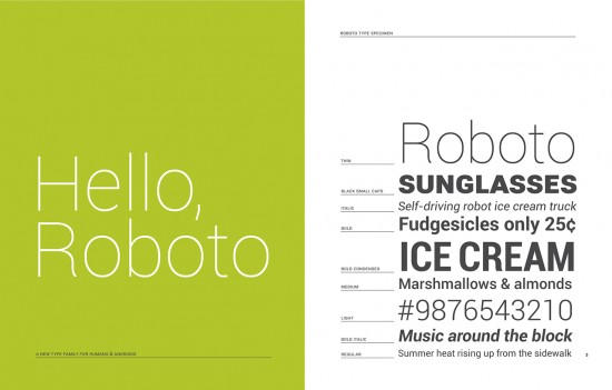
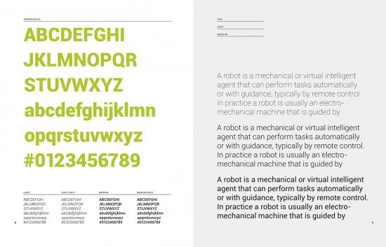
Matias Duarte took to his Google+ page today to give everyone a behind-the-scenes look at the developmental process behind one of Ice Cream Sandwich’s tiniest updates: the font. Those boys over at Google are calling it Roboto (don’t you dare call it san-serif Helvetica) and if you thought there couldn’t possibly been much thought behind the new typeface you were wrong. Soooo very wrong.
According to Mr. Duarte, the reason for the new change is simple — the old Droid font was made for lower res devices and wasn’t displaying correctly on the now offical 1280×800 screen resolution. They were looking for something new, modern and that would fit the new “magazine” style UI of Android 4.0. Apparently, the Roboto font isn’t just optimized for high definition screens but it also plays well with older Android devices sporting lower res screens, making it a perfect fit moving forward. In short, every part of the Robot typeface was planned in painstaking detail. And I haven’t even gotten into how they came up with it. If you’re interested in hearing more on Roboto (lots more), hit up Matias Duarte’s Google+ post. While I found it interesting, I’m sure even the most dedicated Android faithful may find it a snoozer.





So is it pronounced “Robot-O” (Like the song domo-origato mr. roboto), or like “Robo-toe” ?
The former.
It’s the latter actually
really? guess they should have spent more time working on the name
Did you watch the Galaxy Nexus presentation?
It’s pronounced Robot Toe, which is what his first example says. It’s not robo toe, as in robo-cop + the things on your foot.
I did watch it, they pronounced it Row (row a boat) – bow (bow and arrow) – toe. Not “robot-oh” as is suggested by the former.
Really? you weren’t listening then or need some new speakers. Everyone else heard the pronunciation from the song Mr. Roboto. Hell its even spelled the same.
Well, Jean, watch the presentation again. I’ve not only attached a link to the presentation, but I’ve set it to skip to when Matias start’s talking about the font. Please have a listen and then come back and tell us that it’s pronounced row-bow-toe.
http://www.youtube.com/watch?v=Ts5WBm0tXzI&feature=youtu.be&t=21m58s
That’s weird I read a report that it’s Ra( like rat) bu too. The article said it was based on the creators”cute friendly bunny” he had as a kid. This was his tribute to his lovable little friend.
This makes sense because in the image above why would you say,” hello” to a font?
He is reaching out hoping that Rabutoo knows he is missed.
DOMO (domo)…..DOMO (domo)….
That’s weirdI read a report that it’s Ra( like rat) bu too. The article said it was based on the creators”cute friendly bunny” gee had as a kid.
This was his tribute to his lovable little friend.
Forgive me guys, a lack of morning coffee… I must’ve watched some foolish journalist pronounce it wrong and have that stick in my mind. I also wasn’t aware there was a song. The take home message is where is our beautiful shiny new Nexus?! I want it now!
http://goo.gl/y8crq
I love typography!
> Those boys over at Google are calling it Roboto (don’t you dare call it san-serif Helvetica)
As opposed to serif Helvetica?
Also this font doesn’t really look much like Helvetica, aside from being sans serif. It has a couple of facets in common but only in the same way that a cat has a lot of similarities to a dog.
**sigh** I was hoping for a font that distinguished a bit better between I (capital i) and l (lowercase L) like Trebuchet