Over at CNET’s Android Atlas an anonymous source sent in two pictures of what appears to be a completely overhauled UI for Android Market complete with added functionality. In the screen shots you can clearly see a new, vibrant and colorful approach:
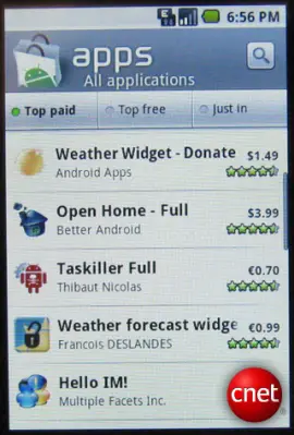
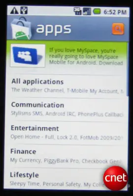
As you can clearly see, the background color of the entire App Market display is white as opposed to the current black background and white text. Sorting options include Top Paid, Top Free and Just In with the search button being prominently displayed in the upper right. The category display lists apps that are available in the category in smaller/lighter text – I’m not crazy about this as it seems to clutter things up a bit. However, I like the idea of displaying recently searched or often searched keywords and other dynamic info.
According to the article, this Market view was running on a Donut build of Android and most blogs republishing this information say this is the Android Market we can all look forward to later this year. But can we? Seeing as how the leak comes only a week before the big Motorola Android event, perhaps we’re seeing a custom displayed version of the market offered by Motorola. We know they have their own unique offering called Motorola Blur and perhaps THIS is what we are seeing?
This possibility hadn’t been brought up yet and I thought it warranted a mention. I don’t have any information that would suggest one way or the other, but I think the idea that these COULD be the first screenshots of Motorola Blur is definitely a possibility. What do you think?
[Via CNET]



my money is on new market update who is with me eh?
I don’t have much of a problem with how the market is now but it wouldn’t hurt to clean it up a bit. But yea I’m thinking its a new market update.
The market could do with some major updates, like enhanced filtering and a better search function. The search in particular is very poor. For one thing, it doesn’t do nearest matches to a query. An example: typing in Touch Pal returns 0 hits; typing in TouchPal gives the TouchPal app. WTF! And this was made by the master of search engines? Bollocks!
I also agree with a related article in displaying a screensot or image. And what about “Search by:”, e.g. author, within a sub-category?
It certainly looks prettier, but aesthetics only isn’t what this update would be, hopefully. A major categorical overhaul to separate themes and home-screen modifications, small toggle apps, etc from true full blown apps. Screenshots that can be uploaded to each app would help some paid developers grab a sale, and please allow other territories to buy apps from the market. Developers have expressed their distaste left and right with how bad they’re doing on the Android market place in comparison to iPhone (64 dollars a day versus 6900 dollars a day, you do the math). While the iphone does have an extremely large amount of users, Android could potentially make a nice return for developers if things were done right. Unfortunately, the open nature of the OS leads everyone to believe that every app ever made should be free, and thus we get the jerks downloading a paid version of their favorite app just to rate it 1-star because he feels he was stabbed in the back (even though the developer left the free version in-tact and took nothing from it. Yes, I’m looking at you Twidroid users). The idea that every app should be free needs to be dissolved into nothingness and people need to start appreciating just how hard these developers work to enable android to do amazing things (I have a full functional FTP client, IRC client, file manager, etc on my phone. I can barely get some of these things to work right on my PC!)
Sorry fo the large rant. I’m just excited for ANY changes that would help clean the market up and get android users more aware about the nice apps that are hidden above the crap.
Seems thin. My bet is that it’s just the Android Market update. Am dying to see blur, but I doubt this is it.
Don’t really care I have the HTC Rom so
I like the white-on-black style of the standard UI better. I hope this isn’t the color scheme on the Sholes. I’m looking forward to seeing the Sholes since VZW has service at my house but T-Mobile doesn’t.
We’ve had this in the UK for months!