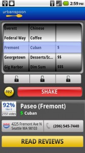
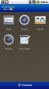
One of the problems I had with Urbanspoon when it came to Android was its look – I don’t like Android apps that try so desperately to look like they belong on an iPhone. And if you’re going to do that, at least make the app look good. There was also a lot of unnecessary eye candy.
All that doesn’t matter anymore, though, because they’ve updated the Android version of their application and brought its aesthetics closer to what you’d expect from other high-quality Android applications. More than that, functionality is greatly improved. You’ll be able to sign up for an Urbanspoon account and review the restaurants you come across, and it even has reservations support.
Basically, it’s more Where-ish and Yelp-ish, and that isn’t a bad thing. Take it for a spin in the Android market now.




my new favorite thing about reading about new apps is the link to the android market website :D
same… google goggles is amazing with this feature, literally just point, you don’t even have to take the picture anymore, it live scans that shit yo!
I feel like mine has looked like this for a long time. At least the page that selects a restaurant for you.
“they’ve updated the Android version of their application and brought its aesthetics closer to what you’d expect from other high-quality Android applications”
If that is what a high quality android app looks like – android is in trouble. That interface is ugly as sin.
I love that the market screenshot (also in the article) has the listing for my favorite local hole-in-the-wall sandwich shop. Except that now I’m really craving a Midnight Cuban from there…
um have you looked at the ios version. we were the ones behind in the ui overhaul….
Quentin isn’t big on the research thing. This looks almost exactly like the most recent iPhone version.
Ditto, Rachel!
” because they’ve updated the Android version of their application and brought its aesthetics closer to what you’d expect from other high-quality Android applications.”
IMHO this looks like crap. Was this designed in the late 90s or what? Way too much going on here.