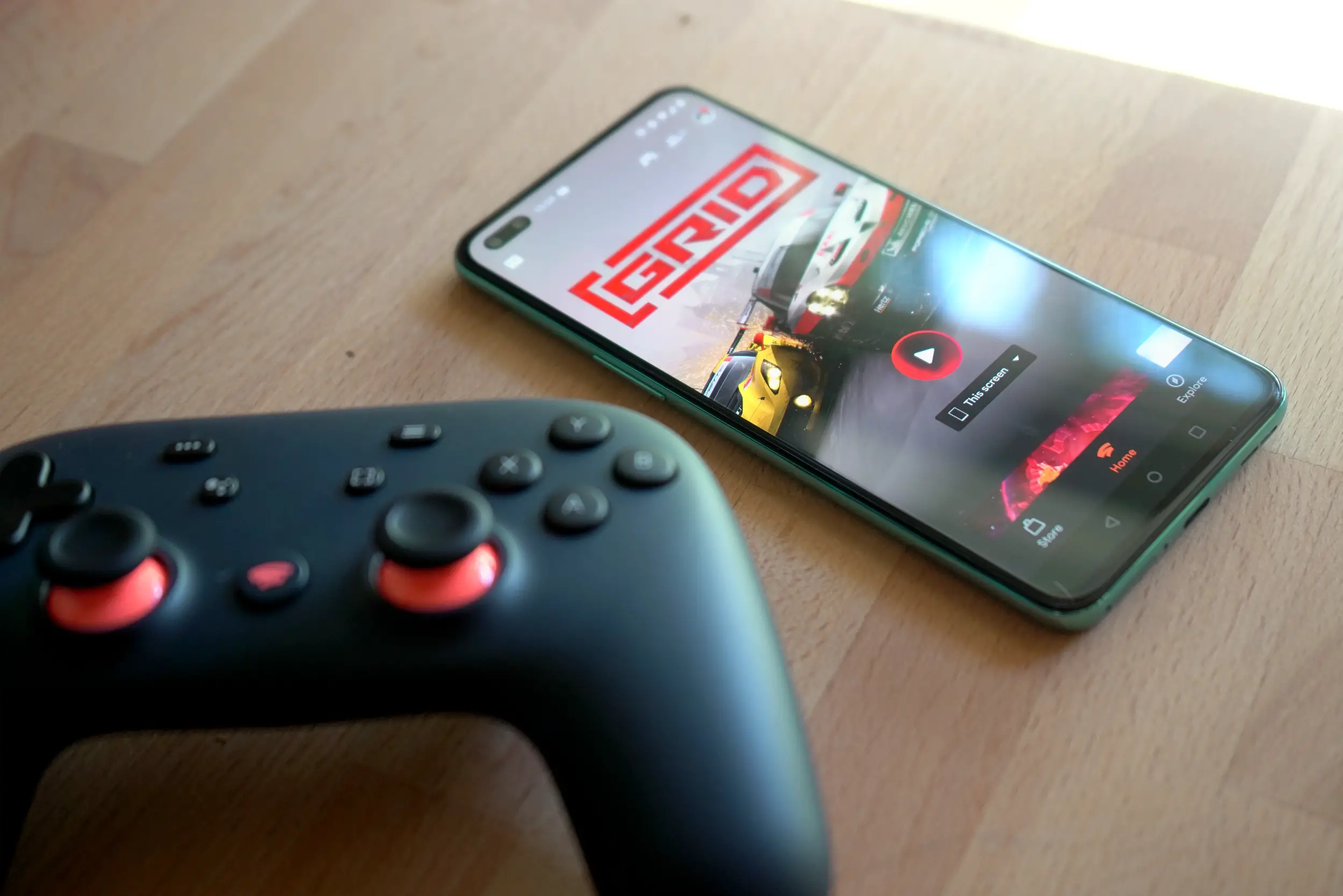
Google Stadia fans will now find it easier to look for the games they want after a new redesign brings the platform’s online store a much-needed facelift. The new store layout will make it easier for gamers to check out demo titles, trial games, as well as Stadia Pro games.
Eagle-eyed Twitter users @in7ead and @scooterama spotted the new changes, which now show a game’s price and additional details set on the left-hand side of the page. Other graphical elements like in-game art and screenshots were tweaked as well, which makes for a more consistent and straightforward design.
Stadia has a new Store UI… 👀#Stadia #TeamStadia https://t.co/tHAVvf3qzK pic.twitter.com/95ws1jcv7D
— inlead (@in7ead) April 28, 2022
The changes follow announcements made by the Stadia team during the Google for Games Developer Summit held back in March, which allowed potential users to browse games in the Stadia store without the need to sign up for a stadia account. Stadia will also enable free trials via a “Click to Play” feature, which will instantly allow gamers to try out games on the platform and reduce the number of barriers for players who are interested in signing up for the service.
Stadia was originally launched by Google back in November 2019, and lets gamers either buy games individually or as part of a subscription plan, which they can then stream from their Android devices, a smart TV, or on PC via desktop browser.


Comments