We’re at Phandroid LIVE and while everyone here votes on their favorite T-Shirt – which will be put into production with the winning designer earning $200 – you can also vote at home! So check out the following designs, vote for your favorite, and by the end of the night we’ll have the plan for the first ever Phandroid T-Shirt!
PS: My faves are #6 and #3 ;)
Design #1
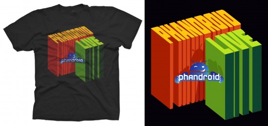
Design #2
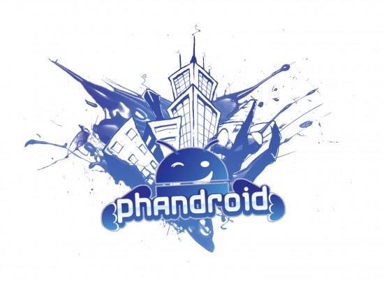
Design #3
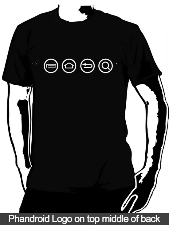
Design #4
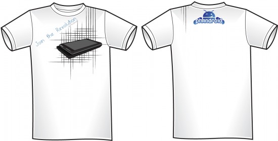
Design #5
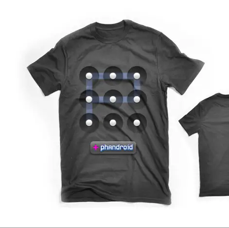
Design #6
[polldaddy poll=3800964]



cool!!! thanks for the design locks “chevere”
I went with number 5
Definitely love the 3rd and 6th Designs
So if we can’t attend are we going to be able to buy these, I hope so
I like #1 and 6. I can’t get on board with #3 because my phone’s buttons aren’t arranged in that way.
Design #2
I want to vote for 3 and 6 :(
1 and 5 are cool
#6. Clever.
I liked 3 and 6 too. I cheated and viewed the results first, so I gave 3 a one-vote boost. :)
#6
My vote #6
#3 buttons are not the same on my phone, but it is a good design.
#6 reminds me of my dearly beloved g1
I liked #3 the best because if you know Android you get it and if you don’t, you’ll ask what it means. Subtlety with Phandroid on back, almost like a hint as to what the front means. A conversation starter, rather than an in-your-face statement. Reminds me of the one that says “There are 10 types of people in this world. Those that get binary and those that don’t.”
No better way for Phandroid to spread the Android/Phandroid message without looking like a total wanker of a walking billboard. ;)
My vote #5, I am a fan of cool graphics.
#3 seem like the only normal one that could wear without being laughing at….
i agree with jonathan.. i wouldn’t like that design because i have never seen/used that sequence before.. 6 ftw.. uber nerd status how i like it :)
I like 6 but I think the keylock P should go on the back, seperate from the +Phandroid box. They don’t go too well together…
Shht my laptop crashed and couldn’t get Photoshop and illustrator on my new desktop on time
I really like #6 .. but make the button smaller.. and ill buy 2 ;)
Of the t-shirts, I like #1 first and #3 second.
Peter Zachar
First off, great job to all the artists’ submissions.
Secondly, I’m curious why those with both front and back designs, are not ALL being shown (like 3 and 6). I’d suggest in the future, when having similar contests, Phandroid also provides a standard template for everyone to use. In this case, a plant t-shirt with both front and back options.
None of the above.
They’re nicely done, but I wouldn’t want wear them. I have to say #2 reminds me of de Blob.
i like #6 but i agree with Will Sours about it and i also like #3
#3 all the way. I would have voted early and often had it used the same G1 button config. And it’s the only one I’d buy to wear on casual Fridays at work. Good luck #3. All might take a shot on Threadless with other concepts too. Nice work.
I like 2 the best but I think 3 embodies Android more than the rest.
is there any way we can see ALL the submissions?
Uhmmm #6 is cute if ya love the iphone lock too. Is that iPhandroid?
to be honest, all of these are crappy. from a graphic designers pov, 3 and 6 are the ones with the most concept. However, both of them could have been executed better.
I would wear 3 and 6 but if i had to choose one I would go with #3.. maybe you can put both shirts into production and let me buy them both tomorrow :)
not to mention some of them are not even sporting the logo that you’ve required. wtf?
I voted 3. Even though that’s not the order of my phones buttons its the only one I would 100% sure wear. I may wear 6 but not the others.
The position of the pictures on #6 is pretty weird looking. The +phandroid should go on the back, and the pattern lock should move up a little higher in my opinon.
I’ll go with #3 for now. :)
I like #3 and #5 but #3 is too simple so I prefer #5 if I had to choose.
i like 6 and 3 but i don’t like to wear black shirts :/
2 and 5 allllll z way a
Not to sound mean or anything but isn’t the “P” lock pattern on number 6 done incorrectly??? Since you aren’t allowed to use the same dot more than once? wouldn’t the “P” have to stop at the center dot? and I think it might look cooler that way to be honest…
2 and 3.
@William M. Davis we were talking about this last night and you’re absolutely right LOL. We were wondering when someone would point that out. We will change it for the production shirts and have it stop in the middle.
Totally agree with Johnson. Next time, Phandroid, find a professional.
#6 is the most unique to Android. And not Everyone has a Droid.
As a designer in another field, I came to this to late to submit a design. But by far #3 is the best of the lot. #6 is interesting but seems a bit geeky, and appears a little proportionally off.
I am surprised as I expected a whole lot great designs from this community, and these seem a bit mundane and weak on concept. Then the fact that so many where unaware what an .eps was, suggested that the forum may have fewer graphics professionals than I thought. Then again, all the graphics professionals I know have iPhones! Joke joke, Please don’t flame me!
@William M. Davis & @Rob Jackson – Just a note about the the “P” lockscreen not being able to be drawn like that.
It CAN be a fully connected “P” if the pattern starts on the first column, second row, then goes right, up, left, down. I tried it on my nexus. This may be how the designer intended it.
PS. No, I did not design that shirt.
Design #3 is good, but it’s Android specific, NOT Phandroid specific.
Don’t you think posting your faves skews the results? Those are the ones in the lead.
@George Anderson
I understand that it can be drawn like that but most likely wouldn’t be…
And I still think it would look cooler stopping in the middle because it would give it a more unique and realistic feel to it…
I like #3 cause its based of my Epic 4G capacitive button layout ;)
(Although when they are not lit you cant even see those buttons lol)
:p
#3 is fucking awesome. It’s the kind of thing that your average person would look at and think nothing off, but an android user will see and smile because they’re “in the know”. Good stuff.
well i do like design #6 i bet people will still ask whats that mean
I voted for #3, subtle design that cleverly gets the message across without screaming, sure to get some confused looks.
I would have to say #6, only a droid user would know what it is. Kind of like a secret society. My company which was anti-android just announced that they would be selecting 2 android devices. Viva La Revolucion!
Wish I could vote for more than one. I hope these are for sale to anyone.
Do we have the contest results yet?