Hey, would you look at that? The YouTube app is getting a much-needed change to improve its usability.
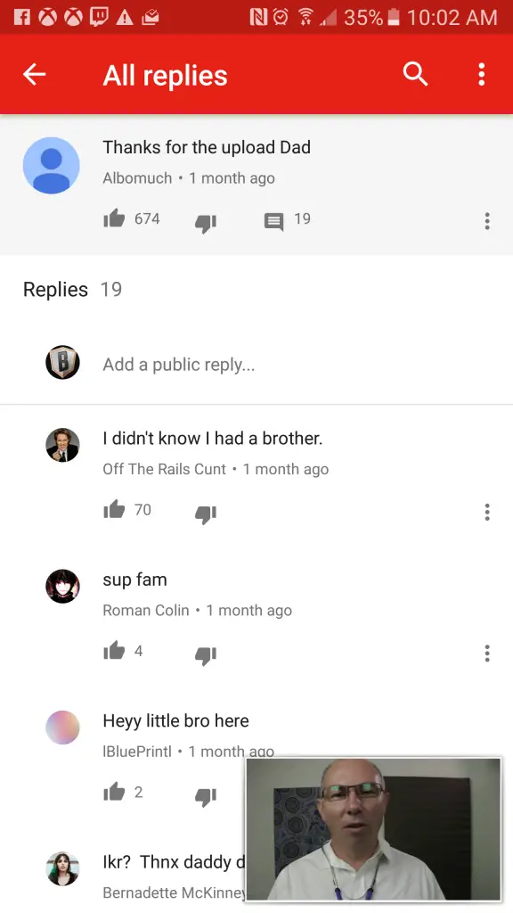
Anyone who dares plunges into the comments section of a YouTube video might have tried to read a response thread at some point. On YouTube mobile, this typically results in the YouTube video shrinking into a box in the lower right corner of the screen while a whole new pane to show the full comments thread opens up.
This behavior was consistent across both iOS and Android versions of YouTube. What’s really silly is that this also occurred on the tablet version of the app, so all that screen real estate is essentially dedicated to reading comments. Talk about wasted space.
And the desktop website version is even more annoying because you don’t even get to continue watching the video if you want to jaw it up with your peers. But hey, baby steps here.
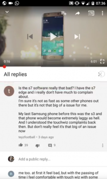
The story here is that Google is testing a change that allows you to read those comment replies without the YouTube player shrinking. The thread will open up in the existing space that’s reserved for showing comments, so you can keep reading while enjoying the same viewing area you had before you decided to see what everyone’s talking about.
Left: Before. Right: After
The update doesn’t seem to be hitting everyone so it may be some server-side testing on Google’s part for now, but we see no reason why they wouldn’t eventually pull the trigger and roll it out to everyone.
[via Google+]


Comments