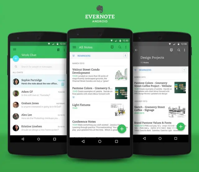
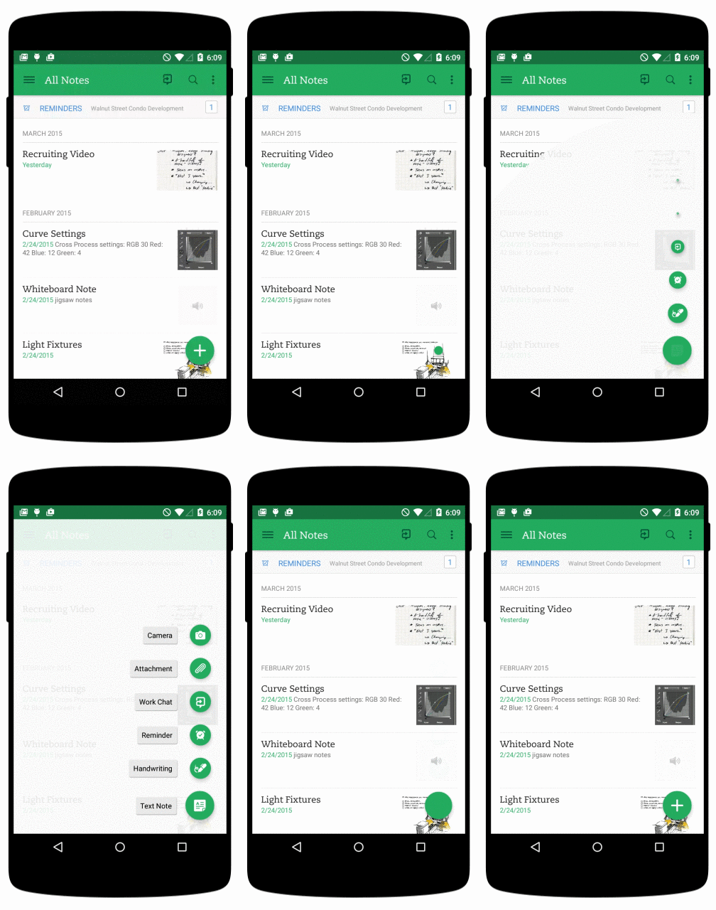
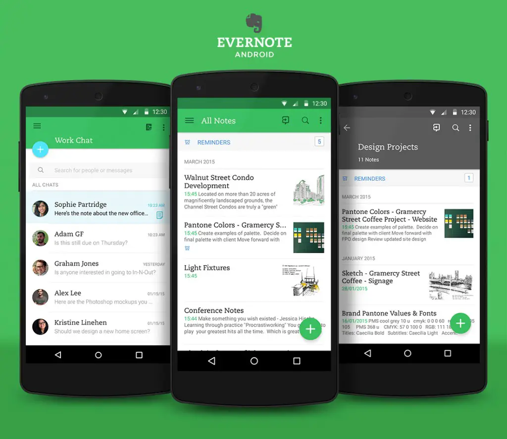
 It seems like every day more and more apps are adopting Google’s Material Design language (and we love it). The latest app to get a Material makeover is the uber-popular Evernote. Everything you’ve come to expect from Material Design is present in the new Evernote. Floating buttons, thoughtful animations, clean fonts, colorful status bar, and more.
The update isn’t only about aesthetics. Evernote has taken the time to also improve note editing and viewing. They’ve also simplified the controls and updated the navigation drawer with more personalization. Lastly, new notebook covers will help you differentiate your notes. Overall this is an excellent update for an already stellar app.
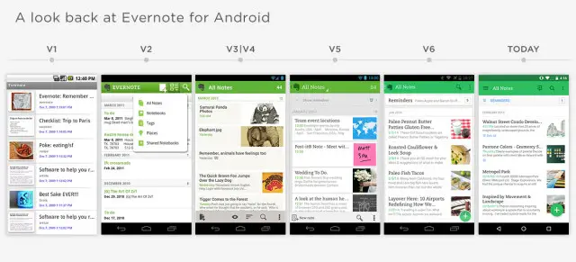
To celebrate the big update Evernote has shared an interview with Android product manager Theresa Pittappilly and designer Adam Glynn-Finnegan. If you’re interested in the design process it’s a great read. They also shared some cool photos, like the one below that shows the evolution of the Evernote Android app. Download Evernote for free right here.






does this have recurring notifications yet??? this is something I really rely on and quit using Evernote because it did not give me this….now I am on Any.Do but am not all about the expense of it really nor the design of the app