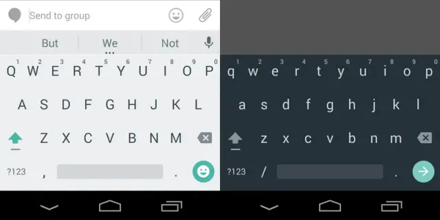
Update Wednesday is here with a vengeance. The latest app to get updated with a taste of Material Design is Google Keyboard. Version 4.0 of Google’s keyboard app has two new themes to choose from: “Material Light” and “Material Dark.” These are the keyboard themes we’ve seen on the Nexus 6 and 9.
Once you download the update you’ll have to go into the setting to change the theme. The behavior of the keyboards hasn’t really changed much, but it’s a nice little facelift that should look great alongside all the other Material Design apps. If you haven’t received the update in the Play Store yet you can download the APK right here. What do you think of the new themes?



I’m thinking finally, since the other inputs have already been updated for a week now.
Any word on whether the gapps error goes away with this?
I like it works well.
Don’t like the new themes, myself. It’s a little jarring to not have
demarcated “keys” even though I swipe for most input … feels as if I
can’t really be sure where to move my finger to get a particular letter.
I like how you have the option to choose between the jellybean, kitkat, and lollipop themes
It looks…. weird. I do like the large letters tho.