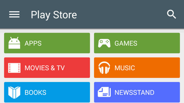
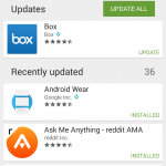
As we move closer towards Android L’s impending announcement, more and more core Google apps are getting the Material Design treatment. Google’s Material Design update for the Play Store leaked a few weeks back, now it seems that Google is ready to unleash their latest rendition of the Play Store upon the masses. Version 5.0.31 began rolling out to devices this evening and as you would expect with a big version bump, the update focuses on Google’s new design language and user experience (#PraiseGrouchnikov).
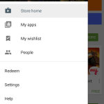
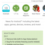
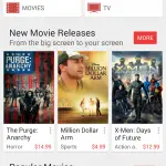
First things first, the Play Store icon itself has been updated to a flatter design. In material Design Fashion, the entire Play Store sports newly colored categories that align with Google’s Material Design color palette, which are incredibly bold and bright. The What’s New section for apps is now highlighted and front and center when you tap ‘Read More,’ meaning there’s no need to scroll furiously to the bottom to read the change log. You’ll also notice a new hamburger menu icon (with a kick ass animation I might add) on the side as well as a newly designed sidebar with flatter icons.
Besides the cosmetic changes you see above, the Google Play Store 5.0 update feels very snappy and flows quite nicely. Of course a lot of that feel could come from all of the new animations and transitions that are flowing freely through the app.
If you don’t want to wait for the Google Play Store 5.0 update to hit your device, we’ve snagged the APK for you to sideload. Enjoy!
Download Google Play Store 5.0.31
Update: If you’re running the Android L preview, you might want to hold off on this update. We’re seeing numerous reports of people having a rough time and having to revert back to a previous version.








You weren’t kidding Derek, very fast & smooth transitions/operation.
It feels like a brand new app!
Just got a CHROME update w/material design & faster page loading changes.
I can’t wait for every core Google app to be updated. Hell, I can’t wait for L!
Material-ish chrome is already available.
OK, well, I just got the update, dated October 9,2014, w/those changes noted.
Guess whatever you’re speaking of is something else,or,Chrome Beta……
No the material design changes are in the current stable version as well.
I didn’t say material design wasn’t in the previous version.
You’ll see the changes in appearance. It’s subtle, but, noticeable.
As is the transition speeds.
Oh. Sorry I misunderstood your previous comment.
No problem my man. See ya around & have a good weekend.
Same to you :)
The latest Chrome stable update with even more Material Design has been rolling out for a couple days, which can easily be confused with the Beta channel of Chrome, which has had that update for a few weeks. Either way man, congrats on the update ;) It’s a Material Design world we’re living in!
yeah, and hopefully ART in L will reduce/eliminate stutters from other apps.
if i update the playstore manually will future auto update for it be available still or would i need to update it manually?
It’s a Google signed APK, it will update in the future, no problem!
Nah, you’ll get future updates just fine
Badda-bing aaand downloaded, just like that!
I love it , Feed me more of Android L
open up…
“Play Store icon itself has been updated to a more flatter design” Come on now, I know its a blog and not journalism, but “more flatter”? You can do better, Derek. Yes, turns out I’m “that guy”…my apologies.
Ahhh man I was sure as hell about to correct you until I saw you were correcting them lol. I hate “more + er” it doesn’t even sound right when you say it so I don’t understand how ppl can use it and not realize how wrong it is
Thanks for being that guy! Your right, you’re suggestion is correct. :p
^ Not sure if serious, or deliberately misusing “your” and “you’re”…
The What’s New section is beautiful. :'( It was my biggest gripe because I’m OCD in what an update brings.
Thanks for the APK!
I’m on L and haven’t got that update yet. I did have to reset my G watch to get it to sync to L for some reason.
The best play store update yet. Very fast and fluid now. Looks great too. Well done.
Never understood why they had the what’s new at the bottom in the last release. If you’ve installed it then you have either read the app description or know what the app does from using it and so don’t care about that text, but you will care about what’s new.
If i install this, will i have to update play store manually or I can receive automatic update to a newer version than this?
You’ll be able to receive future Play Store updates automatically. This APK is signed by Google.
Downloaded and installed this just now. I think my update failed earlier today but this has installed and is working great. It is much snappier!!
I also like the “share” button in the Chrome update.
Google’s New Play store came with amazing new look, here is path to download APK if you cant wait for the update to hit your phone.
http://uneedtech.com/2014/10/10/download-and-install-google-play-store-5-0-31-apk-with-material-design/
Gee, bright, high contrast, lots of different bold colors. Sounds a lot like Touchwiz. Everyone criticized Samsung because their interface was so bright and too colorful, but when Google does really bright and colorful suddenly it’s wonderful.
Google fanboys are no different than Apple fanboys.
I don’t think it’s too bright and colorful, the problem with their interface is that its general design lacks finesse, aesthetic appeal, elegance, and intuitiveness. Its colors do not mingle and play together nicely, its buttons are ugly and out of date, and it’s packed full of so much garbage you get lost in trying to find the useful things to use. HTC One has a bright colorful interface and it’s leagues ahead of Samsung’s, many people love it and nobody complains about it so ??????????
Google is going in a new direction with Android L and material design, and not everyone will like the change, but at least they are doing it with some actual professional design and doing things like…you know…using complimentary colors. Anyone who’s professionally designing interfaces should understand such elementary rules, and samsung doesn’t seem to grasp that concept. It’s like they got some dude behind the design helm with no experience who’s in love with Android 2.x.