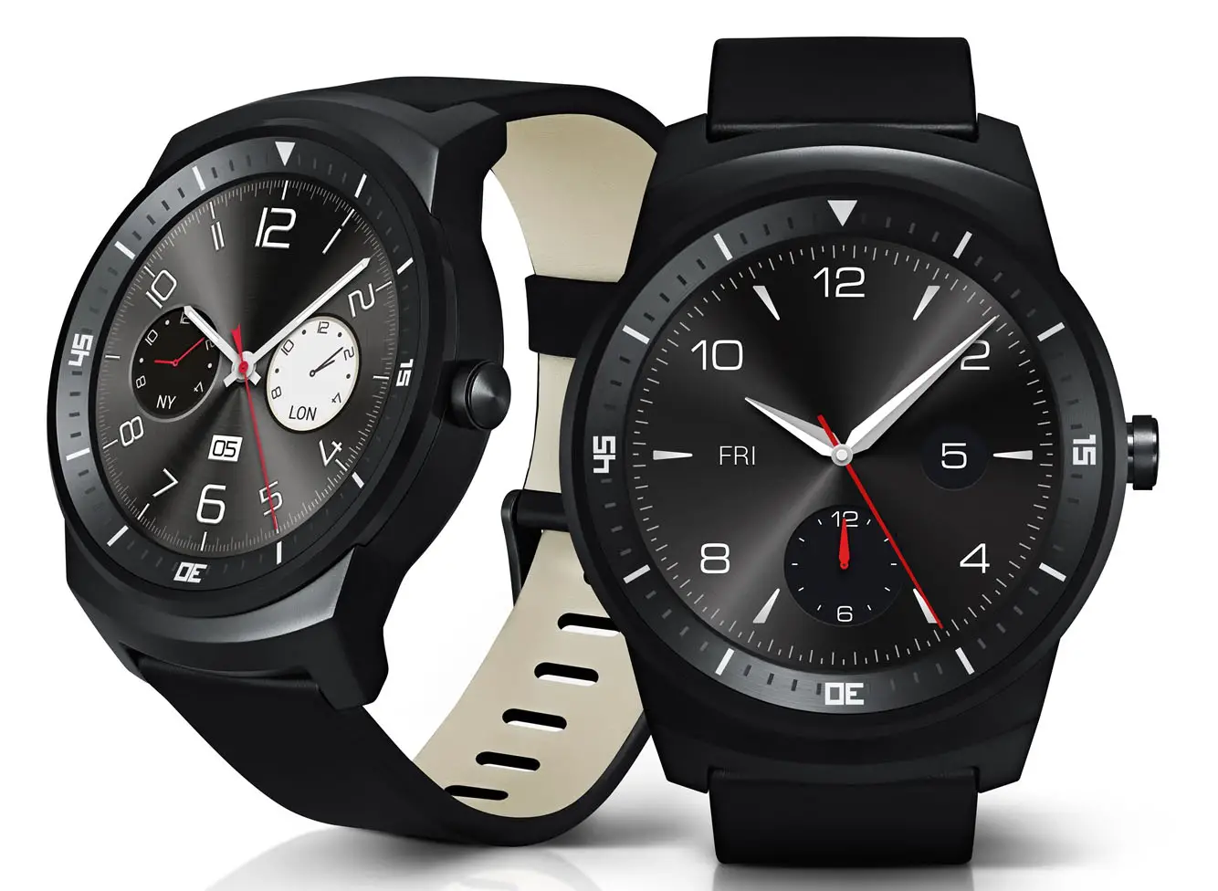
Should two separate South Korean reports be correct, LG could be looking to launch the LG G Watch R in their hometown starting next week. That’s the news being dropped by ETNews and ZDNet Korea today. The company says LG is planning to launch the watch throughout the country October 13th, with one Korean retailer said to be getting a one-week exclusive set to arrive as early as tomorrow.
While this doesn’t say anything to the device’s launch in Europe, North America or other regions, it is an indication that it’s ready for prime time and that it should be headed out to the majority of the world shortly after. We might see it even sooner in these parts of the world compared to, say, a phone launch considering there are no carrier barriers (totally made that saying up just now) to deal with.
The LG G Watch R is a bit more expensive than the original G Watch, and that’s to be expected. LG spent a lot more care in crafting this thing than they did the blocky plastic-clad build of the original. We imagine it being circular only adds to its manufacturing costs.
The LG G Watch R is seen as the first smart watch that can match the Moto 360 in terms of design and fashion, though many have not taken nicely to its increased bezel size featuring numbers and notches. Whether that’ll be a true deal breaker remains to be seen, but it’s still a fantastic looking smart watch that should give any competitor a run for its money.


the 360 still looks better but i might hold off for this one and see reviews
I just don’t see this in the same class as the 360, even 2 weeks after getting mine. I’m now familiar with all it will and won’t do, and I still love my 360!
i agree. it just has a fully circular screen that’s about it.
It’s a trade of between bezel and flat tire. I’ve seen a lot of really nice faces for the 360 that are ruined by that flat tire look.
Funny thing is the flat bezel doesn’t bother me one bit. I always wondered why other people hate it so much. But then I only use black faces because they don’t use as much battery, so it’s not very obvious at the bottom.
A black watchface won’t save battery on the 360 it uses an LCD panel.
yep, sadly Moto 360 doesn’t benefit from black since it’s LCD. I was very close to biting the bullet.. the flat tire look started bugging me and then when I heard they went with LCD I decided against it. I will likely get the G R watch, at least it uses an OLED screen.
That 360 battery tho is a deal breaker. Not to mention the 4 year old processor and flat bezel at the bottom too.
The 360 battery was fixed with a software update. Just Google it. I am holding off because of the outdated Hardware. I want to see the 2nd generation before I dive in.
What kind of battery life are you expecting? If you’re looking for a solid day, the latest update makes good on that. If you’re expecting 3-4 days, get a fit bit, no current smart watch will deliver more than a day or 2 at the most.
My Pebble gets more than a week. Smart watches are competing with that benchmark, not with phones.
Cool, keep your pebble. Good luck finding anything on Android Wear or Apple with that. Besides, I plug my phone in every night, I’m happy to set my 360 on it’s stand next to my phone.
If Apple/Android Wear can’t give me more than a day — as in, 36 hours, minimum — then I won’t consider it. My phone only lasts about 12 hours (Nexus 5) without a charge, but I can plug it in on my desk or in my car to get me through the day… But a watch goes on my wrist, so 14 hours doesn’t cut it. It has to strap on in the morning, and last until I go to bed, which isn’t always less than 14 hours later.
Take a look at the 360 forums on this site, they’ve got a great battery life thread. Reports are that people are consistently going to bed with plenty of battery life left. I think it’s actually in the 36 hour range after the update.
Everything I’ve read + accounts of people I know with it say it’s gone from 12 to 14 hours after the update.
That’s much worse than I’ve gotten and much worse than what I’m seeing on the forums. If they leave ambient screen on, I can see that, but if it’s off, should be much better.
I had considered this watch, but the smaller screen and large bezel with permanent numbers are what killed it for me. Some hate the flat tire of the 360, while others hate the bezel on this.
I’m glad we as Android users have choices.
I’ve had mine since last week. I only ran one battery cycle, because I’d most likely destroy it in my line of work, but charging it fully first and then getting the new update out of the gate, I saw around 30 hours out of it after I finally put it in the charger and it was at 19% when I did so. Considering the notifications and also playing with the new device like we all do, that was pretty good for the first battery cycle.
A diving bezel on a smartwatch is simply absurd.
it looks cool and like areal watch so it isn’t absurd
I’ve owned watches with diving bezel and ya know what, never once have i dove. I must be absurd! :)
There are diving bezels on a lot watches that never get used. One functional use of this bezel is that LG’s always-on watch face can just be a continuosly moving minute and hour hand so there would be no screen burn-in or ghosting from static minute and hour markings. When you wake the watch, the full watch face is shown, but just the minute and hour hand is shown in semi-sleep mode. I like the dial bezel solution over the flat tire.
Why is the watch face numbers not lined up with the ring of numbers which is around the face? Notice that the 6 and 30 are off and the arrow and 12 are off too. I noticed it immediately.
I guess it’s just poorly photoshopped. The guy who did it knew how to flip the picture upside down, but not how to rotate it a bit. Notice the watchface is aligned with the picture itself.
Here’s a real picture of it: http://assets.hardwarezone.com/img/2014/09/LG_G_Watch_R_1.jpg
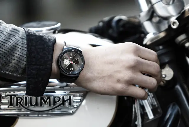
It looks ridiculously big on that persons wrist from that angle.
Yes that is terribly off putting.
Somebody dropped the ball on the render. The numbers are properly aligned in the thumbnail for the article.
It’s a diving bezel…the outer ring can be rotated.
The dial does not rotate.
Where did you see this? I read several early reviews and none said it rotates.
Yeah bad Photoshop. The dial does not rotate.
Its funny…I’ve never seen a picture of the G watch R with a notification on it. Seems they are really pushing the “digital watch” aspect, or the notifications look bad…
I’m kinda of liking this. However, I saw a rumor of $499 pprice point. Hope it comes in better than that.
Give me a version without the diving numbers and without a leather strap for less than $200, and I’m in. Otherwise, I’ll stick with my Pebble.
How much less than $200? Will $199 be low enough? ;)
It all comes down to the price (at least for me) if its more than the Moto 360, I am not getting it.
Looking forward to seeing this in person. Looks more like my current watch than the 360. Not feeling the hockey puck 360 look with no transition between the puck and the straps.
Whoever releases the metal bracelet version of a Wear device first gets my money.
It has a more sporty look which I’m fine with. I wonder about the battery most though. Having a newer low powered CPU should help with that.
I am waiting for these watches to have much better battery life (perhaps solar or charged by your movements) and for them to do a lot. Like, something my phone can’t do.