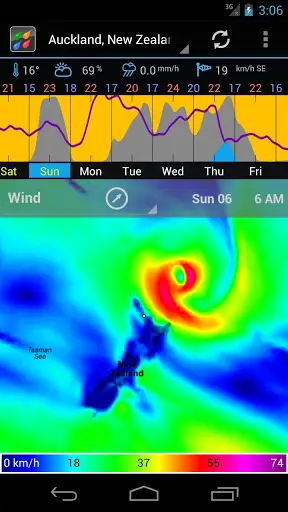
Weather apps are a dime a dozen these days, so an app really needs to stand out to get me to take notice. Weather Bomb fits the bill quite nicely, and just 10 seconds with the app will let you know why. Weather Bomb delivers comprehensive weather forecasts by giving you a nice look at temperature, precipitation, humidity, cloud formation, wind patterns and even more over a period of days and times.
This particular app simply lets you thumb back and forth across the map or daily timeline to get a time lapse of the radar as if you were watching the meteorology report on your local news channel. Couple its easy-to-digest information with an app that’s pure holo and you’ve found my new favorite weather app. Oh, and best of all, it’s free! Download it in the Google Play Store and see if you can’t find something that you like in this very beautiful package.
[via Reddit]


Somebody set up us the (Weather) Bomb?
All your droid are belong to us
Thanks for your support.
Make your time
Working outside, commuting by bike, and living in Minnesota… I have many reasons for needing as many weather apps as I can get… Thank you
Free free to send data you’d like to see and I can add it to the list of todo’s. I have snow, hail, sun/moon rise/set, tides, frosts, cloud layers, wave period and direction so far.
This is a good thing to have, for the past few years we are having horrible weather.
Fantastic resizable widget to boot!
Play Store Link: https://play.google.com/store/apps/details?id=com.enzuredigital.weatherbomb&feature=nav_result#?t=W251bGwsMSwxLDMsImNvbS5lbnp1cmVkaWdpdGFsLndlYXRoZXJib21iIl0.
quentyn you over hyped this app…..all it does is show you weather from a time interval..you swipe left to right and you get this weather animation. i thought you meant it was going to pop out of my phone and make me feel the weather when you said mesmerizing lol
Hi James, it’s on my is of features. Phones and tablets are starting to get powerful to allow some cool animations, like wind stream lines and lighting. But I’m focussing on the basic features first, like landscape mode and more data. But one day, it’ll be more mesmerizing. Cheers.
Nice app! Hope to get the paid one soon so we can get rid of the ads.
Coming from the meteo perspective, where knowing the source of data is important when understanding biases, etc of each source/model (Since we’re going out in time). Labels for where the data is coming from would be very useful. GFS, NAM, ECMWF (well…I know it’s not this one), SHREF, WRF, etc could all be a source for this data.
NOAA GFS and NWW3 so far. I plan to add more data (hi res USA data and Canadian data) in the future. I plan to split the packs into individual data. I wasn’t going to add details of sources because for simplicity, especially for people who don’t know the acronyms, but with your request I’ll add it or allow you to turn it on in some way.
BTW, I plan to run some validations 1-7 days out against real measured data and publish the results.
Feel free to send me thoughts and requests and I’ll add it to the list. It helps me prioritize.
Cheers.
I understand why you chose to hide the data source – most apps do and that’s fine. Your app intrigued me because it’s the best way by far I’ve seen to dig down into the model output for forecasts on mobile – something many “weather weenies” would love. You might even think of making a “public” version and then a more advanced “meteorologist” version that adds choices between model sources you have plausible data access to (ie NOAA/NCEP) and throwing a bigger price tag on (Radarscope/PYKL 3 run $9.99 but it’s quality meteo material (ie non-filtered, level 2 data) that is nowhere else so we buy) to offset the extra work for fewer users. That sort of thing would confuse the general audience of the app – a simple implementation like you have without all the inner details works best for most people. Model comparison is something we feed on :).
I realize that’s just a meteo’s dream – this implementation has so much potential – and the initial public release to non-beta is a priority.
Props to a good app. Nobody else is close to the way you’re showing forecasts graphically at a glance. Swipe to advance and the graphs up top are great.
Thanks. I have considered this. One solution is to have a tickbox in the settings saying “Pro Mode – I know what I’m doing” which turns on all sorts of details and advanced features. If I can design the program well, it might not bloat too much. What do you think?
That would definitely work too and keep it clean unless you want more.
“Keep it clean” sounds like a Anchor Man line, maybe a a tickbox with “Stay Classy”. A classic movie.
WOW, I downloaded the app and I would have to agree that it’s a phenomenal weather app. It’s actually fun to swipe back and forth and feel like you’re controlling the weather! Probably the most useful weather app I’ve seen so far. The only thing I’d add to it is be able to switch to a “basic view” where it would look similar to other weather apps out there – ie.. just display numbers and stuff, no graphics. You should all try it out.