I’m just going to come right out and say it: eBay for Android was always ugly. It was horrendous. It worked — and it worked well — but boy did it hurt to look at. Thankfully, those days are no more.
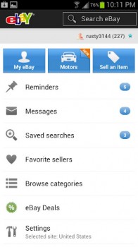
eBay version 2.0 has hit the Google Play Store with a much-needed user interface upgrade. It’s modernized for Android’s Holo UI, and we could be more pleased with what they’ve done here.
They’ve also added eBay Motors support, better list access, the ability to add up to 12 photos when listing an item with the app, the ability to view an item’s bidding history, support for users in Spain and Italy to add listings, payment support for those in Malaysia and Singapore, and more.
I always quickly resorted to my PC whenever I needed to look anything up on eBay, but with today’s changes I think I’ll be giving it another whirl on my phone. Be sure to find the download in the Google Play Store.





I like the new upgrade. Tsunami a better look
Looks like a crippled verson of holo…
Last week I was looking for a tv on the ebay app and it was actually easier to just use their mobile web version. I couldn’t believe such a behemoth company would have a very lacking app. This is good news then
couldn’t believe a behemoth company would have a very lacking app? you may have forgotten about Facebook.
I didn’t have a prob with it.
The app by pocket auctions is much better. That’s the one i use.
I own a small eBay business and never had many complaints about the old app. This is definitely a welcome update though. played with it quite a bit today.
You design-y types are too much sometimes. Hurt to look at? Please…
The only time an app can look bad to me is when you can’t use it. The eBay app looked good before, was extremely usable and now it’s even better.
looks good but doesnt work!!!
And then it failed. Kept crashing on many devices so they have recalled it and reverted back to v1.8.