Gmail for Android tablets just got a improved UI tweak
Given how our phones are used differently compared to tablets, developers need to understand these differences and make sure that their apps are also designed differently. If you have an Android tablet that you use Gmail on, then you might want to check out the latest update.
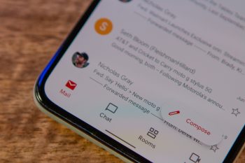
According to a report from 9to5Google, it looks like an update to the Gmail app is being pushed out as we speak. The overall functionality of the app remains the same, but Google has made a tweak to the navigation bar of the app where instead of it being at the bottom, it has now been moved to the side.
Image credit – 9to5Google
This is kind of similar to how Gmail’s web interface looks and in many ways, it’s a huge improvement. As tablet screens can get quite large, putting the navigation at the bottom might be difficult when it comes to one-handed use, but putting it at the side allows users to navigate the app using one hand.
The change is rolling out as we speak but it seems that it hasn’t made its way to all users yet. If you don’t see these changes yet or don’t have an update waiting for you, not to worry as we’re sure that it will eventually get to you, so just hang in there. In the meantime, what do you think of this UI tweak?
Source: 9to5Google