Back in the day, SMS messages were sent as individual messages, meaning that it can sometimes be hard to follow the flow of the conversation. These days, pretty much all messenger services have adopted the conversational design, where chats with individual users or groups are displayed in “bubbles”, making it easier to read and understand.
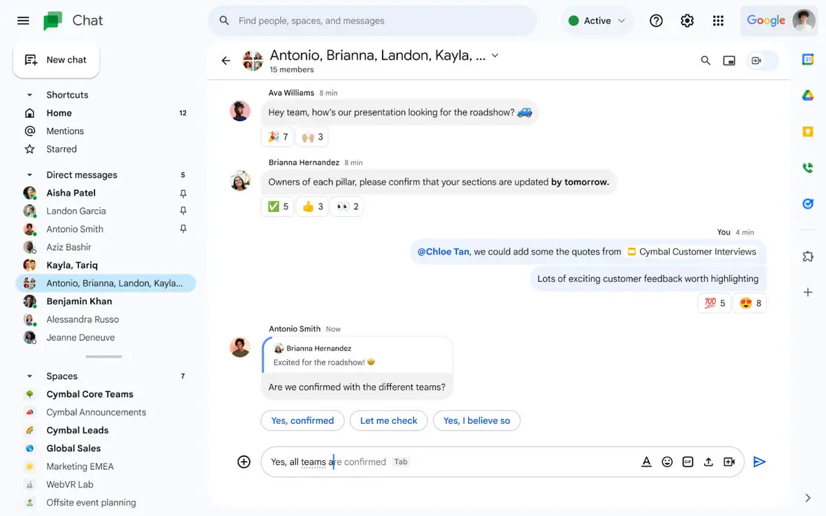
While this design works, we suppose it could always be better. If you’re someone who uses Google Chat quite a bit, then you might be interested to learn that the company has announced some slight design tweaks to the platform’s UI that will make it easier for users to follow the flow of the conversation.

This includes how incoming messages will now have an independent message bubble with a solid color background aligned to one side, while outgoing messages will also have its own bubble with a solid background aligned to the other side. There will also be some quality of life updates where if a user scrolls up the chat history, there will now be a “jump to bottom” button that lets them get back to the latest message quickly.
These changes are being rolled out across the web and mobile versions of Google Chat over the next few weeks, so you should see these changes to your Google Chat experience eventually.
Source: Google


Comments