Twitter has been in a rather interesting phase lately – the once super-popular social media site has undergone a lot of significant changes this past year, and a lot of the newly-implemented regulations within the app have undoubtedly been a point of contention for some users.
This has unsurprisingly resulted in a flood of new social media apps, each enticing users with their own approach to online networking and such. One of these apps is “Threads,” Meta’s own take on how a primarily text-based social media service should be run. It’s mostly a day old into its existence, but it’s impressively garnered a ton of users – more than 30 million now, in fact – and it seems to be on a steady path so far.
It’s not perfect however, and if you were wondering what it’s like, here’s what we’ve observed with Meta’s newest social media app.
Getting Started
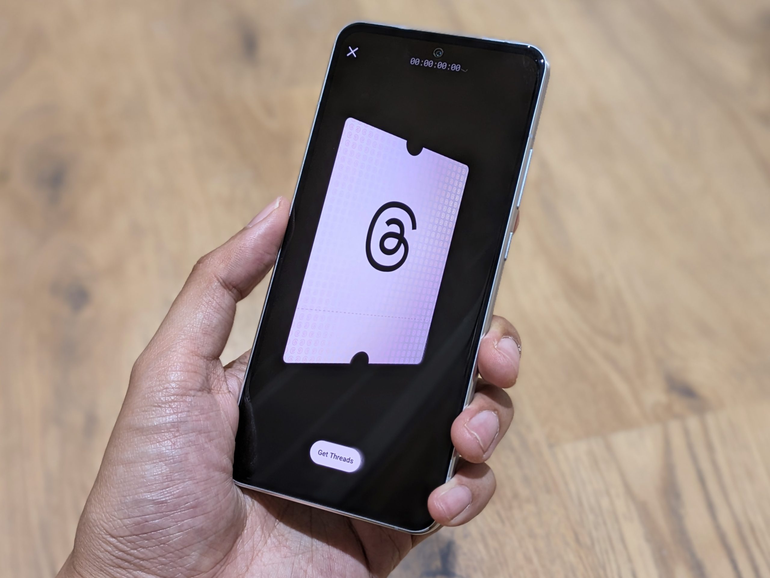
Signing up for Threads is a pretty straightforward affair – you’ll just need to download the Threads app on your Android or iOS device, log in using your Instagram account, and then set up your profile details. Alternatively, you can head directly into your Instagram app, go into the Settings page, and download Threads from the link provided within. To make things easier, you can bring over your profile details from your Instagram account, shortening the setup process,
Threads also gives you the option right away of setting your profile to public or private. Interestingly, a friend who was following me on Instagram noticed that he received an Instagram notification, saying that I had signed up for Threads. It’s also worth noting that while my sign-up on my iPhone went smoothly, my Pixel kept giving me a sign-in error repeatedly – thankfully I managed to sign in after several attempts.
Bare Essentials
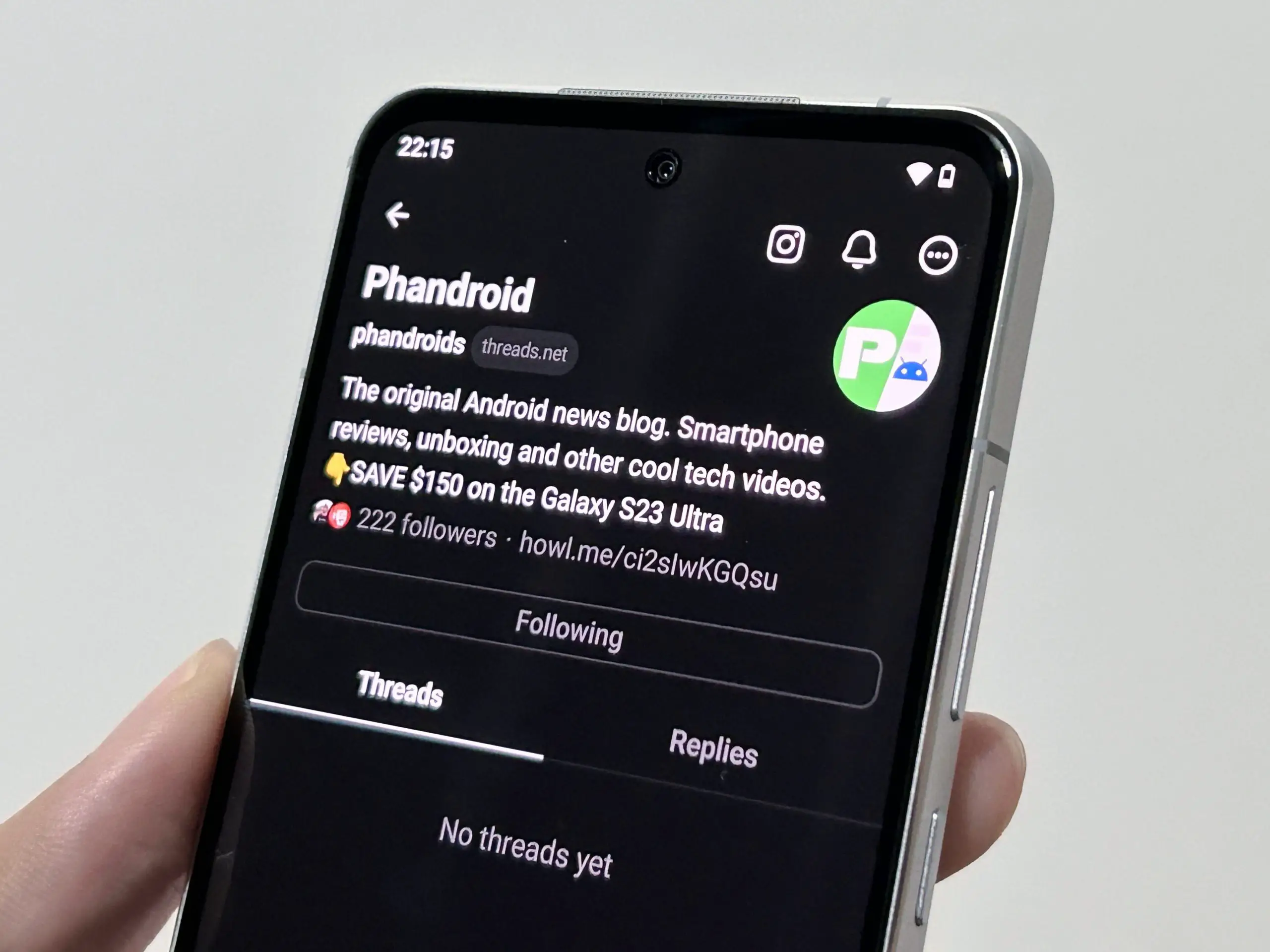
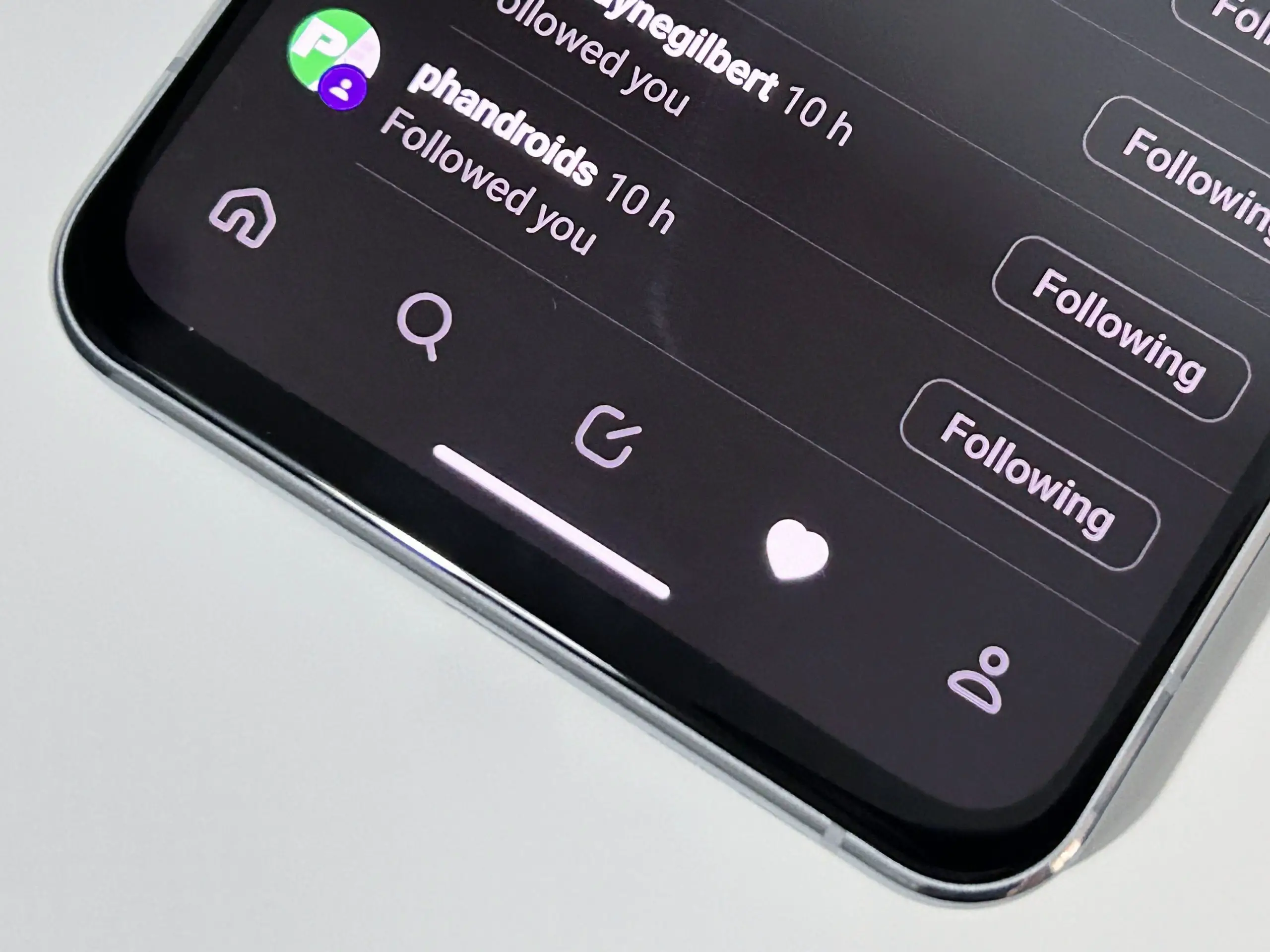
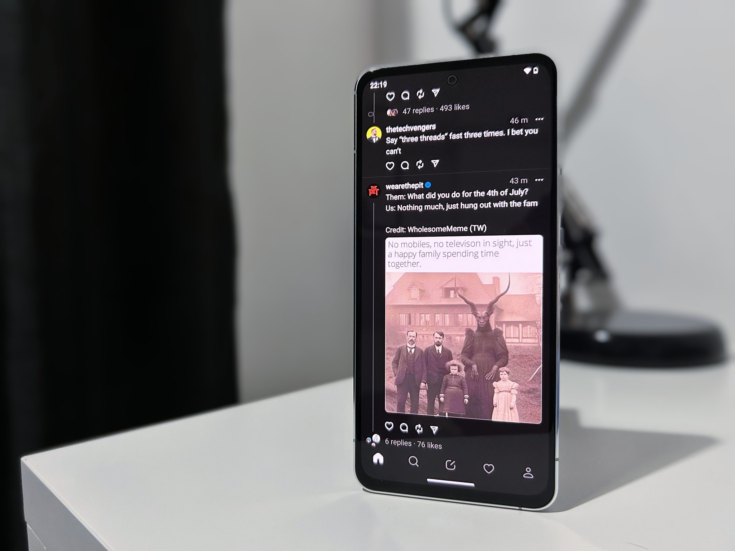
If you’ve used Twitter before, then there will be a sense of familiarity with Thread’s layout. The user interface gets you all the usual stuff – the bottom of the screen features a home button that takes you to your main feed, a search button, a “create post” button, as well as shortcuts to your notifications and profile page. I greatly appreciated the minimalist approach to the user interface, and it does look clean.
There are no ads – not at the moment at least – so the main feed is just filled with Tweets, er, Threads from users. From my usage so far, the feed shows posts from profiles that you follow and haven’t followed, which can be annoying at times, especially if you’re not after Threads and updates beyond your general realm of interest. Additionally, the search button only shows user profiles based on your search terms, so topics, posts, and such won’t show up.
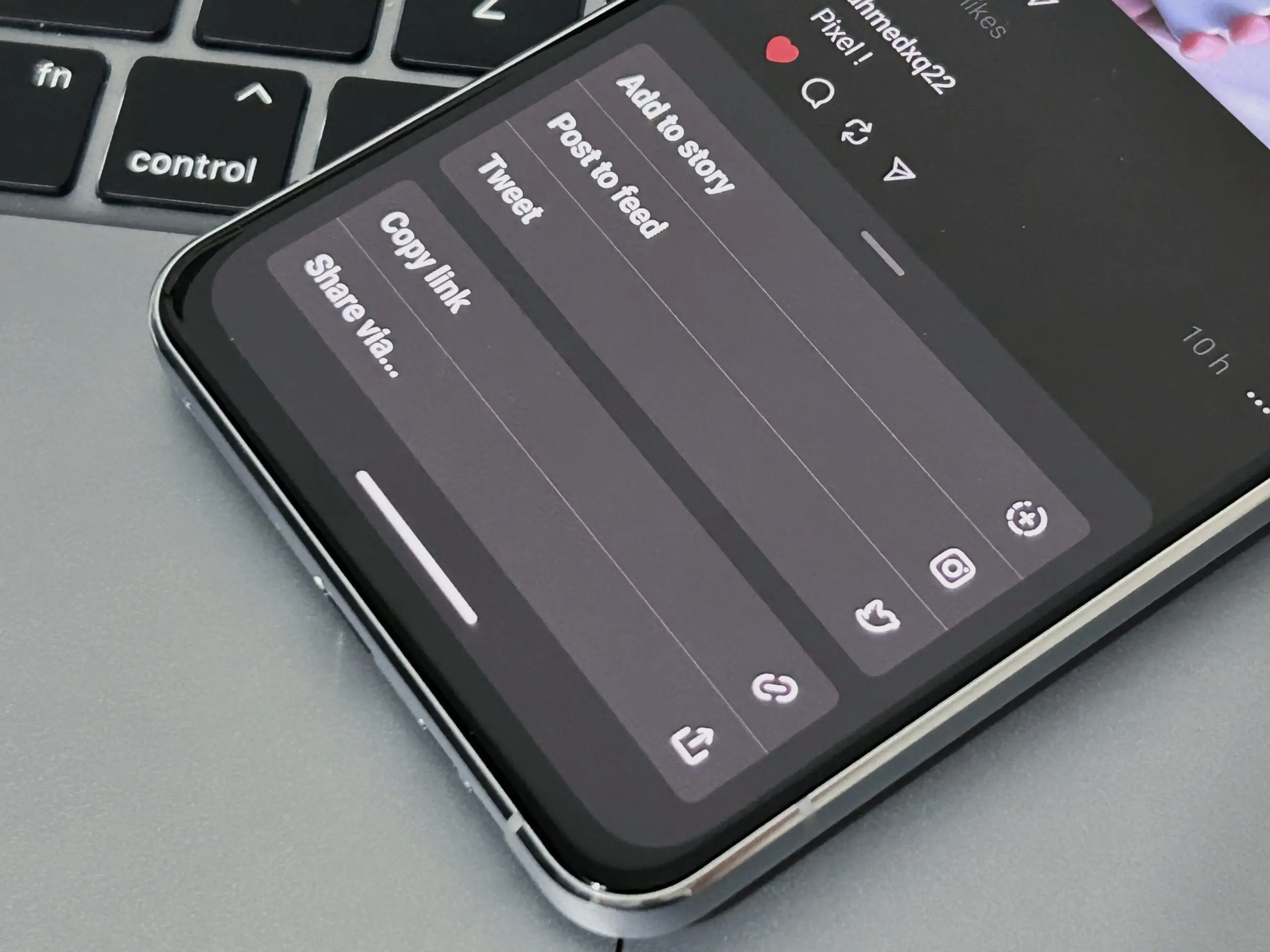
As for user posts, you can reply, repost, and even share them to your Instagram story – Threads doesn’t hide its integration with Meta’s photo-centric social media app, and for the time being it looks like things are going to stay that way.
There’s no option for dark mode, as the Threads app will adapt to whatever setting you currently have your smartphone on. Furthermore, the app is mostly designed for use on smartphones – opening it on a tablet simply yields a blown-up interface of the app (similar to how Instagram appears on larger displays). Meanwhile, attempting to load it on a desktop browser simply takes you to your profile page, without access to your settings or a home screen (as with Twitter).
There isn’t much in the way of settings, at least for now. There are toggles for privacy, with the option of hiding away certain words and accounts from popping up on your feed. Interestingly, a number of options can also be managed via your Instagram app, so it looks like we’ll be seeing heavy integration between the two platforms for a while.
Twitter Killer?
Right now, Threads gets the basics right – for users who are looking to try out a new Twitter alternative, there are a lot of things that will make the transition easier. The UI and approach to user content doesn’t stray too much from the formula set forth by Twitter, and the rapidly-increasing user base means that there’s probably less chance of it shutting down, at least for the foreseeable future.
The app is bare-bones right now, especially in the way of in-depth user customization and personalization, and its ties to Instagram are heavily-integrated – although it certainly has the potential for more improvements and functionality in the future. At the moment it manages to nail the important parts, and if you’re curious as to whether you should try it, then by all means go on ahead – just keep some reservations in mind.







Comments