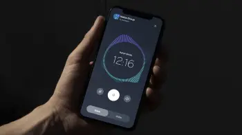
Meet the New “Nokia Pure” Design System
Nokia made headlines during MWC 2023 back in February after it unveiled a new logo, which the company says falls in line with a new strategy and approach towards branding and marketing its products and services. With that being said, the company has now unveiled a follow-up with “Nokia Pure,” a design system that introduces new visual concepts to the Finnish brand’s digital products.
According to Nokia, the new design system was developed towards creating digital products which will be future-proof, using various elements and guidelines which are focused on giving users a minimal and “fresh” new style, in-line with the logo reveal from a month ago.
Nokia laid out several details in designing the new UI. For one, software icons have undergone a dramatic change especially since Nokia smartphones usually stick with the “stock” look of Android. With the Pure UI however, the icons as well as typefaces have been thoughtfully redesigned, with a focus on flexible strokes that can adapt to different hardware platform sizes.
This design language extends to the onboard illustrations, as well as infographics and screens which display visualized data feeds and infographics. Nokia says that the whole focus towards simplicity also integrates abstract geometric forms, all while allowing for adaptability for ease of usage and understanding on the end user’s side.
This new development is certainly a nice take on software from Nokia, especially since we’ve seen similar development from other UIs including One UI and Color OS for example, which have seen a lot of changes in the past couple of years. While there’s no word on when or where we can see this new UI in action, it seems that it will be aimed strictly at future software products and apps, at least for now.
Source: Nokia