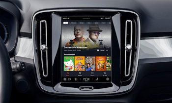
Google is giving Android Auto’s UI a much-deserved upgrade
Android Auto has been around for quite a while now and we reckon that its UI has gotten a bit long in the tooth. Don’t get us wrong, it’s still very much functional, it’s just that maybe it could do with some upgrades. Sure enough, at I/O 2022, Google was happy to oblige as the company has since unveiled an upgraded UI to the platform.
This UI upgrade was revealed during Google’s “What’s new with Android for cars” session (see video below). According to Google, the changes that they are making to Android Auto’s UI is designed to make the platform easier to navigate and control media, as well as communications. It also takes into account the larger displays that we’re starting to see in cars these days.
As such, some of the changes include making split screen view the standard view across all displays. This is a welcome change because it means that users need to fiddle less with their settings and menus and just focus on their driving, while still being able to receive messages, see their maps, control music playback, and so on.
Other changes also include making Android Auto’s UI more adaptable. Since the infotainment displays in cars don’t follow a particular standard, Google is hoping that these UI changes will make it so that regardless of the display size or orientation, Android Auto will still be very much functional and usable.
Source: Google