Google finally begins testing redesigned Play Store website
For years, the online Google Play Store has retained the same design, despite the Play Store on our phones constantly being tweaked and changed around. But it seems that Google has finally recognized (via Android Police) that a redesign is needed as some users have started seeing a completely different interface.
Instead of relying on the sidebar for navigating through the different areas of the Play Store website, this has been replaced. There are quick-access buttons at the top of the page for games, apps, movies, and books. And when you dive into one of those sections, you’ll be able to filter apps based on certain devices, such as phone, tablet, TV, and Chromebook.
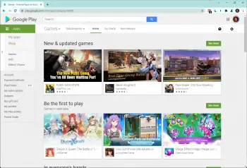
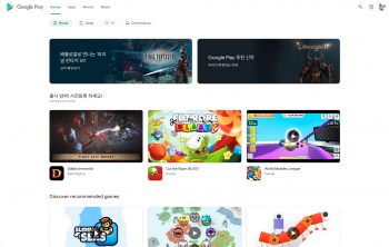
While the “old” sidebar was useful for accessing things like viewing your account, redeeming codes, and viewing subscriptions, Google has moved these options. Now, you’ll just click on your profile image in the top right corner, and a drop-down menu will appear providing all of the same selections.
It’s easy to discern that Google is essentially just bringing the tablet UI view of the Play Store and using that interface on the web. For example, looking at an individual app listing shows a rather massive app icon on the right. Then, all of the rest of the app’s information such as the name, rating, and the number of downloads is still on the left side of the page.
The only problem with this update that we can see is that it’s not rolling out to users everywhere. Instead, it seems to be one of Google’s server-side tests, meaning that you likely won’t find it if you were to head over to the Play Store website yourself. Some users have been able to at least view the changes by navigating to the Korean Play Store, but we didn’t have any luck trying to view it or activate it ourselves.