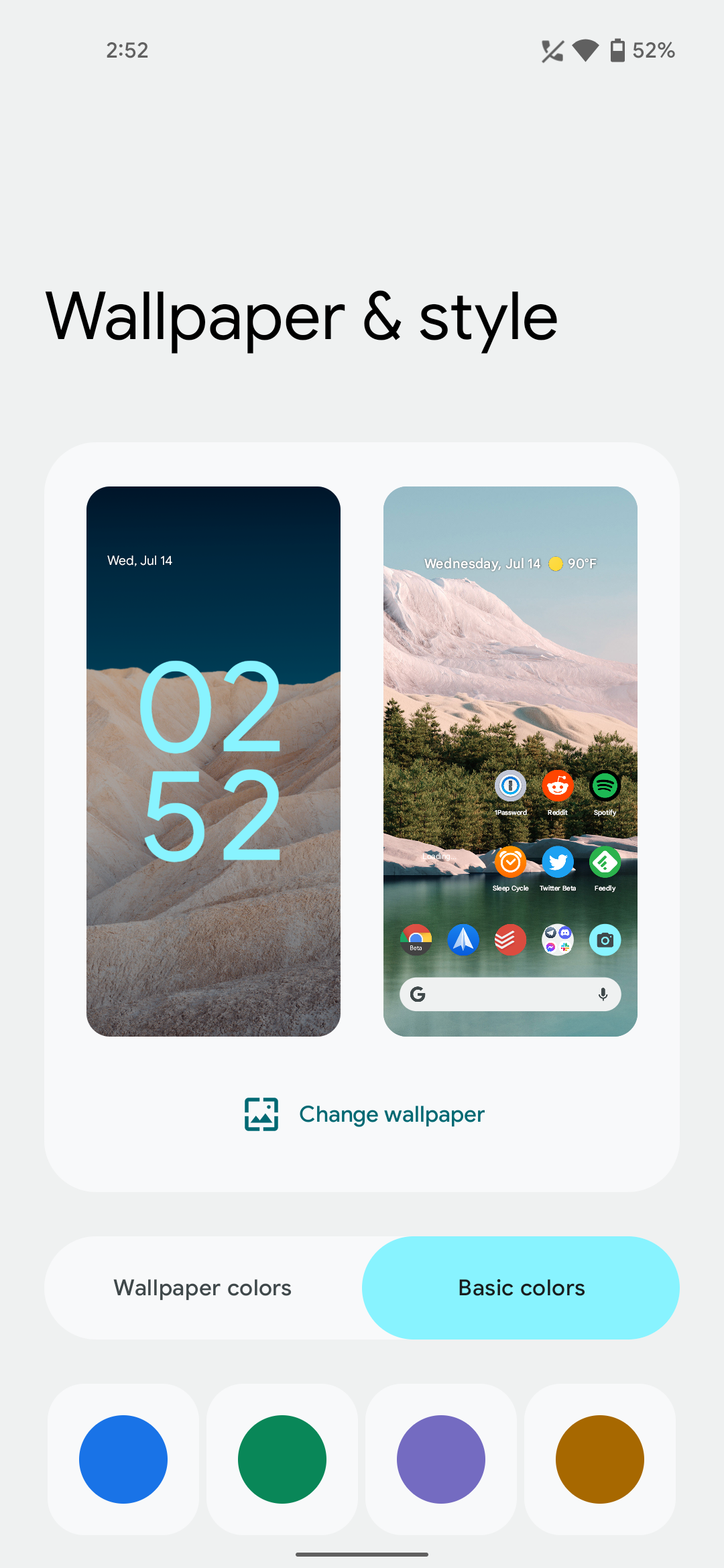
Google redesigns the Wallpaper & Style app in Android 12 Beta 3
When Android 12 was unveiled at Google I/O 2021, the biggest headlines were surrounding the introduction of Material You. Although there have been a few changes here and there, we still had not seen much in the way of the drastic overhaul for customization.
With the release of Android 12 Beta 3, we’re finally getting an idea of what to expect. This includes the built-in theming engine that pulls colors from your wallpapers and adds accompanying accents throughout.
The Wallpaper & Style app found on Pixel devices has been redesigned with Android 12. With the new app, you can now begin using the color picker based on the wallpaper, or you can pick from blue, green, purple, and an orange-like color. There are also toggles at the bottom to manually enable Dark Mode, along with opting to use “themed icons” or not.
Additionally, you can change the app icon grid for your Home Screen from here. These are the available options in Beta 3:
- 5×5
- 4×4
- 4×5
- 3×3
- 2×2
Admittedly, the 2×2 grid is a comical to say the least, but it would make for a great Home Screen if you need a simpler interface for an older parent or grandparent.
This is one of the biggest changes in Android 12 up to this point, so don’t be surprised if things change between now and the final version. It’s also possible that we could see changes to how the color picker is utilized across the operating system.
We’re still diving through Android 12, so we’re expecting to find even more changes.


