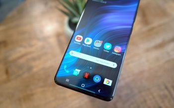
48 hours with the Samsung Galaxy S20+
Getting a new phone is always exciting. There’s nothing more satisfying than taking a phone out of the box for the first time and peeling off the protective plastic film from the screen and carefully examining the glass on the front and back of the phone before getting my greasy fingerprints smudges all over it.
I picked up the Samsung Galaxy S20+ from Best Buy over the weekend and have started my typical review routine. The process typically includes camera comparisons with other flagship devices, some benchmarking and speed tests to get a better feel for its performance and a deep dive into the software to see there’s anything truly useful in all the bloat that manufacturers add on top of Android.
While that whole process typically takes 5-7 days, I thought I’d share my experience with the phone after owning it for two days. This isn’t a comprehensive review by any means; simply a few initial thoughts worth considering if you’re planning to buy the phone before our full review comes out.
For a long time, I hated the software experience Samsung delivered with its phones. I was incredibly excited a few years back when they unveiled One UI and the cohesive design language which touched every aspect of the phone. This year, Samsung has tweaked a few things to make the interface slightly better than before.
I still prefer the look of stock Android, but using the Galaxy S20+ right next to my Pixel 4 the same dramatic shift that it would have been just a few years ago. Personally, I think One UI’s rounded corners and bubble-shaped pop-up look a bit childish, but that’s just a personal aesthetic preference and I can live with. Fortunately, Samsung’s theming engine is quite powerful with thousands of amazing themes that can give your phone a unique look and feel.