
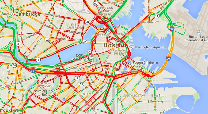
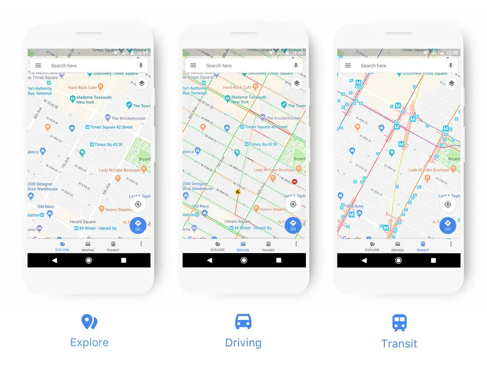
Google Maps has received a bright new coat of paint. Everything from navigation, transit, and places have been refreshed with new colors and icons to be more clear and easy to quickly spot and read.

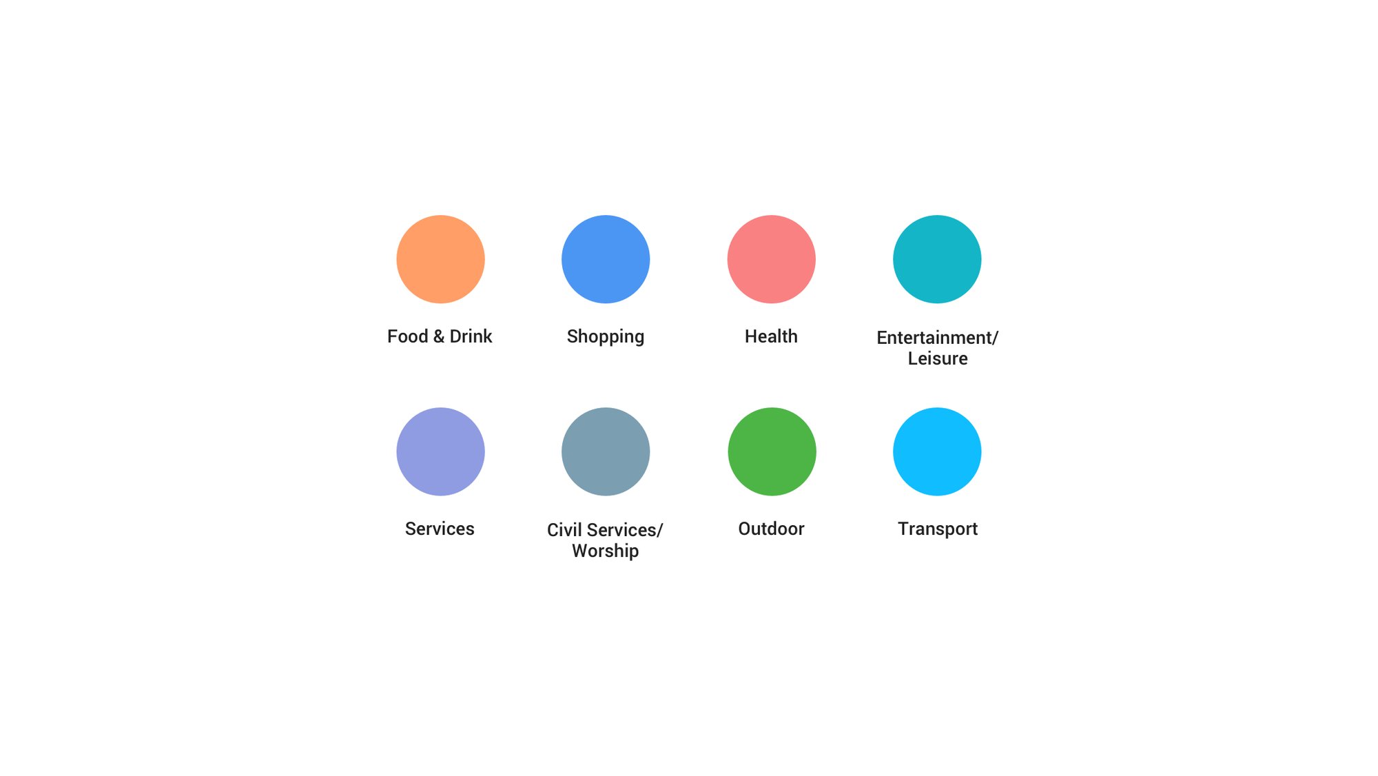
Everything from gas stations to churches has new colors (shown above) and icons. Gas stations will now be more prominently displayed when you’re driving. The goal is for things to be easier to find on the map. Instead of a bunch of blue and red dots, Google is using 8 different colors.
This update is rolling out over the next few weeks. Everything from Google Assistant to Android Auto will be getting the refresh. What do you think of the new color scheme? Will this make Maps easier to read?
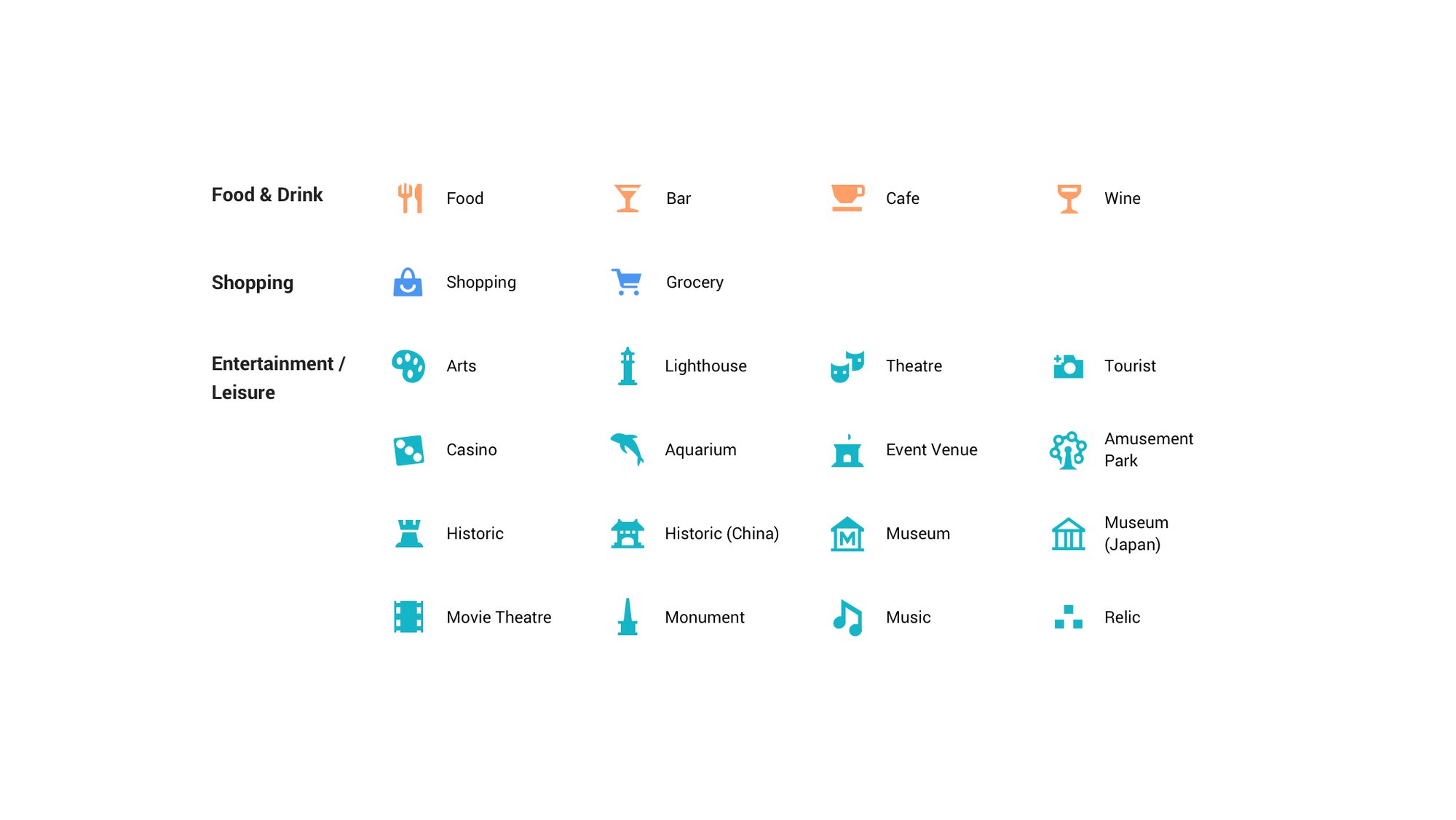
Some of the new icons


Comments