Google Calendar on the web finally gets a Material facelift
Back in 2014, Google created Material Design and they’ve been updating all of their services to match ever since. Some services have taken longer than others to get the new design. Most of Google’s apps have Material Design, but a lot of the web services still don’t. Google Calendar is finally getting a taste of Material.
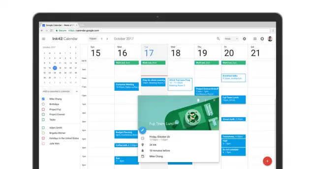
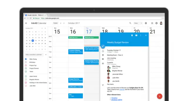
Google Calendar on the web now has better colors, cleaner events, bigger date icons, and much more. It looks much more like the Google Calendar app on your phone. Functionality as improved as well. Events can include info about conference rooms and users can link to Google docs so everyone is on the same page.
This is a great update to Google Calendar. You can visit the Calendar right now and select “Use new Calendar” in the top right corner. How do you feel about the Material Design update?
[via Google Blog]


